
Case study
Gradvisors
A consultancy that sends students abroad is asking a family to trust it with a decision worth years and a great deal of money. Almost none of that trust is built online. It is built across a desk, with a notebook open, which is exactly where this identity had to work.
- Client
- Gradvisors
- Sector
- Study-abroad consultancy
- Year
- 2025
- Scope
- Stationery and identity collateral
- Palette
- Charcoal and mint
- Visual identity
- Stationery design
- Icon and badge design
- Print collateral
Gradvisors advises students on studying abroad. The live site puts it as study abroad, done right, and the identity carries the line creating impact together.
The category has a look, and it is not a good one: flags, mortarboards, stock photographs of lawns outside universities the consultancy has no relationship with. All of it signals the same thing, which is that the business is selling a destination rather than the work of getting there.
What the work had to do
- Look like a professional service. The competition looks like a travel brochure.
- Work across a desk. This is a business closed in meetings, so the collateral is the campaign.
- Say what the service actually is. Preparation, not departure.
- Stay cheap to reproduce. Two colours, line art, no photography to license or reshoot.
The decisions
A badge that separates the work from the outcome. Everything inside the circle is preparation. The paper plane, the only element outside it, is the part the student does.
Charcoal as the ground, mint as the accent, never reversed. Optimism without looking inexpensive.
Line art instead of photography. A consultancy this size cannot license campus imagery, and borrowed photographs of places you have no tie to is exactly the borrowed credibility the category runs on.
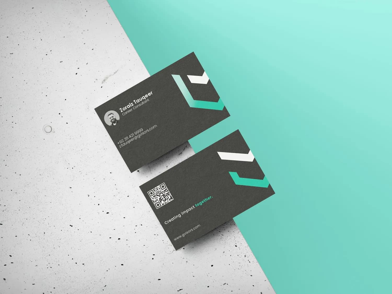
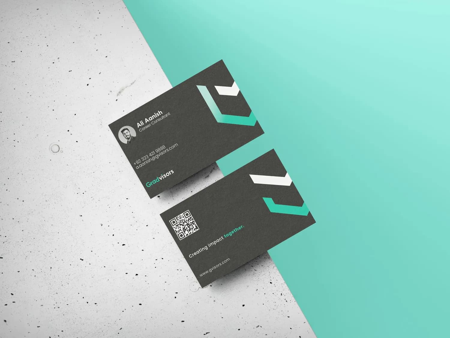
A QR code on the card. The paper's job is to survive the meeting and hand off to the phone, not to hold every detail.
Visual Communication
Gradvisors, stationery system
One badge, two colours and four objects, built for a business whose selling happens across a desk rather than on a screen.
Everything inside the circle, one thing leaving it
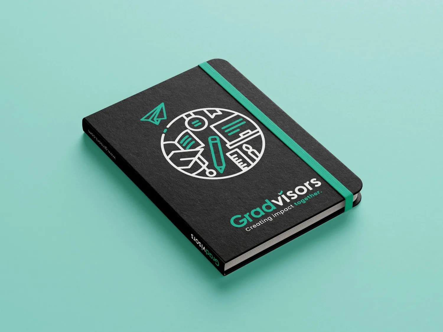
The badge is a line drawing held in a circle: a desk, books, a ruler, a magnifier, a route drawn across the lower left, and a pencil standing upright through the middle. A paper plane sits outside the circle, at the top, already gone.
That is the whole proposition in one mark. The circle is the work of preparing, which is what the consultancy actually sells: applications, tests, documents, decisions. The plane is the outcome. Keeping the plane outside the ring rather than tucked inside it is the only reason the mark says anything, because a plane inside a circle is a travel agent.
Two colours, doing different jobs
Charcoal carries the substance. Mint carries the optimism. They are never mixed into a gradient and never swapped: the mint is always the accent and never the ground for text.
That discipline is what keeps a hopeful palette from reading as a cheap one. Study-abroad advertising in this market runs on flags, gowns and stock photographs of campuses. A charcoal notebook with one green band reads as a professional service instead.
Designed for the desk, not the feed
Four objects: a notebook, a letterhead, a pen, a card. Every one of them exists in a meeting.
- The notebook is the thing a parent watches you write in. It gets the full badge.
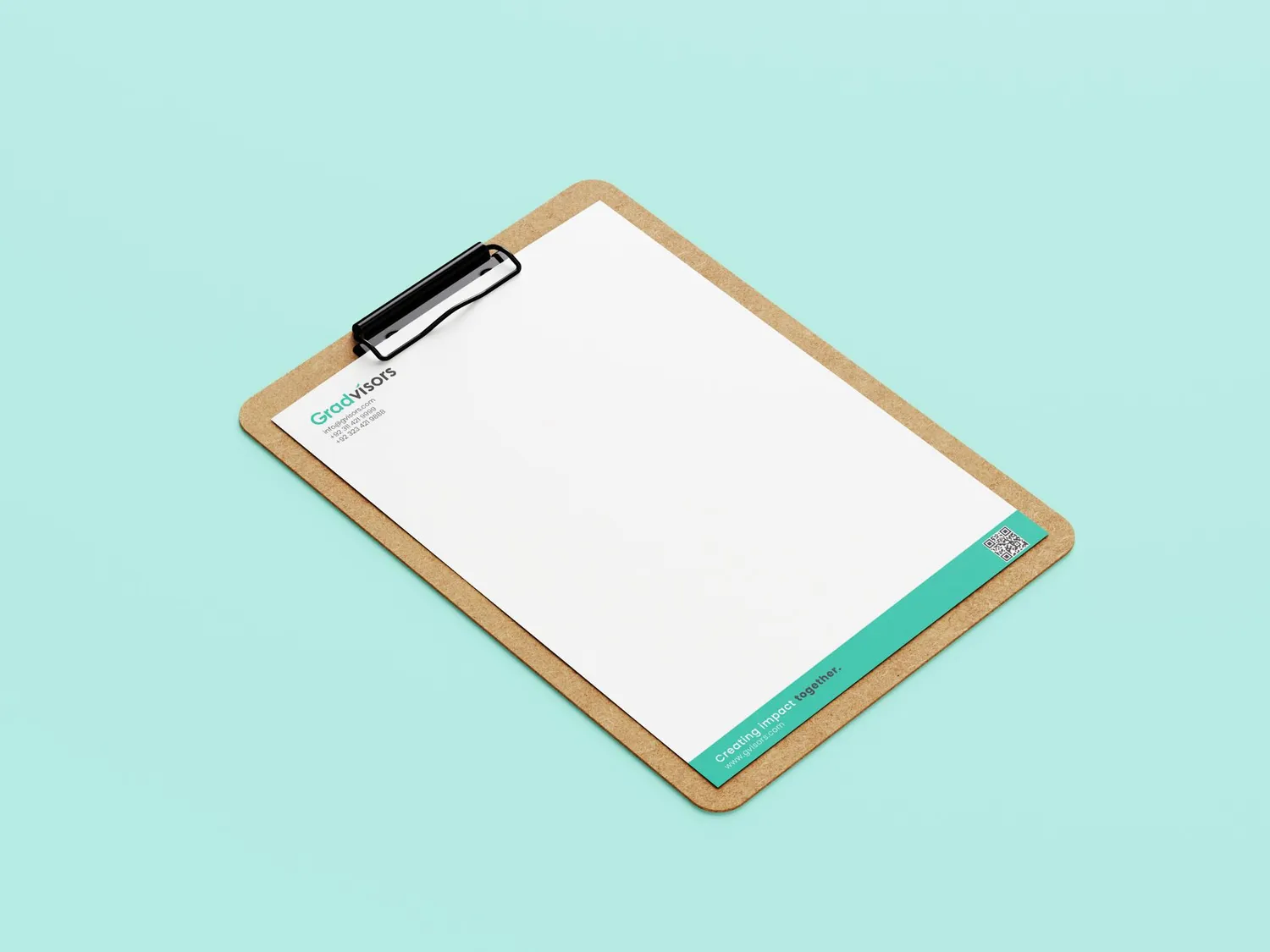
- The letterhead puts its brand band at the foot, so a page is identifiable lying face down among the other papers on a desk.
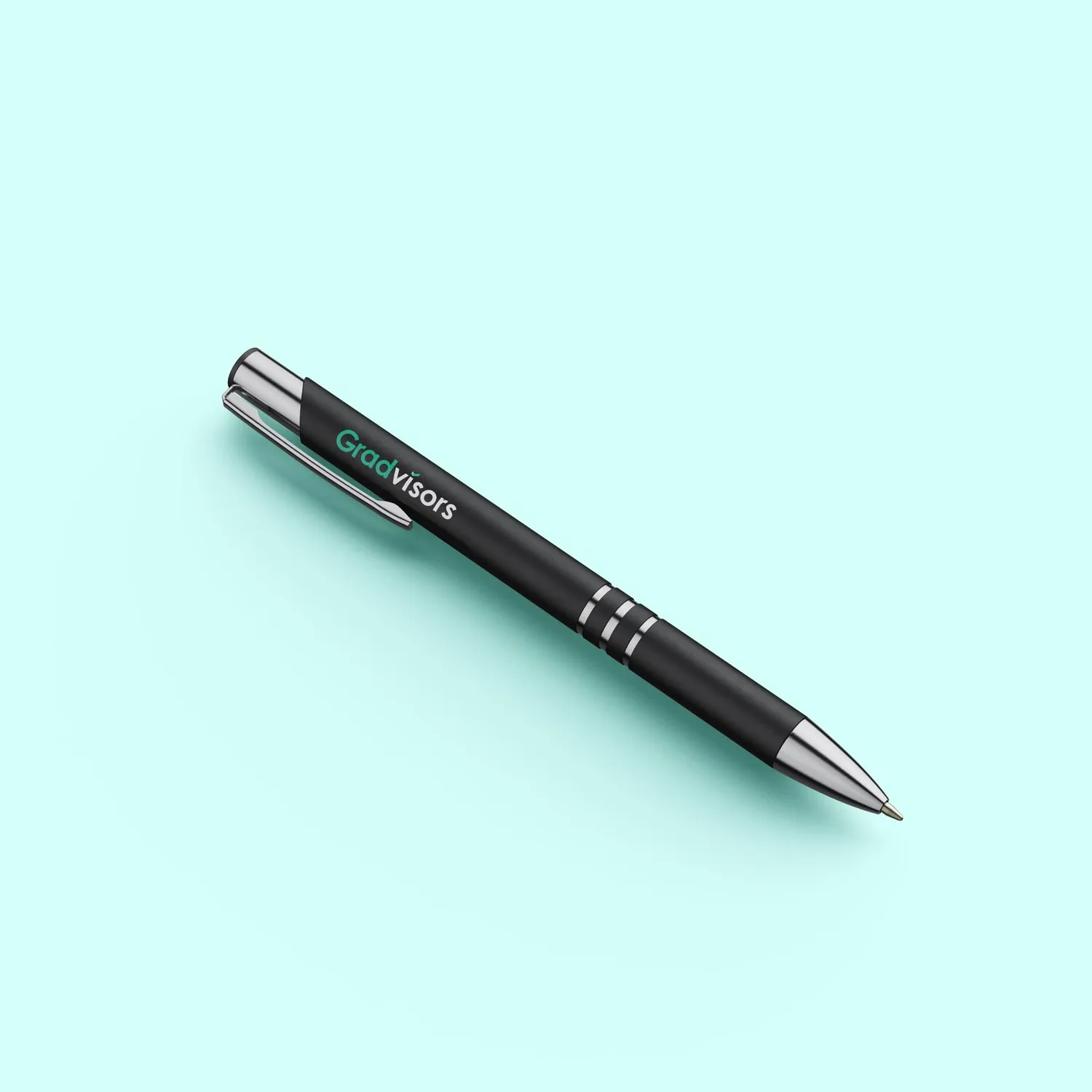
- The pen is the piece most likely to leave with the client.
- The card carries a QR code instead of five lines of contact details, so the paper hands off to the phone rather than trying to hold everything.
The domain is printed on the notebook spine, which is the one surface that stays visible when the book is shelved.
One team, from identity to intelligence.
Brand, software, AI, and growth from a single team, not separate vendors. That is why the positioning, the copy, the site and the data model on this project agree with each other.
Book a discovery call