
Case study
The Rice Bowl
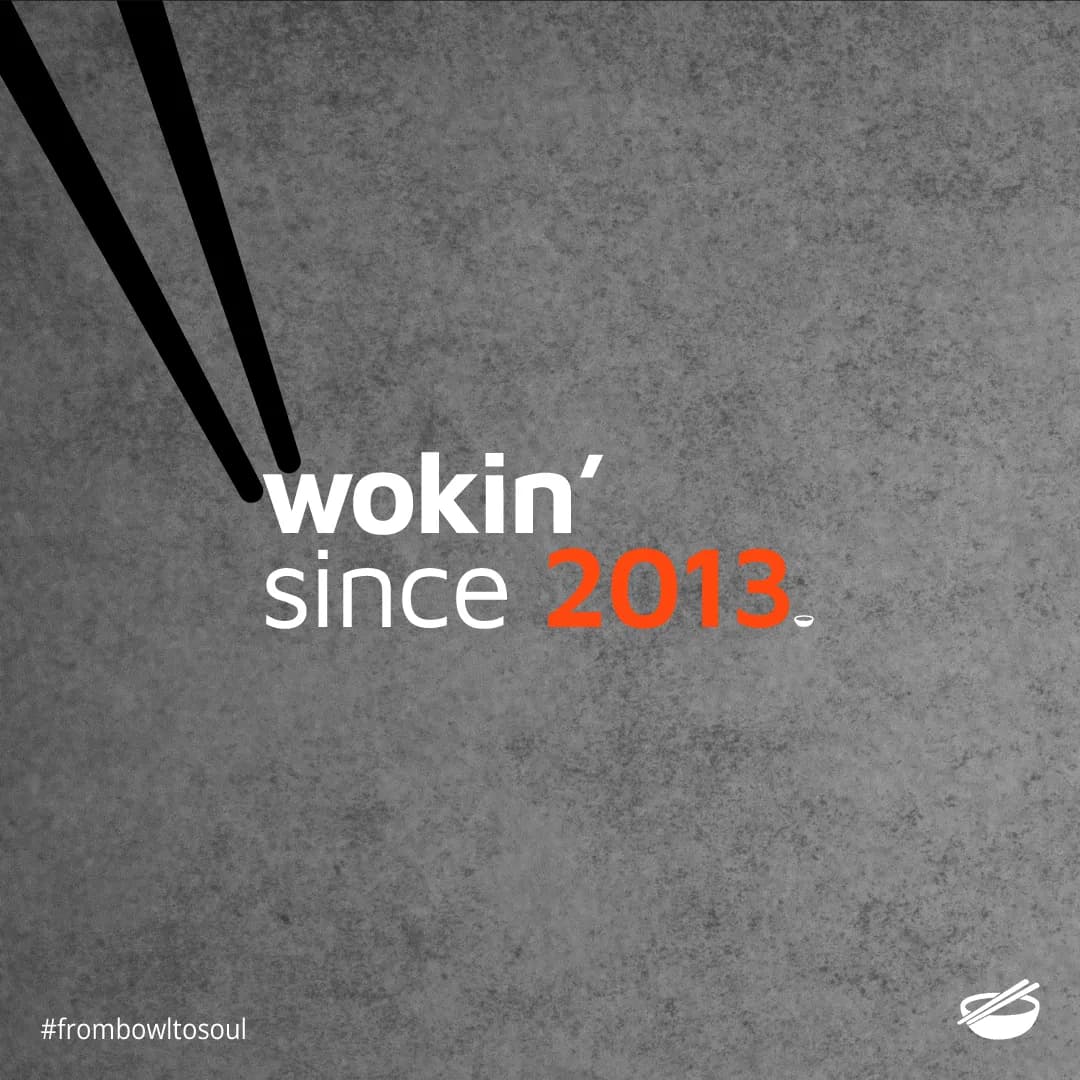
A restaurant that has been wokking since 2013 already had customers. What it did not have was a way to sell to them without paying a commission on every order. The campaign's job was not awareness. It was moving a habit, off the aggregator apps and the phone, onto ricebowl.pk.
- Client
- The Rice Bowl
- Sector
- Chinese restaurant
- City
- Lahore, Pakistan
- Trading since
- 2013
- Year
- 2025
- Result
- PKR 8M in 3 months, client reported
- Output
- 36 pieces
- Social content system
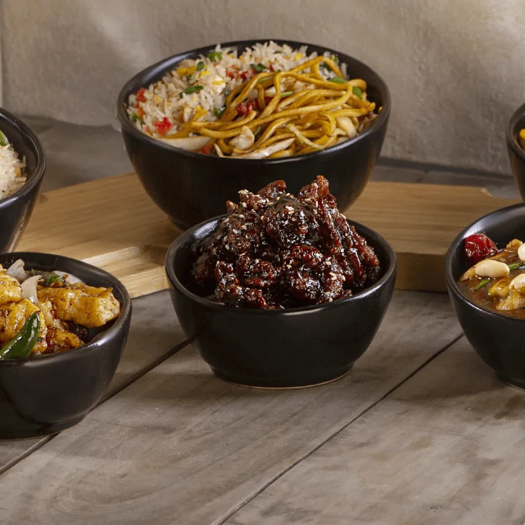
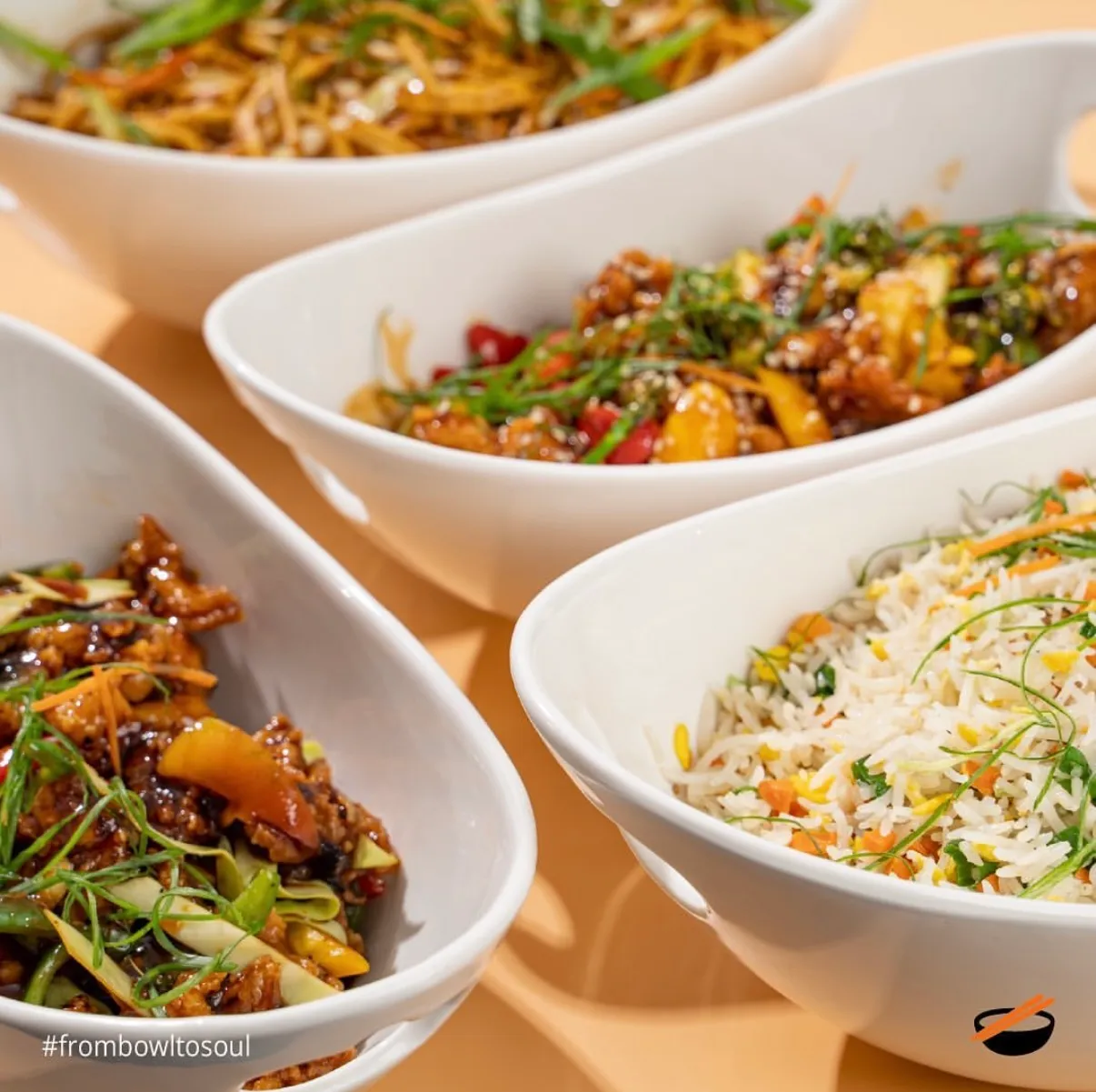
- Food art direction
- Campaign copy
- Launch campaign
- Online ordering
The Rice Bowl has been wokking in Lahore since 2013. By the time this campaign ran it had the two things a restaurant needs, a menu people came back for and a room that filled, and one thing it did not: a way to sell to those people without paying a commission on every single order.
That is the whole brief. Not awareness, not a rebrand. A migration.
What the work had to do
- Give the restaurant a channel it owns. ricebowl.pk and an app on both stores.
- Move an existing habit onto it. Customers already had a way to order that worked.
- Keep the account worth following in between. A feed that only sells is a feed people mute.
- Survive being run by the restaurant. No design team, so templates rather than one-off artwork.
The decisions
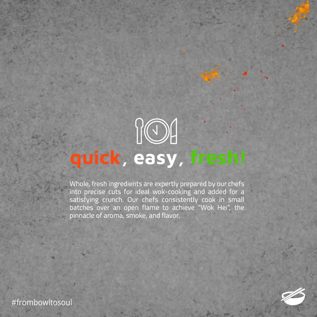
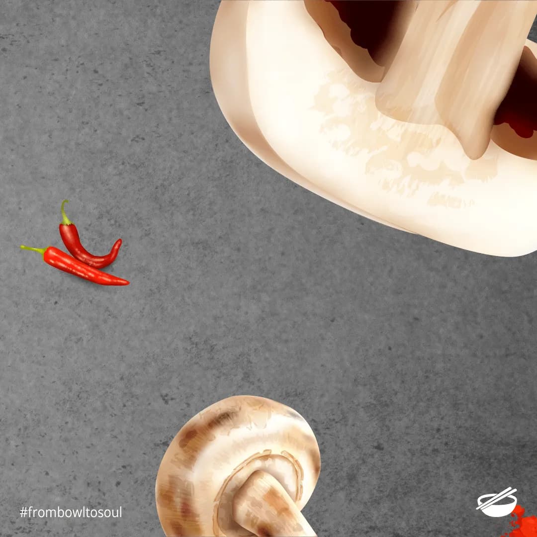
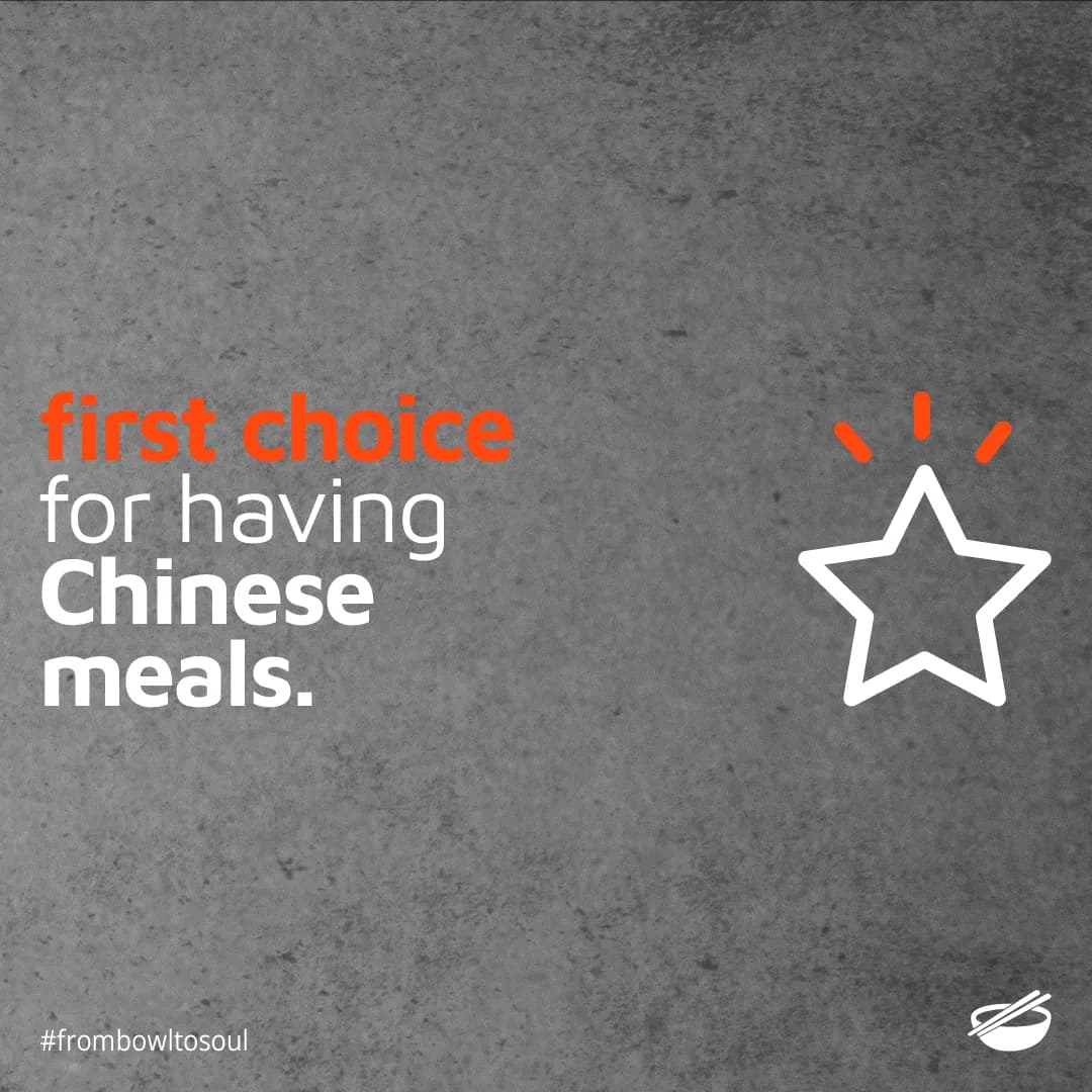
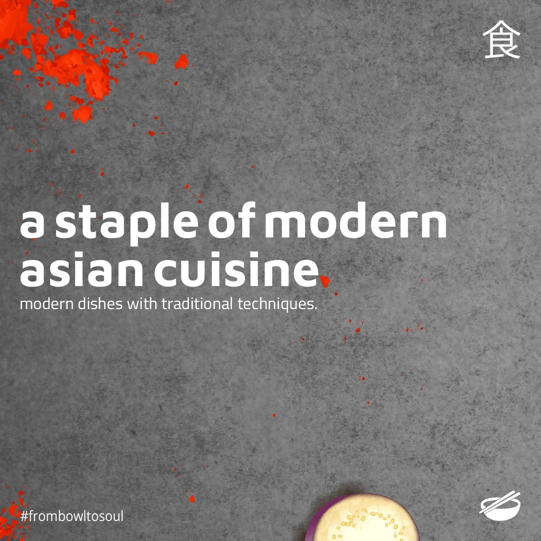
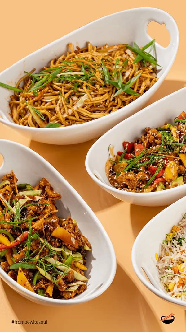
Two registers, never blended. Grey concrete and long copy for the craft. Flat saturated colour for the offers. A restaurant that only posts discounts teaches its audience to wait for the next discount.
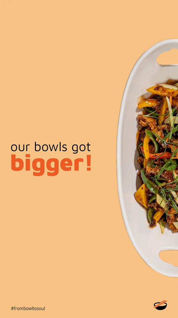
One fixed frame. The bowl mark bottom right, #frombowltosoul bottom left, on all thirty six pieces. Everything else moves.
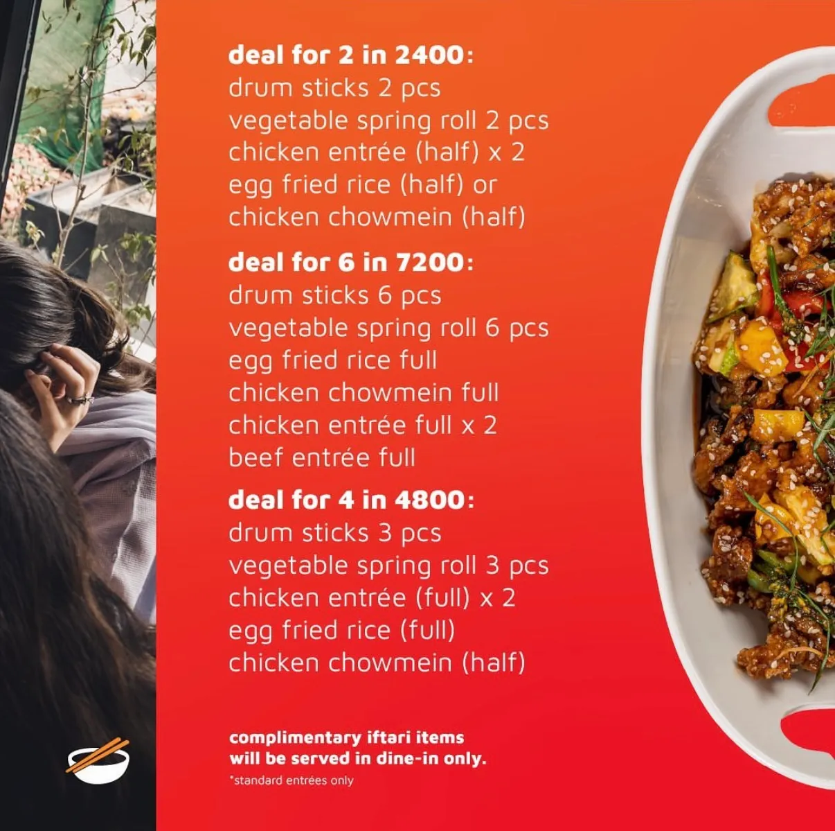
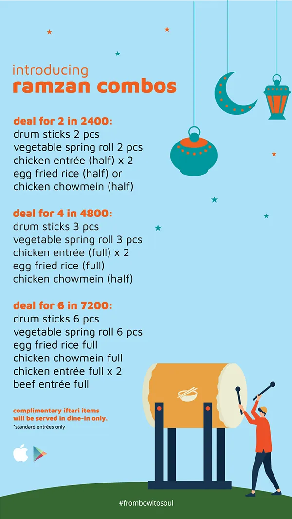
The price, printed. Every combo lists its items and its cost in rupees, on the card, where "DM for price" is the norm.
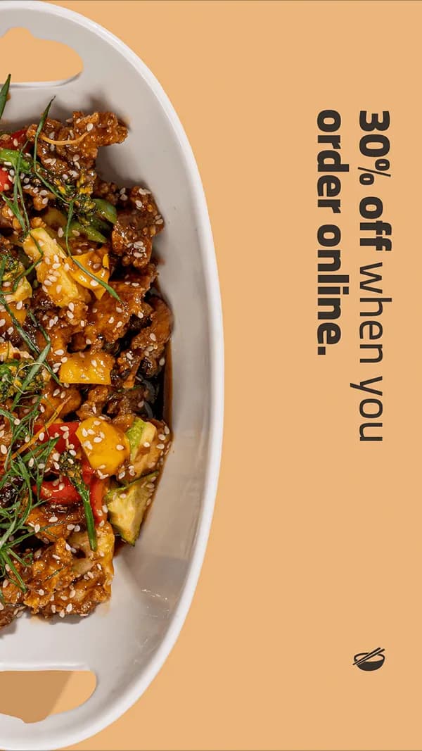
Thirty percent, on the owned channel only. Not a margin decision. The cost of breaking a habit once, after which the second order is free to win.
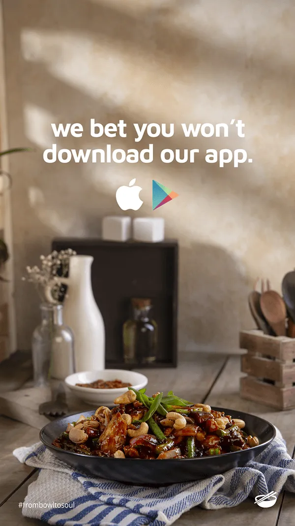
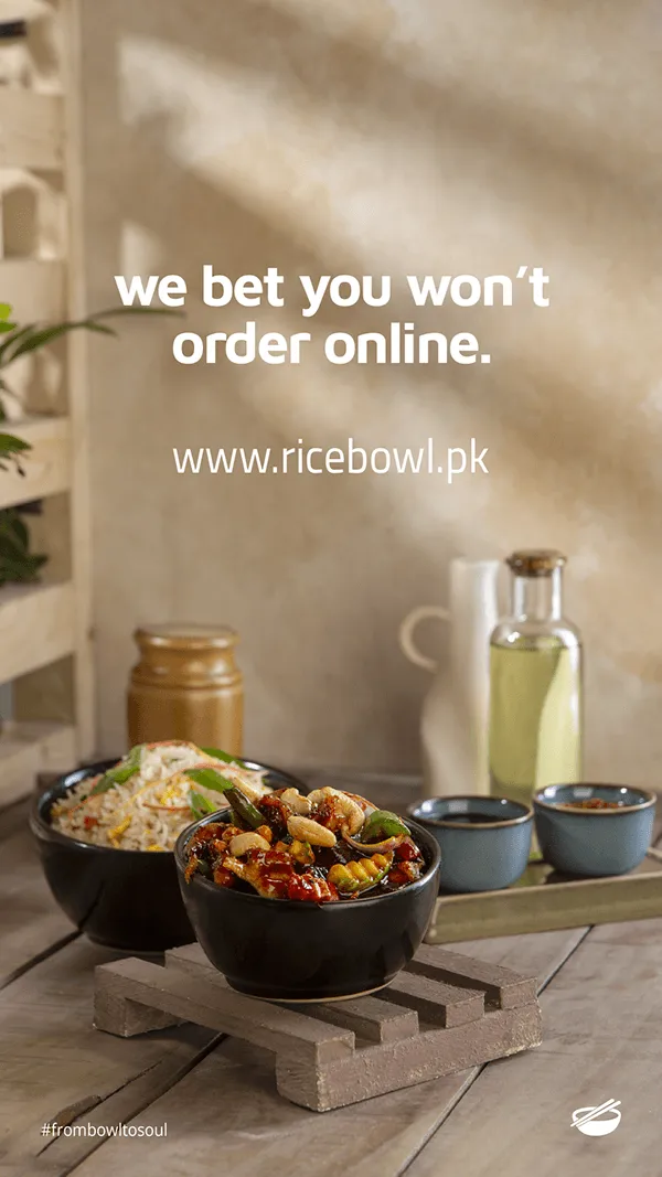
A dare instead of an instruction. "We bet you won't order online" is the only pair of posts with no offer and no link, and they are the ones aimed at everybody who scrolls past a discount.
The result
The client reports PKR 8 million in the three months after the ordering platform launched. That is their number, from their books, for the channel this work existed to fill. We ran the creative and built the launch, not the accounting, and it is stated here as what they told us rather than as an attribution we measured.
Web
The Rice Bowl, online ordering launch
Moving a twelve-year-old restaurant's customers off the aggregators and onto its own website and app. The client reports PKR 8 million in the first three months.
The problem was a habit, not a website
Building an ordering site is the easy half. The hard half is that the customer already has a way to order, it works, and it lives on their home screen. Every order placed through an aggregator costs the restaurant a commission, so the entire value of the project sat in one number: what share of existing customers could be moved to a channel the restaurant owns.
So the launch was not treated as an announcement. It was treated as a migration, and it was sequenced like one.
The sequence
Six posts, in this order, each doing one job:
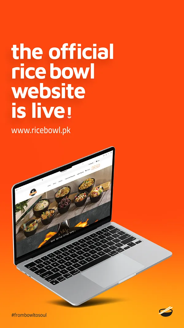
- The website is live, with the URL set as large as the headline.
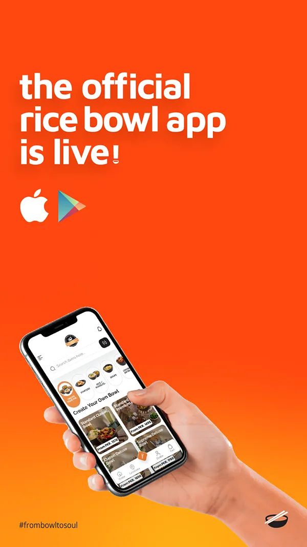
- The app is live, one post later, in the same template, so two launches read as one move.
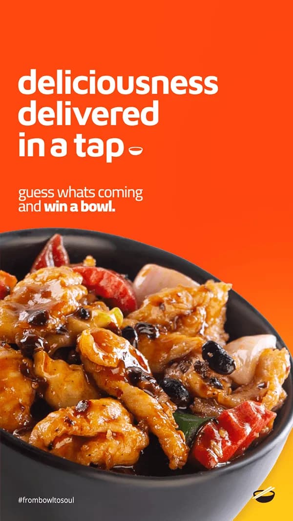
- Deliciousness delivered in a tap, the benefit stated as a gesture rather than a feature.
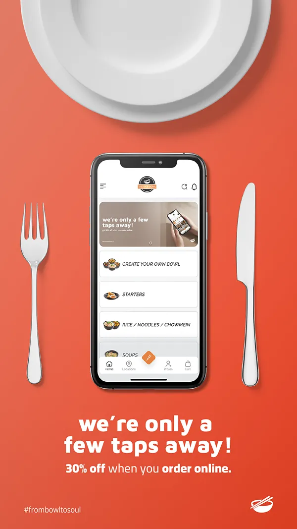
- We're only a few taps away, 30% off when you order online, the incentive, offered only on the owned channel.
- We bet you won't download our app.
- We bet you won't order online.
The last two are the interesting ones. They ask for nothing, and they are the only posts in the campaign with no offer, no link and no imperative. Daring someone is a cheaper hook than instructing them, and it converts the passive audience that scrolls past a discount.
Why thirty percent
Thirty percent is not a margin decision, it is the price of breaking a habit. It only has to run long enough for a customer to place one direct order and learn that it works, because the second order costs nothing to win. Offering it exclusively on the website and app is what makes it a migration tool rather than a discount: taking it means leaving the aggregator.
The result
The client reports PKR 8 million in the three months after launch. That is their figure, from their books, and it covers the channel this campaign existed to fill.
Visual Communication
The Rice Bowl, social content system
Two registers, one fixed frame, and a grid built so a restaurant with no design team can keep posting: 36 pieces across brand, food, Ramzan and promotions.
Two registers, deliberately kept apart
The feed runs on two visual languages and never blends them.
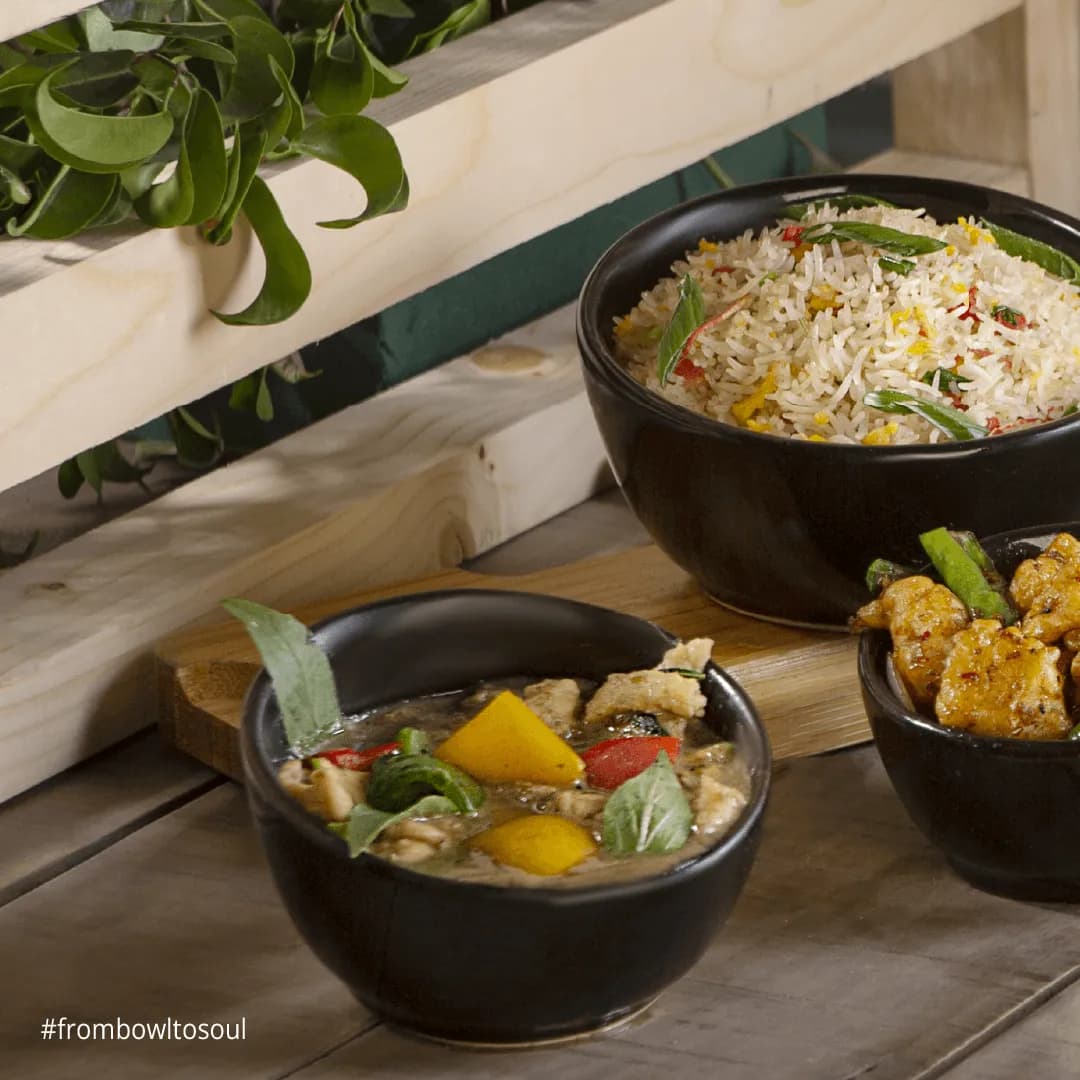
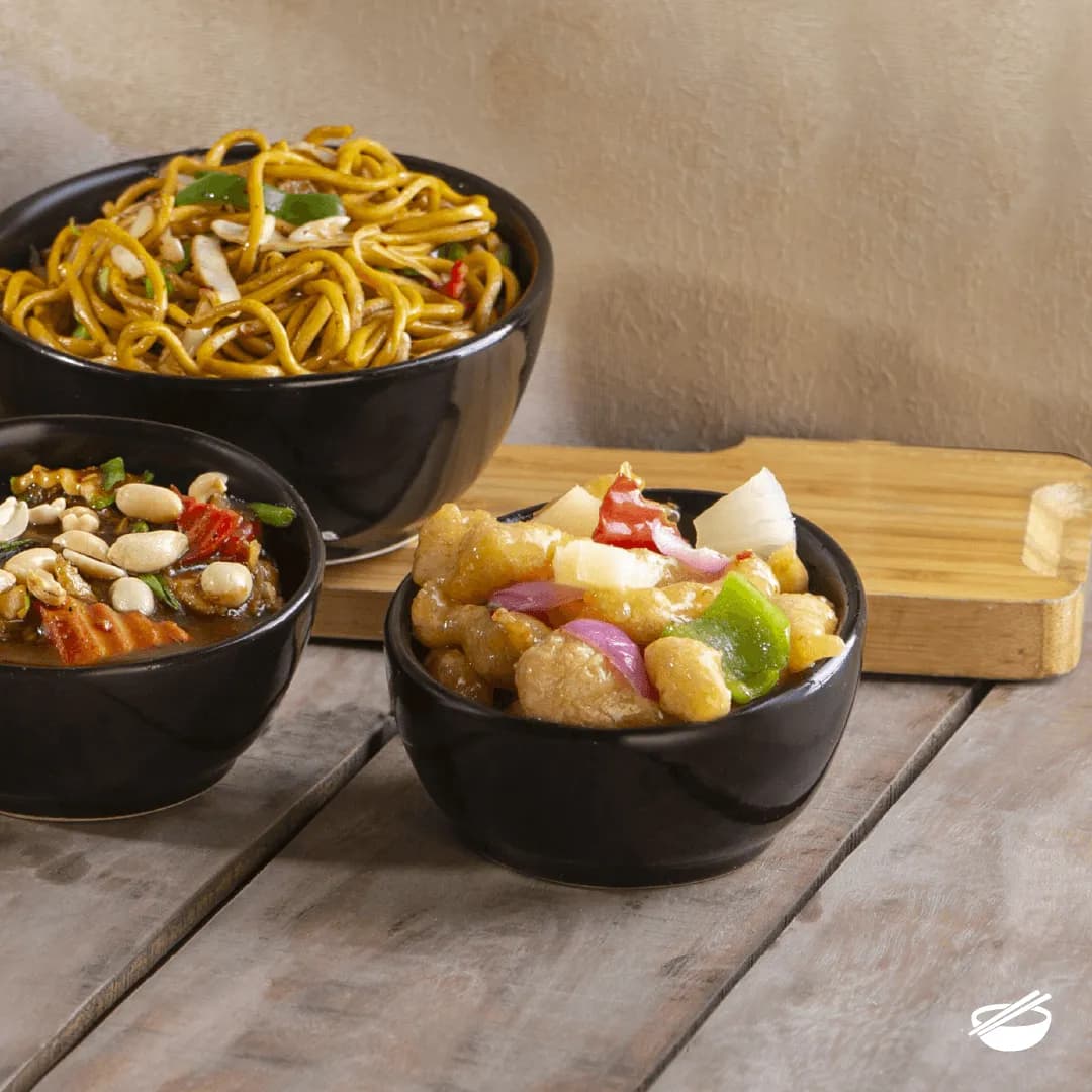
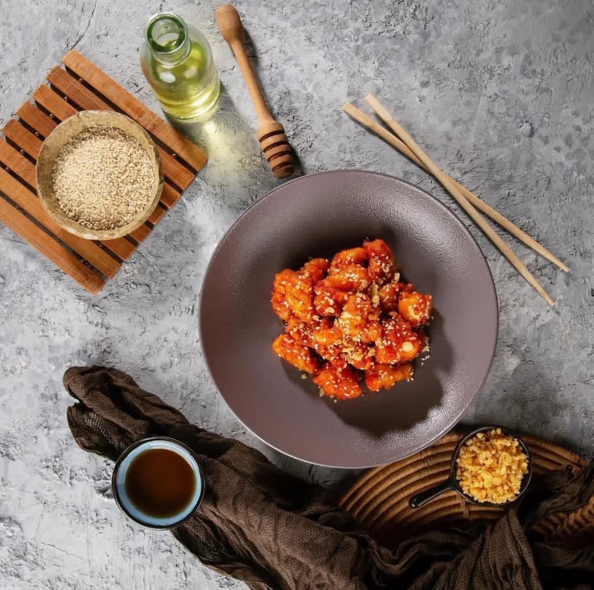
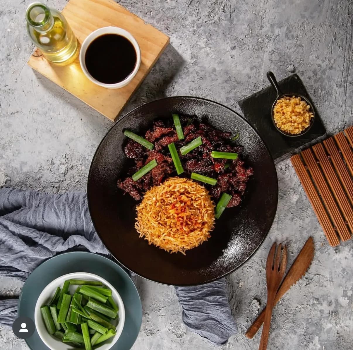
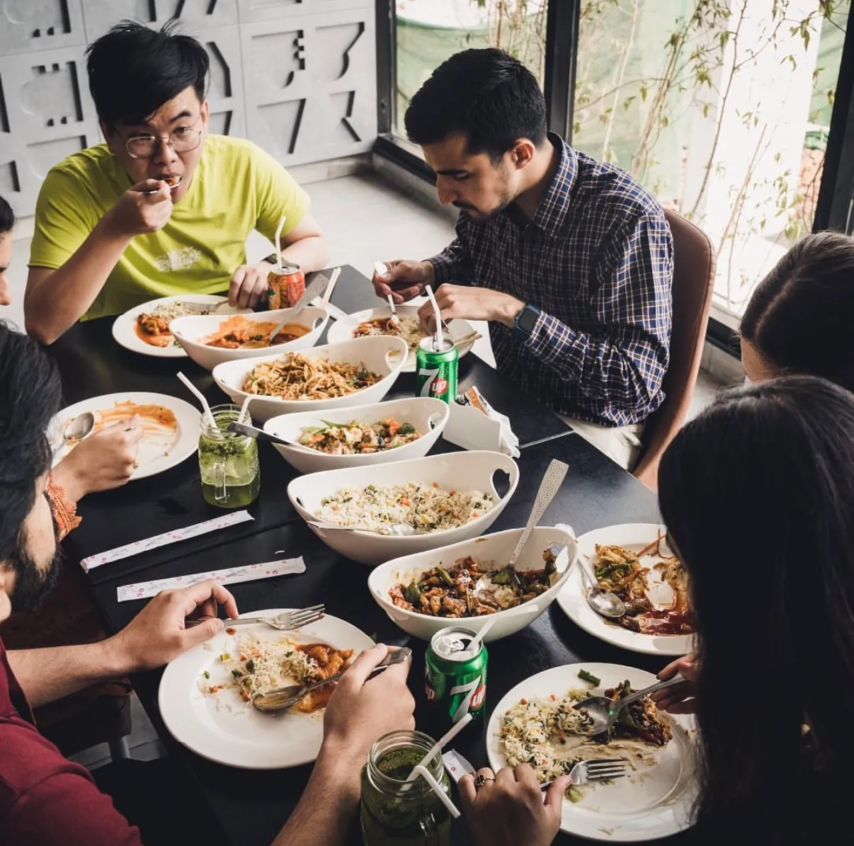
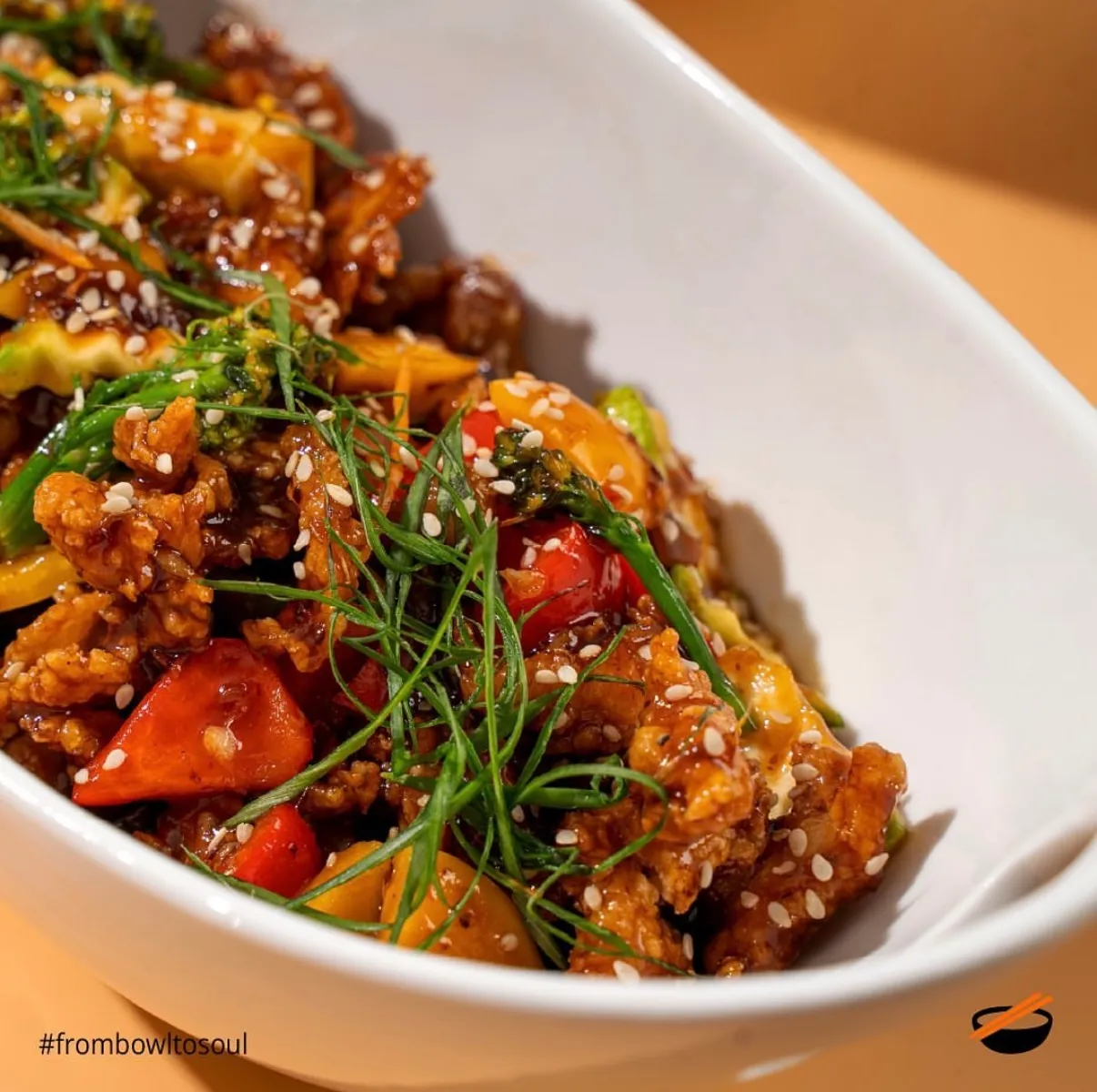
The craft register is grey concrete, small type, long copy, ingredients caught mid-air. It carries the things that take a sentence to explain: modern dishes with traditional technique, small batches over open flame, Wok Hei.
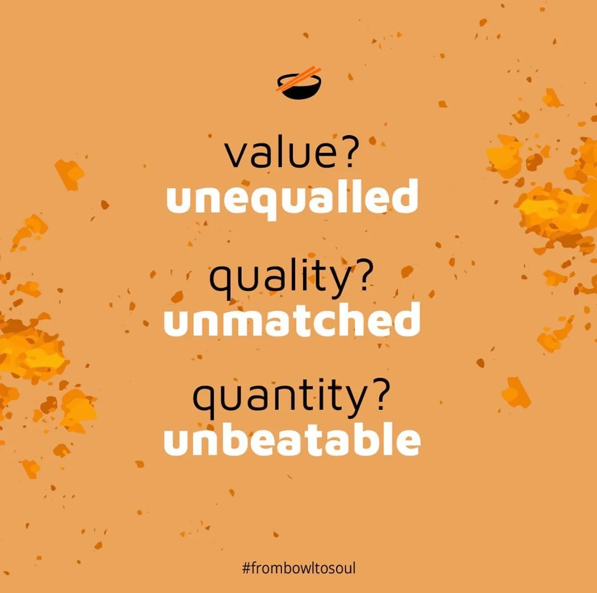
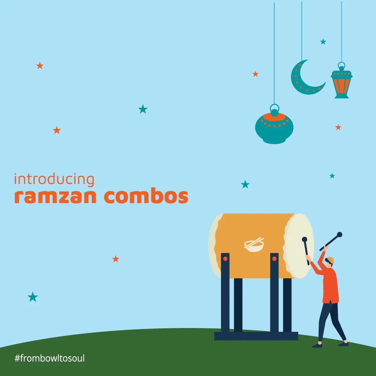
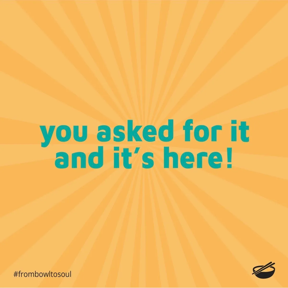
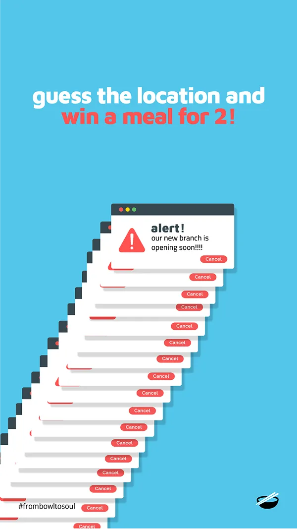
The offer register is flat saturated colour, orange and teal and yellow, type set large enough to read at a glance. It carries prices, deals and launches.
Keeping them separate is what stops the account becoming a coupon book. A restaurant that only posts discounts trains its audience to wait for the next one.
One fixed frame
Every single piece carries the bowl mark bottom right and #frombowltosoul bottom left. Nothing else is constant, and nothing else needs to be. It means any post is identifiable when it is cropped, reposted, screenshotted into a group chat, or seen without the handle attached.
The grid as a canvas
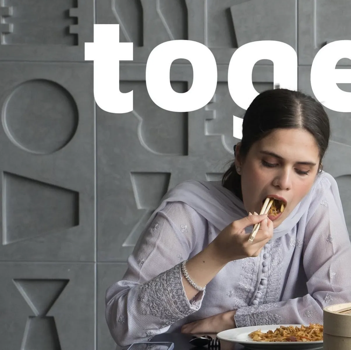
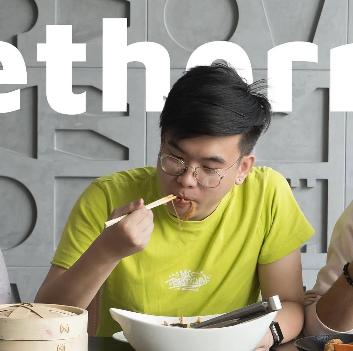
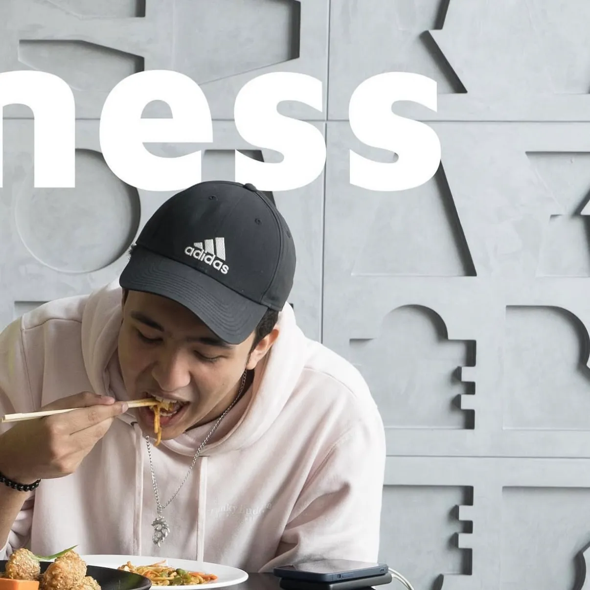
The togetherness set splits one word across three tiles, so the shape only resolves on the profile page. Each panel still works alone, which is what makes the trick safe: the payoff is a reward for visiting rather than a dependency.
Publishing the price
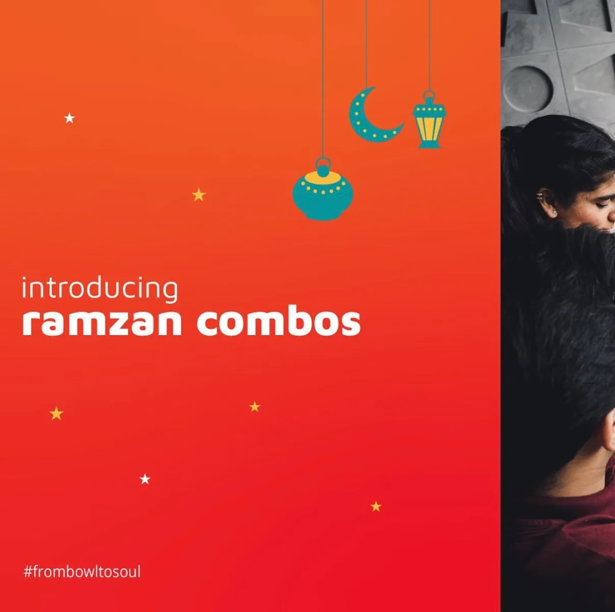
The Ramzan deal cards list every item in every combo and the price in rupees. In a market where "DM for price" is normal, printing the number removes a step between seeing and ordering, and it is the same instinct that made the ordering site worth building.
Built to be handed over
A restaurant this size has no design team. So the system is templates with slots: a teaser and a reveal that are one layout in two colours, an announcement frame that refills, story crops drawn separately rather than squeezed from squares. The measure of it is the thirty seventh piece, made by someone else, that still looks like The Rice Bowl.
More from the project
One team, from identity to intelligence.
Brand, software, AI, and growth from a single team, not separate vendors. That is why the positioning, the copy, the site and the data model on this project agree with each other.
Book a discovery call