
Case study
TGS AV
A distributor has a problem an ordinary brand does not. Every post it makes belongs to somebody else's brand. So the house identity cannot be loud, and it cannot be forgettable either. It has to be the frame that a dozen other logos hang inside without any of them clashing.
- Client
- Tera Generation Solutions
- Sector
- Audio-visual distribution
- Year
- 2025
- Scope
- Identity, stationery, social
- Carries
- Miller & Kreisel, Acoustic, Plusminus
- Brand identity
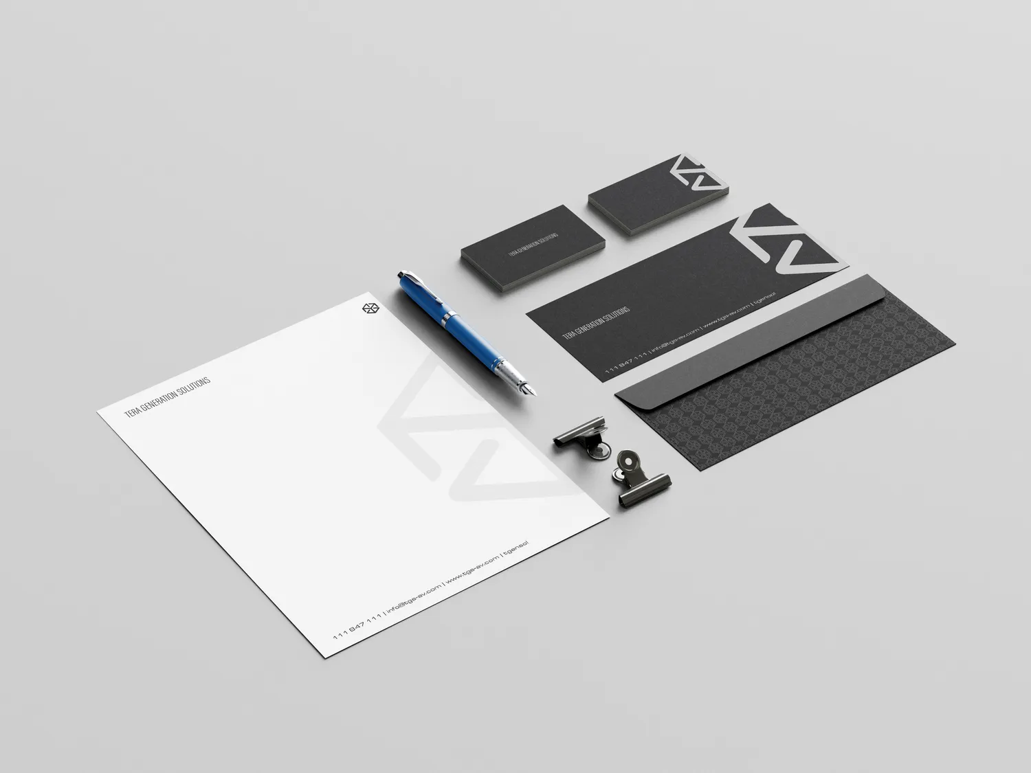
- Monogram design
- Stationery design
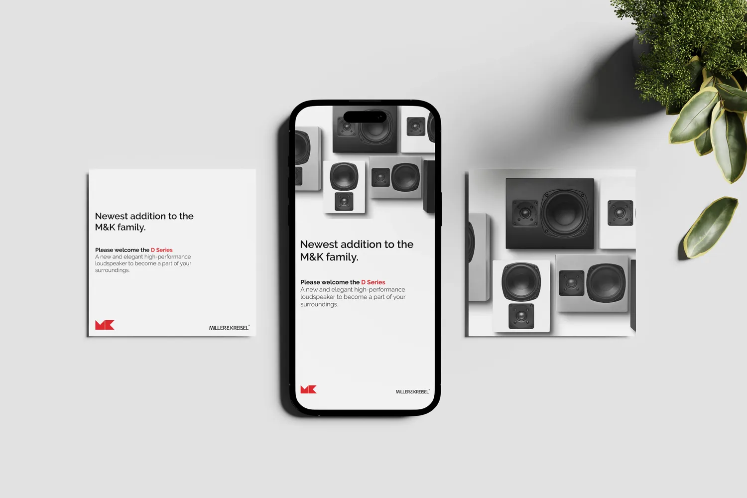
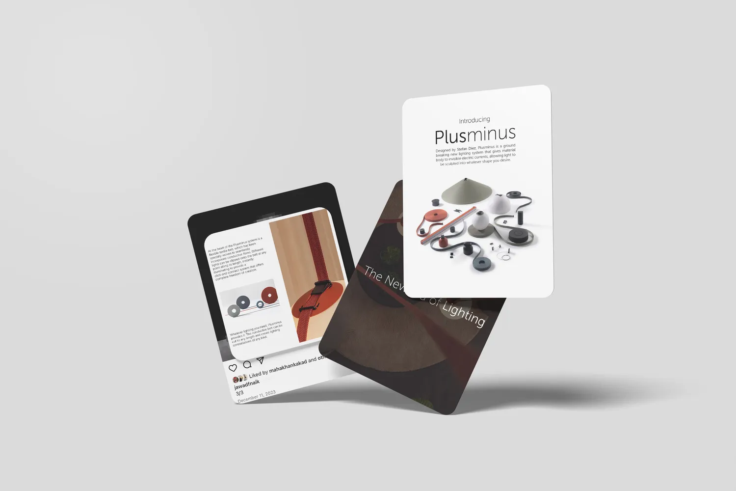
- Social content system
Tera Generation Solutions distributes audio-visual equipment, carrying loudspeaker and AV lines including Miller & Kreisel, Acoustic and Plusminus.
That business model sets the design problem. A distributor's marketing is almost entirely made of other companies' brands. Every launch post belongs to a manufacturer, uses the manufacturer's colour, and ends with the manufacturer's wordmark. The house brand appears in the margins of its own communications.
What the work had to do
- Be recognisable without being loud. The house mark shares every layout with a stronger, older brand.
- Hold unrelated manufacturers in one feed. Four brands, one shelf.
- Survive the smallest position. A corner, an envelope flap, a watermark.
- Read as trade, not retail. The audience is installers, integrators and specifiers.
The decisions
A monogram with no front. An angular cube that works at any orientation, for a business that faces manufacturers and installers at the same time.
No house accent colour. The single most important restraint in the system. The brand of the day supplies the colour, the house supplies the structure, and no co-branded post ever becomes a clash.
One post skeleton for every manufacturer. Headline, one paragraph, product on neutral, their mark, their wordmark. The consistency is the curation.
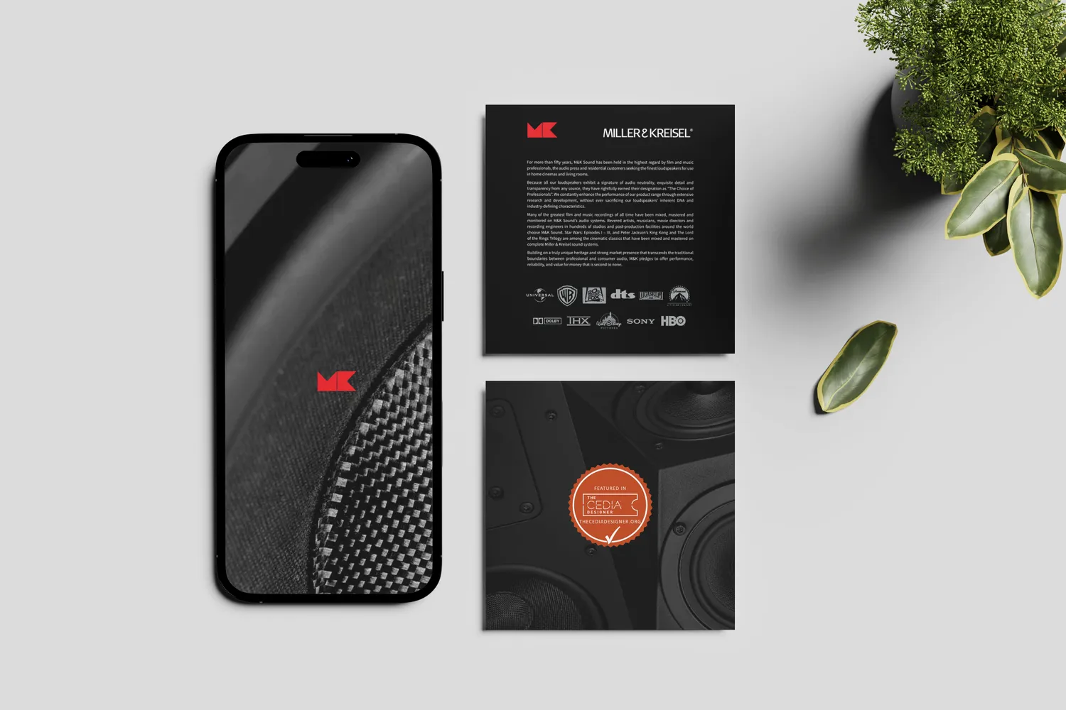
Certifications at readable size. In consumer marketing a certification badge is a footer detail. To a specifier it is the specification, so it gets room.
Installed rooms given equal weight to product cuts. The equipment is bought to disappear. Showing where it disappears to is the more honest sell.
Visual Communication
TGS AV, identity and social for a distributor
A monogram, a stationery system and a social grid built to carry other people's loudspeaker brands without competing with any of them.
A mark with no front
The monogram is an angular cube, drawn so that no single face reads as the front of it. It is a small joke about the business: a distributor sits between manufacturers and installers and faces both ways at once.
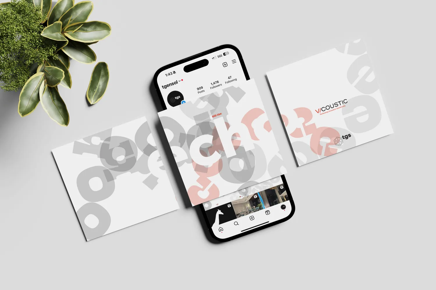
It also solves a practical problem. A mark with no obvious orientation survives being embossed on an envelope flap, blown up as a watermark across a letterhead, and shrunk into the corner of somebody else's product post, without ever looking like it is competing for the title position.
Quiet on purpose
The house palette is charcoal, white and paper. There is no house accent colour, and that is the decision the whole system rests on.
M&K arrives with red. Other lines arrive with their own. If TGS had claimed a colour of its own, every co-branded post would be an argument between two brands. Instead the house contributes structure, and the brand of the day contributes the colour.
The letterhead makes the same point twice: the name is set small and letterspaced at the top, and the mark is enlarged into a pale watermark behind the text. Present everywhere, loud nowhere.
One skeleton, many logos
Every product post is the same layout: a plain headline, one short paragraph, the product photographed against a neutral field, the manufacturer's mark bottom left, the manufacturer's wordmark bottom right.
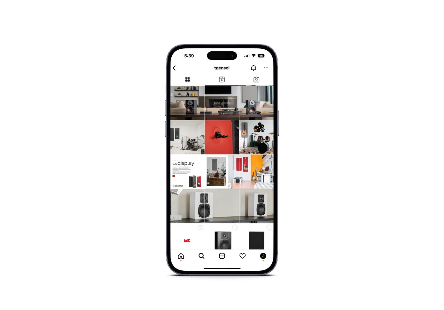
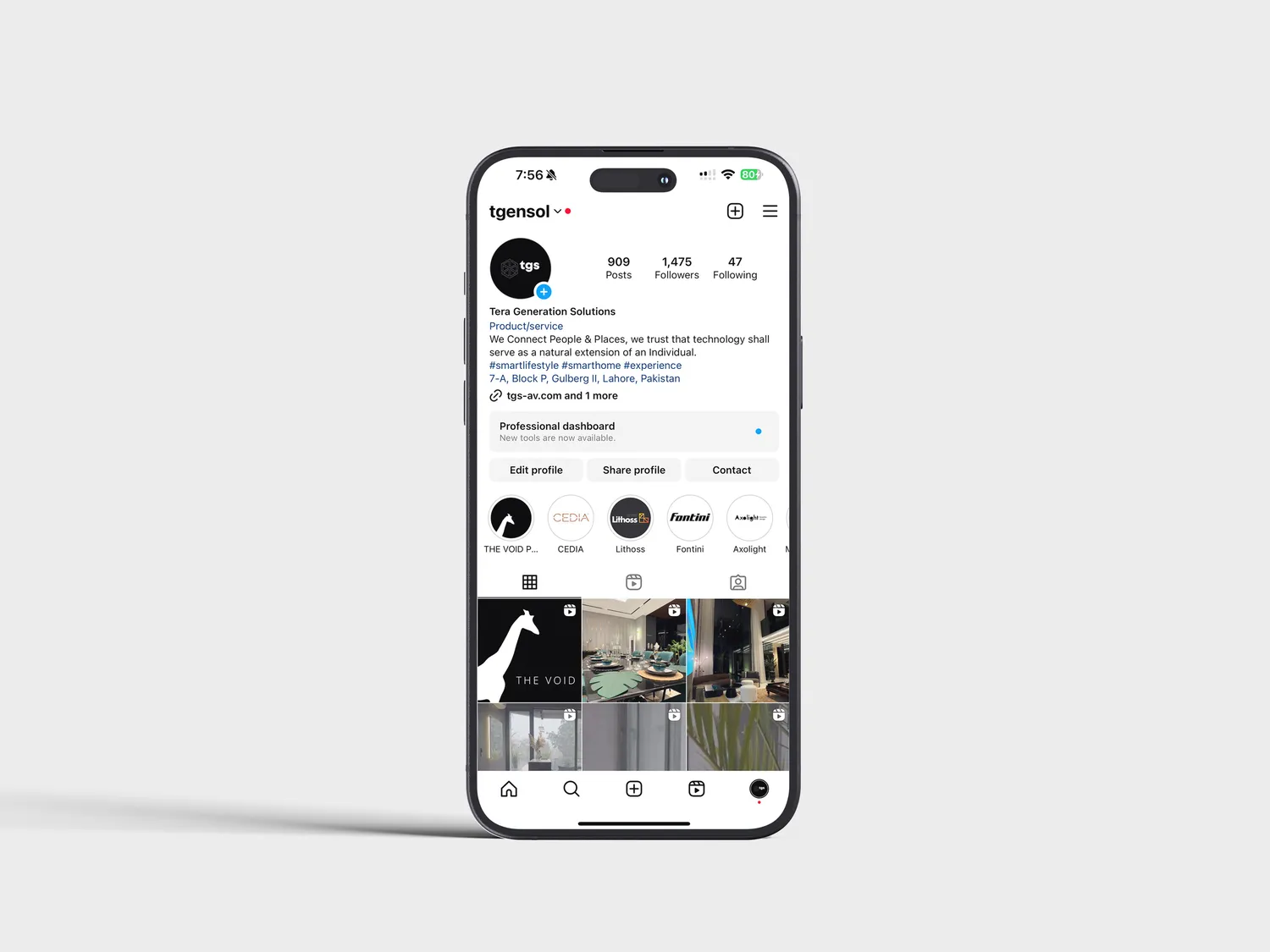
Because the skeleton never changes, a feed carrying four unrelated manufacturers still reads as one catalogue. That is the entire value of a distributor's social account: not that any single post is remarkable, but that the shelf looks curated.
Rooms, not boxes
The strongest posts are not the product cuts, they are the installed rooms. Nobody buys a subwoofer because it photographs well. They buy the room it disappears into, and the grid says so by giving interiors as much space as hardware.



One team, from identity to intelligence.
Brand, software, AI, and growth from a single team, not separate vendors. That is why the positioning, the copy, the site and the data model on this project agree with each other.
Book a discovery call