← Pinn.Works

Case study

BoxPark Pico

Fast food is bought in a second, from a photograph, on a phone. So the work was not to make the food look expensive. It was to make it look like BoxPark, in a feed, at thumbnail size, next to everyone else.

Client
BoxPark Pico
Sector
Fast food
Year
2025
Scope
Photography, menu, social
Output
28 pieces

BoxPark Pico sells burgers, wraps, loaded fries, tacos and a line of iced drinks called Mind Crushers. The decision to buy any of it happens in about a second, on a phone, from a photograph, against every other restaurant doing the same thing.

So this was not three projects that happened to share a client. It was one problem approached from three directions.

One set of rules

The food photography, the menu and the social system were built on the same small set of decisions:

  • The brand's colours are the set, not the styling. Flat blocks of yellow, red and cyan replace the table, so nothing shot can drift off-brand later.
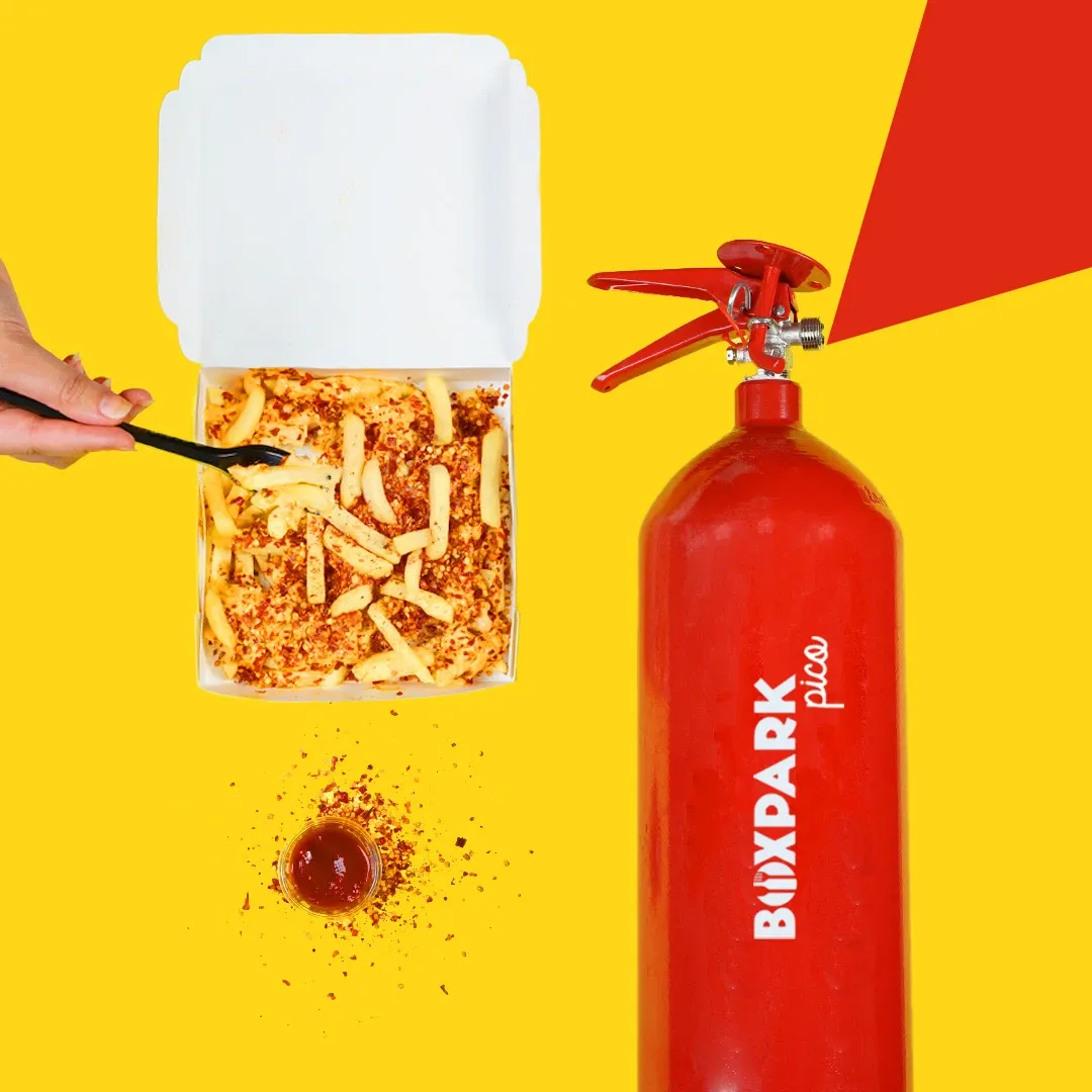
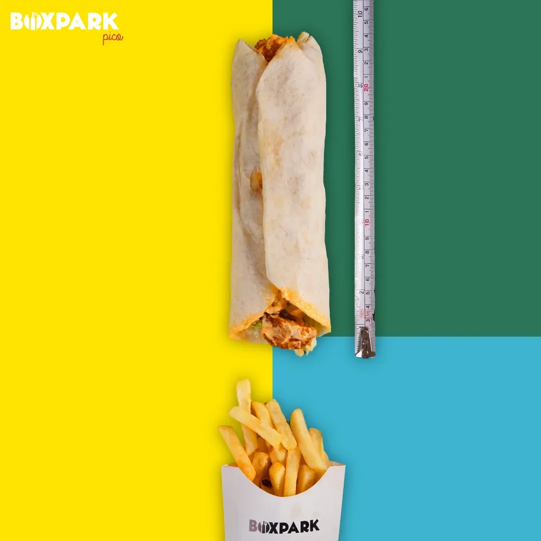
  • A prop instead of an adjective. A branded fire extinguisher for heat. A steel rule for portion size. A runway and a toy plane for a launch.
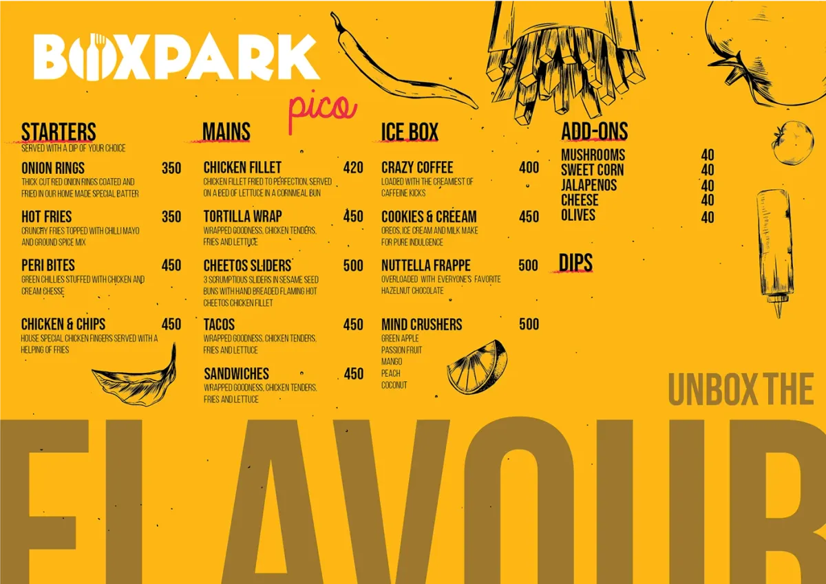
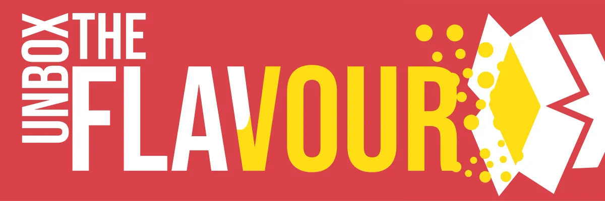
  • One line, carried everywhere unchanged. UNBOX THE FLAVOUR is set large enough to bleed off the menu, and arrives in the feed identical.
  • Drawn where drawing is cheaper. Hand-drawn ingredients on the menu, because a printed menu gets reprinted every time a price moves.

Why it holds together

A restaurant this size does not have a brand team. It has whoever is free on a Tuesday. So the work had to survive being used by people who did not make it: templates that refill, a palette that is structural rather than a preference, and a voice that lives in one line rather than in a tone-of-voice document nobody opens.

The measure of it is not the twenty eight pieces here. It is the twenty ninth, made next month by someone else, that still looks like BoxPark.

The work
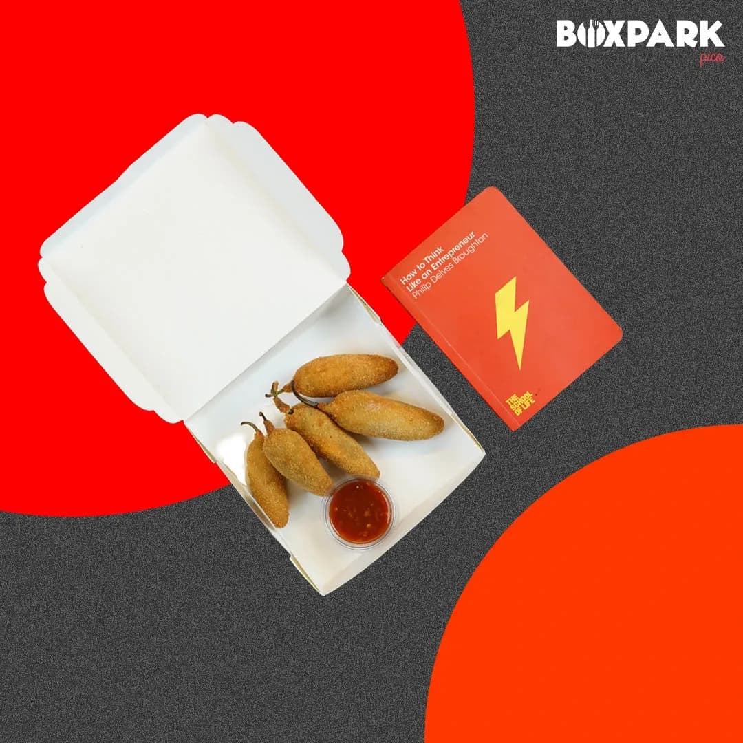
Corn dogs and dip on a split red and charcoal set
The set is built, not found. Flat colour blocks stand in for a table, so every frame is already brand-coloured before the food arrives.
Hot fries poured beside a BoxPark-branded fire extinguisher
Heat, argued with a prop instead of an adjective. The extinguisher is branded, so the joke and the logo are the same object.
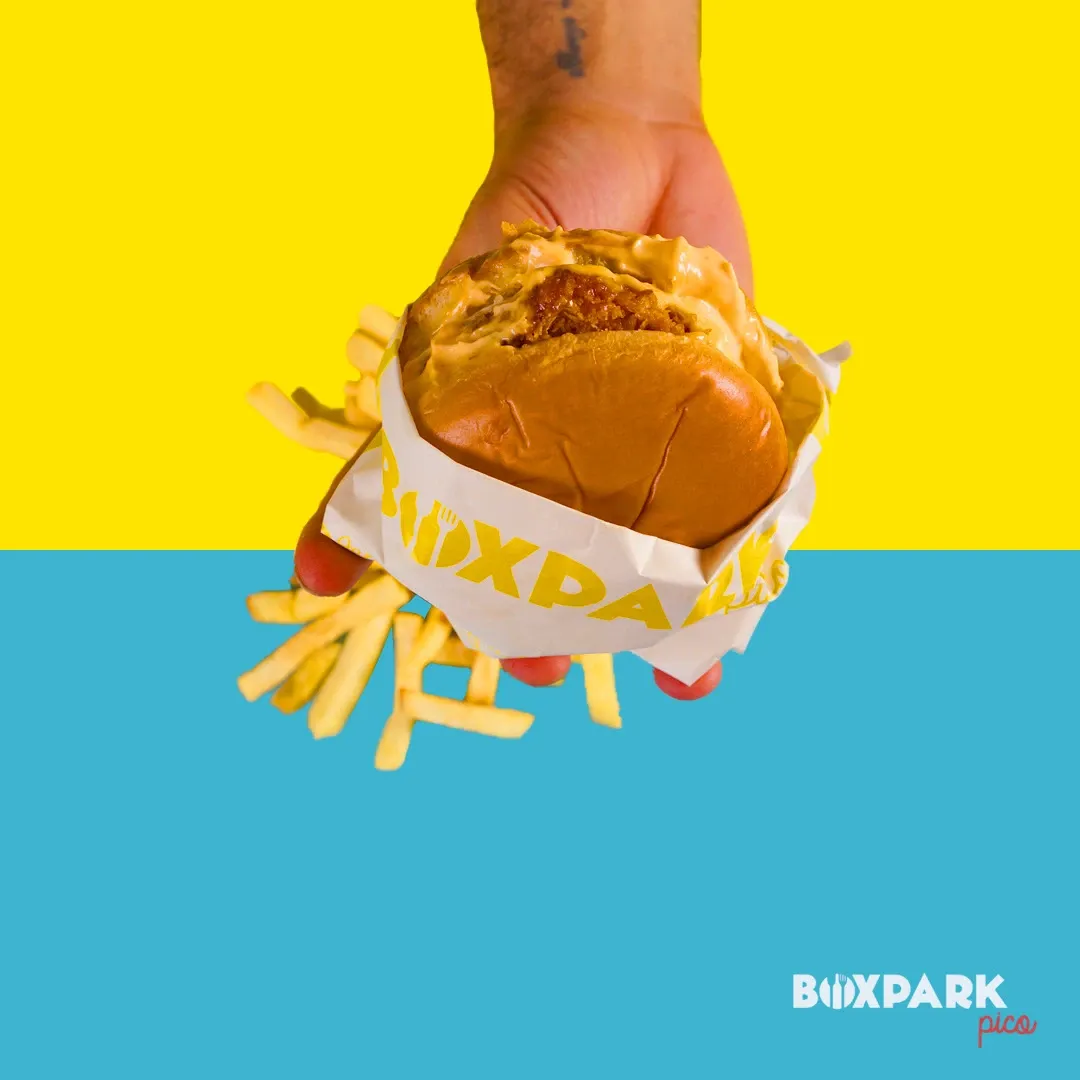
A hand holding a burger over a yellow and cyan field
Hand-held, shot from below. Fast food is eaten standing up, and the photography says so.
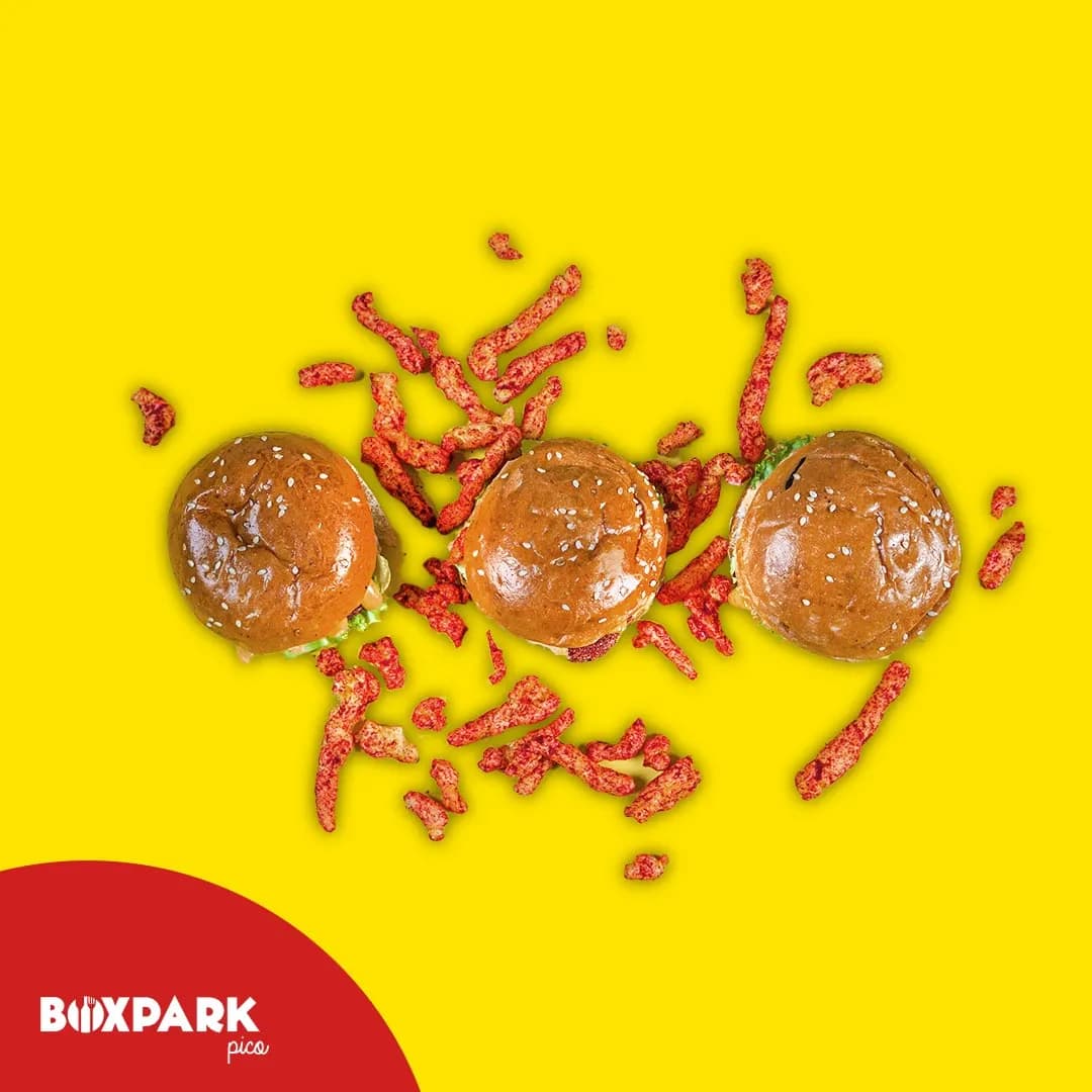
Three sliders scattered with Cheetos on yellow
The Cheetos collaboration, shot as ingredient rather than sponsor. The product is the garnish.
A tortilla wrap photographed beside a steel rule
Portion size answered literally. A tape measure settles an argument that a caption cannot.
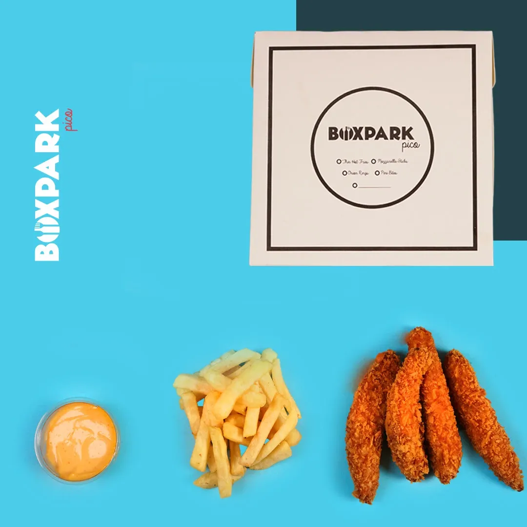
Fries, sauces and peri bites arranged around a menu card on cyan
The menu card photographed as part of the food, so the collateral and the product sell each other.
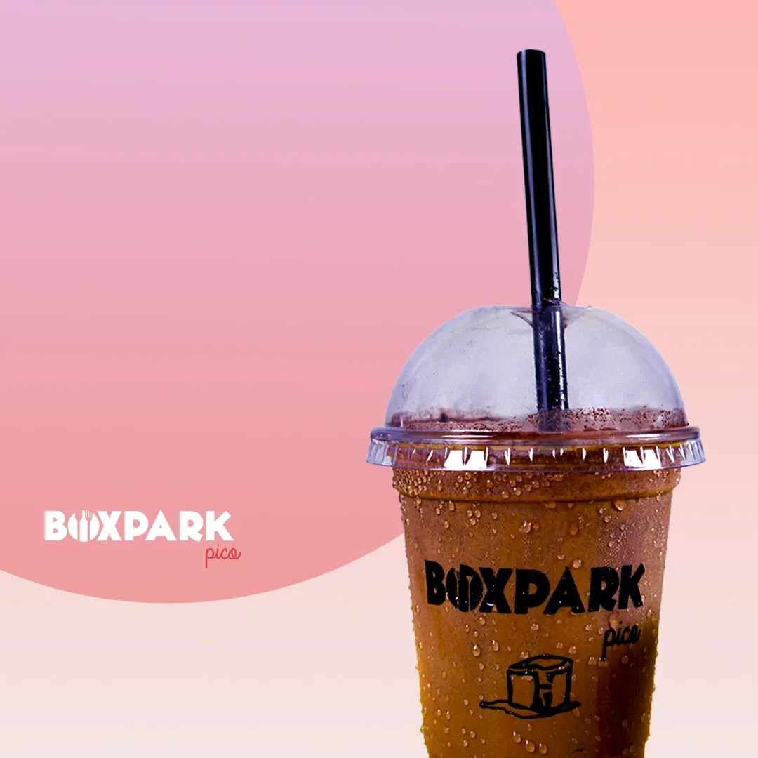
An iced coffee cup on a pink gradient
The drinks range gets a softer palette so it reads as its own line without leaving the brand.
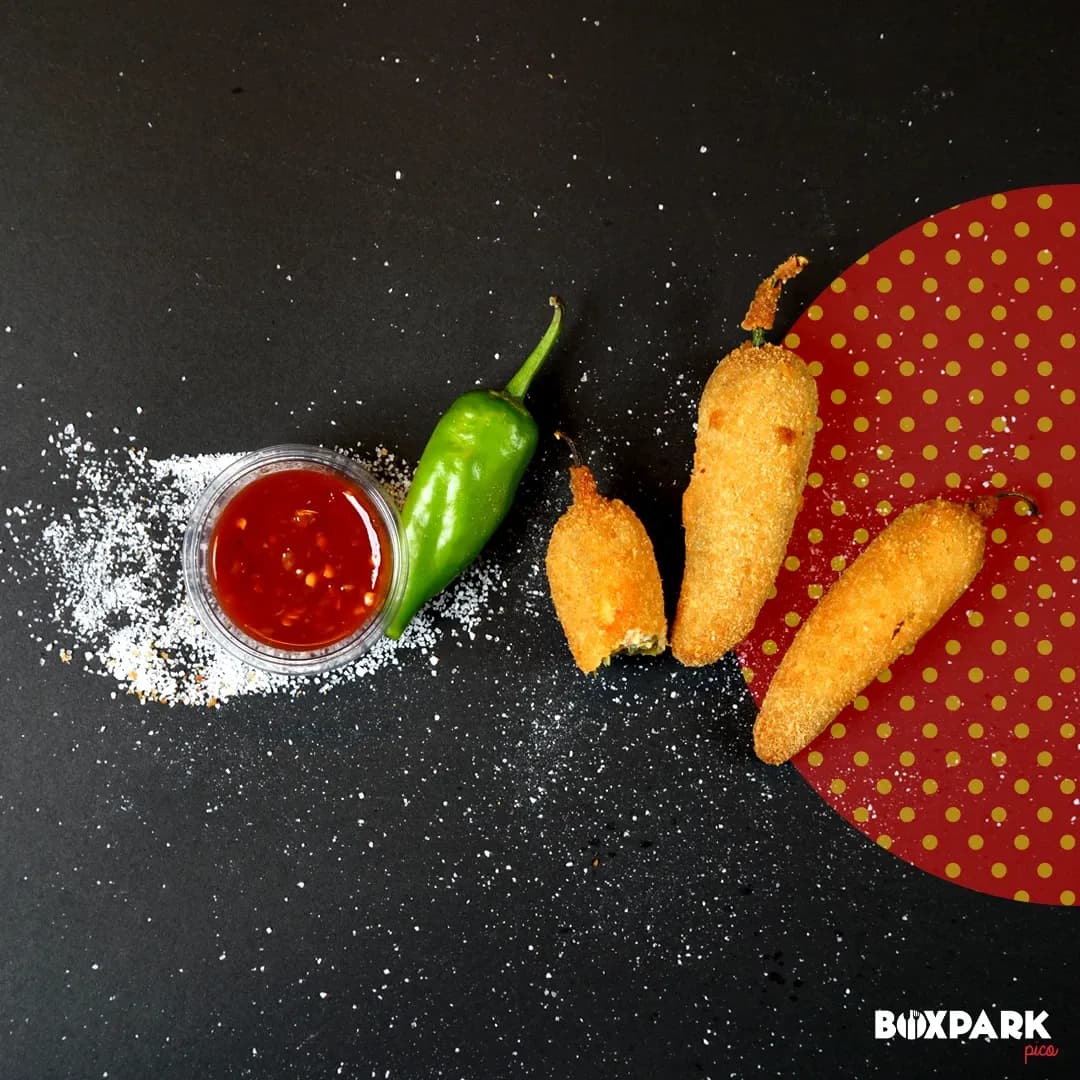
Corn dogs, chilli and ketchup on a dark set with scattered flour
The one dark frame in the set. Contrast is rationed so it still means something.
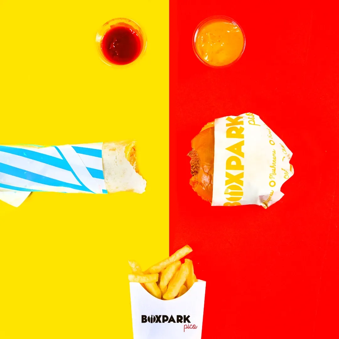
A wrap and sauces on split yellow and red
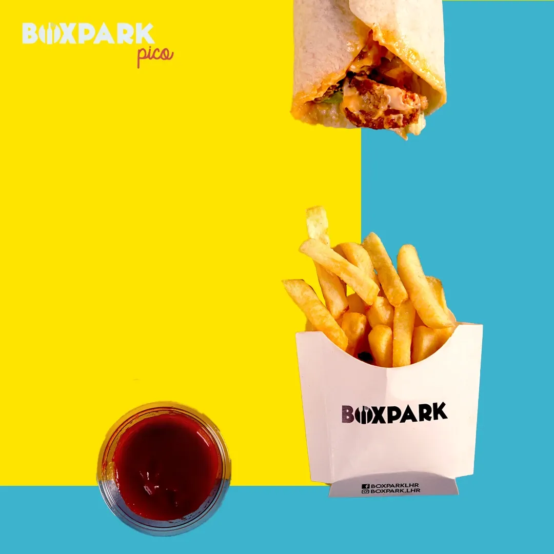
Colour blocking used as composition. The divide does the work a plate would normally do.
A wrap and branded fries box on yellow and cyan
Packaging in shot on purpose: the box is the thing a customer actually holds.
Cheetos Sliders presented on a runway with a toy plane
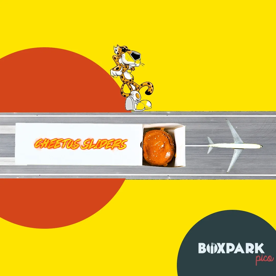
Sliders on a runway. The set is a joke the audience gets in under a second, which is all a feed gives you.
A chicken burger and fries on yellow and cyan
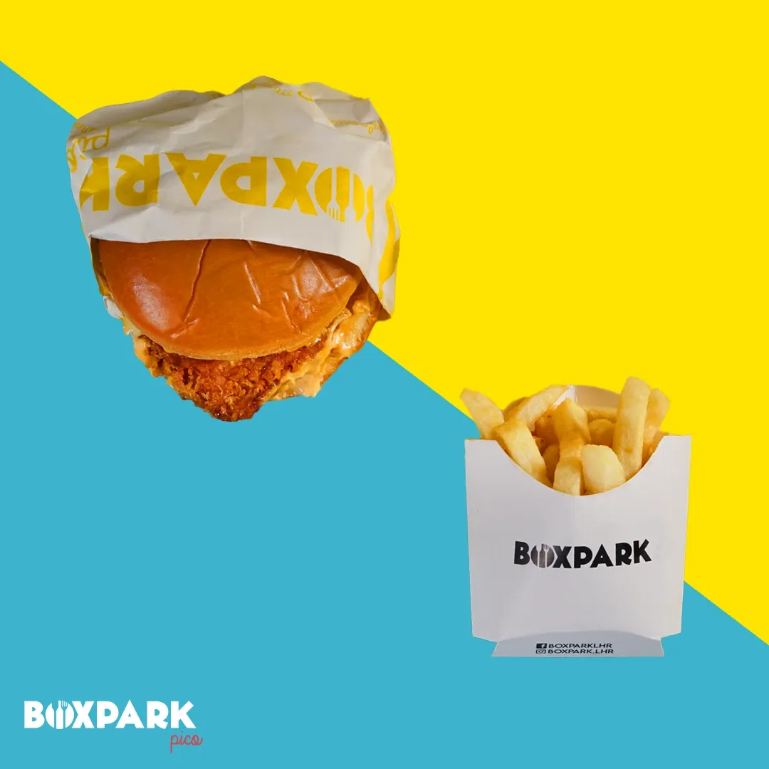
The hero frame. Same grammar as the rest, so the set holds together as a system rather than a shoot.
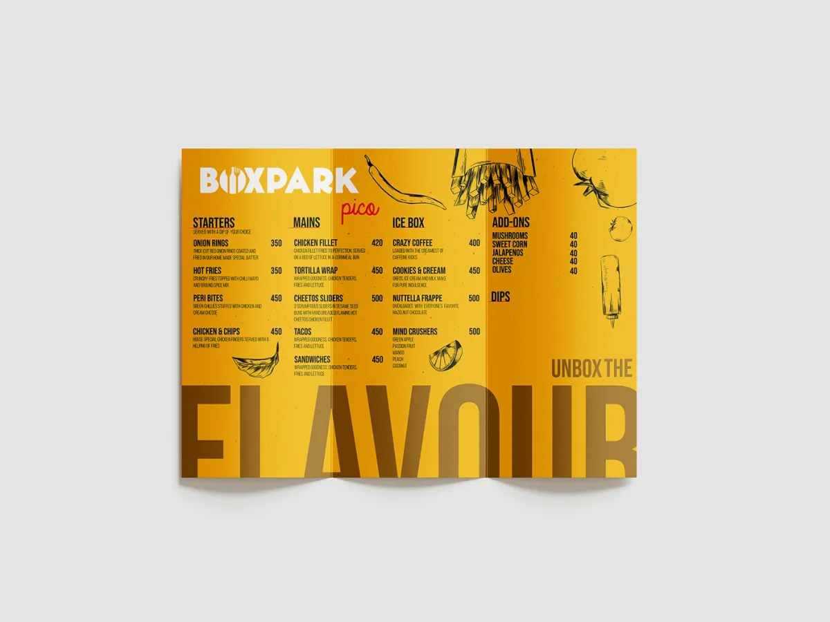
The trifold menu open, showing starters, mains, ice box and add-ons
Four columns: starters, mains, ice box, add-ons. Ordering is a scanning problem before it is a design one.
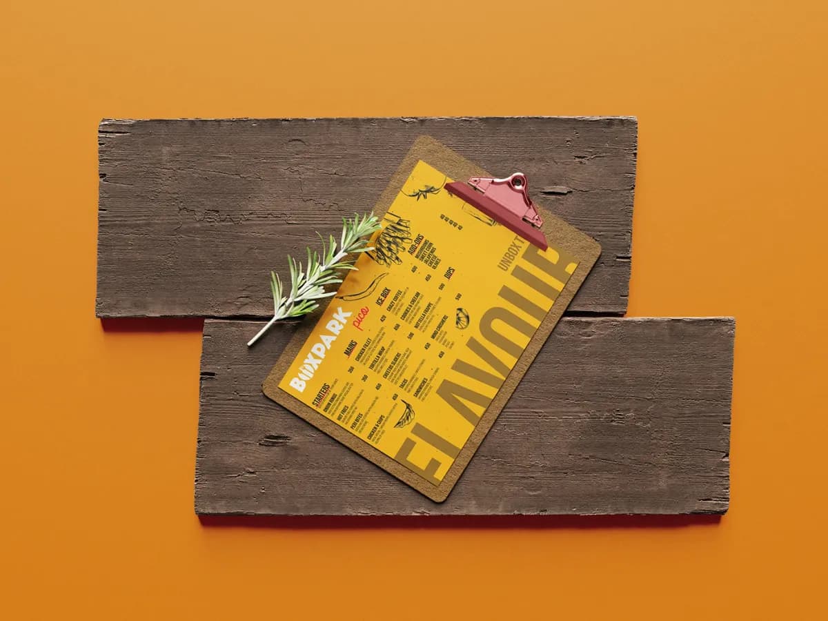
The menu card on a wooden board with a clip and rosemary
The card format, for tables and takeaway. Same content, different reading distance.
The menu artwork flat, with UNBOX THE FLAVOUR bleeding off the base
UNBOX THE FLAVOUR set large enough to bleed off the edge, with hand-drawn ingredients doing the work photography would make expensive to reprint.
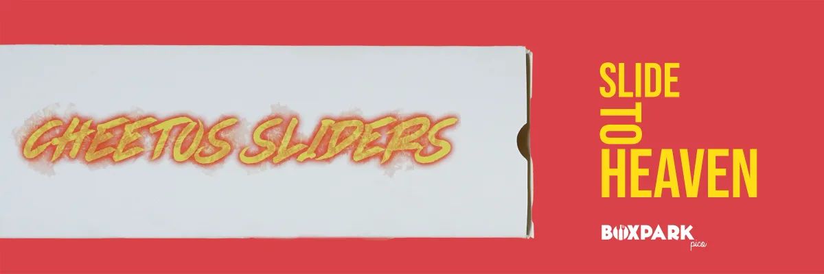
Cheetos Sliders slide-to-heaven banner
A launch banner for the Cheetos tie-in.
UNBOX THE FLAVOUR banner with the box device
The line, carried from the menu into the feed unchanged. One brand, not two.
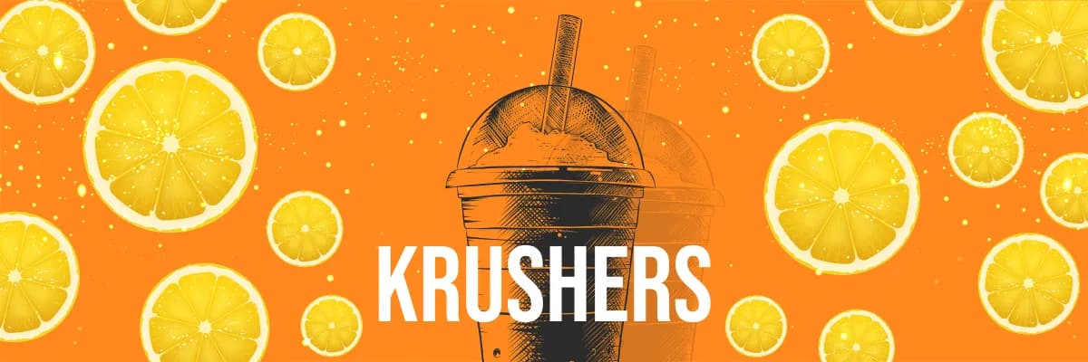
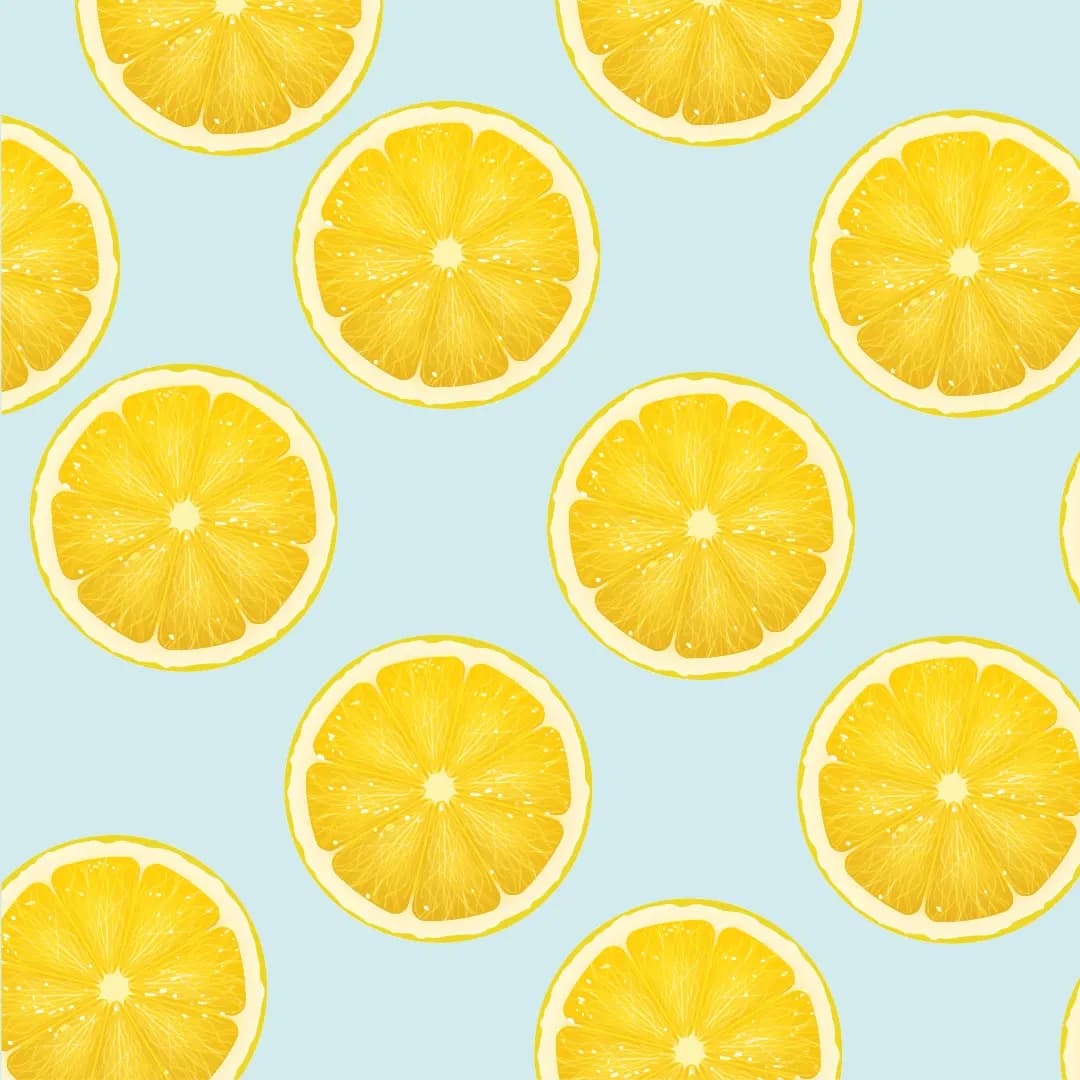
Krushers banner over a lemon-slice pattern
The drinks line gets its own pattern so it is recognisable before the name is read.
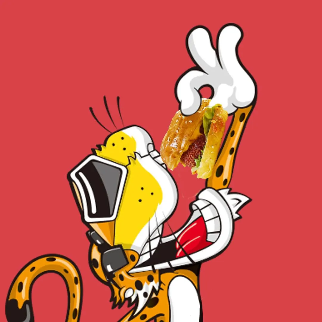
Chester the Cheetah illustration holding BoxPark food
The licensed character, drawn holding the actual products rather than pasted beside them.
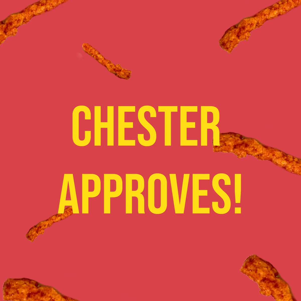
Chester approves, set over scattered Cheetos
Endorsement as a punchline rather than a badge.
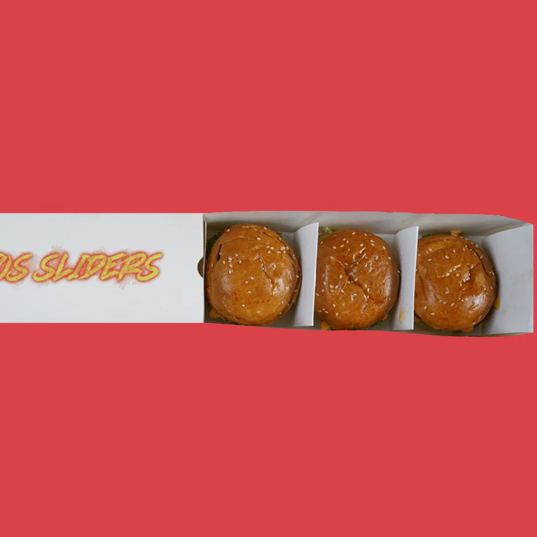
Animated post: a slider box opening to reveal three sliders
The one animated post in the set. Motion is spent on the reveal, which is the whole product idea.
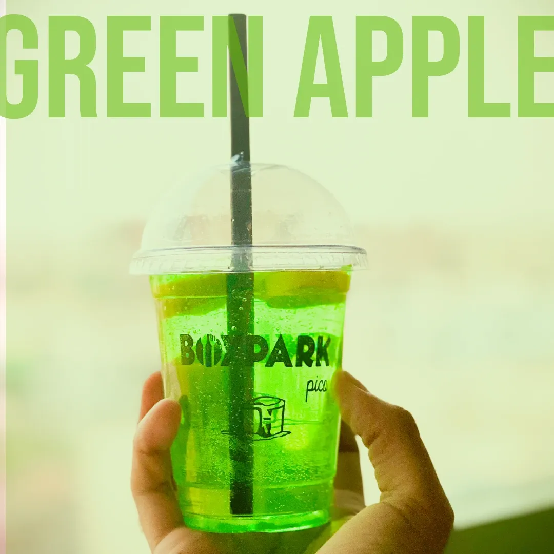
Green Apple Mind Crusher held up against daylight
Flavour launches shot in the hand, outdoors. The drinks look like something you are already holding.
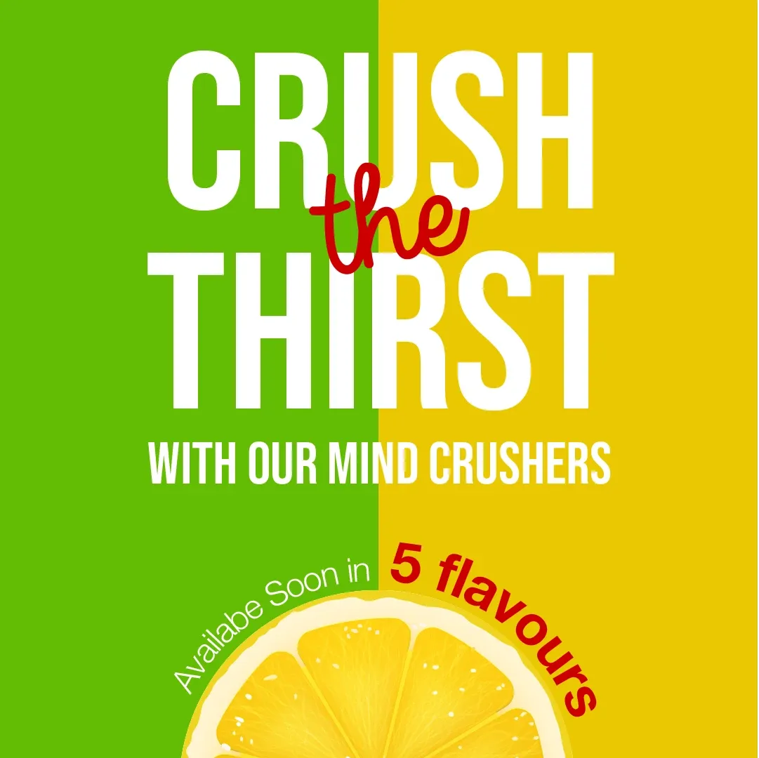
Crush the Thirst launch post, five flavours coming soon
The launch announcement, with the flavour count doing the work of a promise.
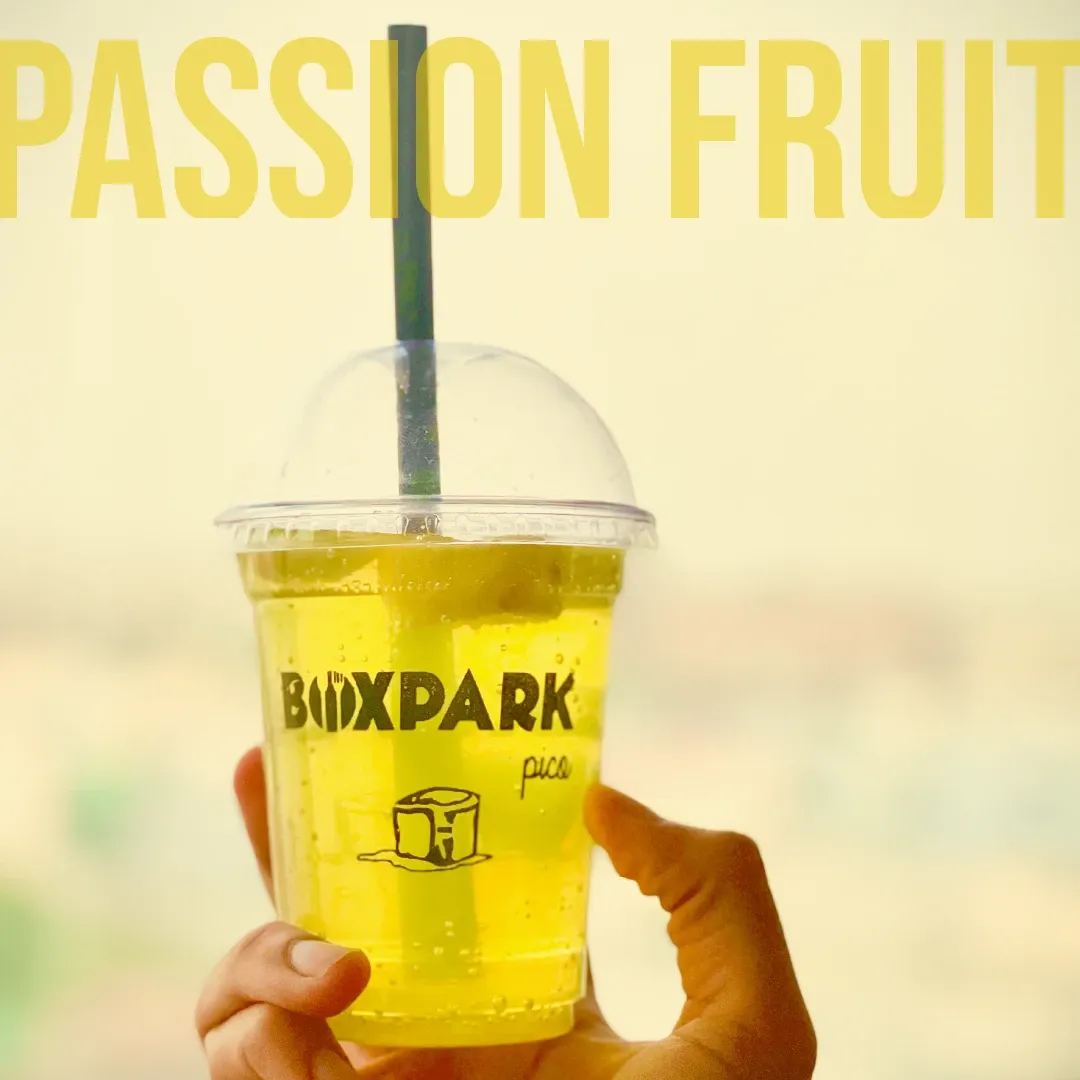
Passion Fruit Mind Crusher held up against daylight
Same frame, different flavour. A template that survives being reused eleven more times.
The wordmark over a lemon-slice pattern on pale blue
A quiet frame. Not every post has to sell something, and a feed with no rest is exhausting.
Lemon-slice pattern tile
The pattern on its own, for stories and backgrounds.
Introducing announcement post with festive props
The announcement template, built to be refilled for every new item.
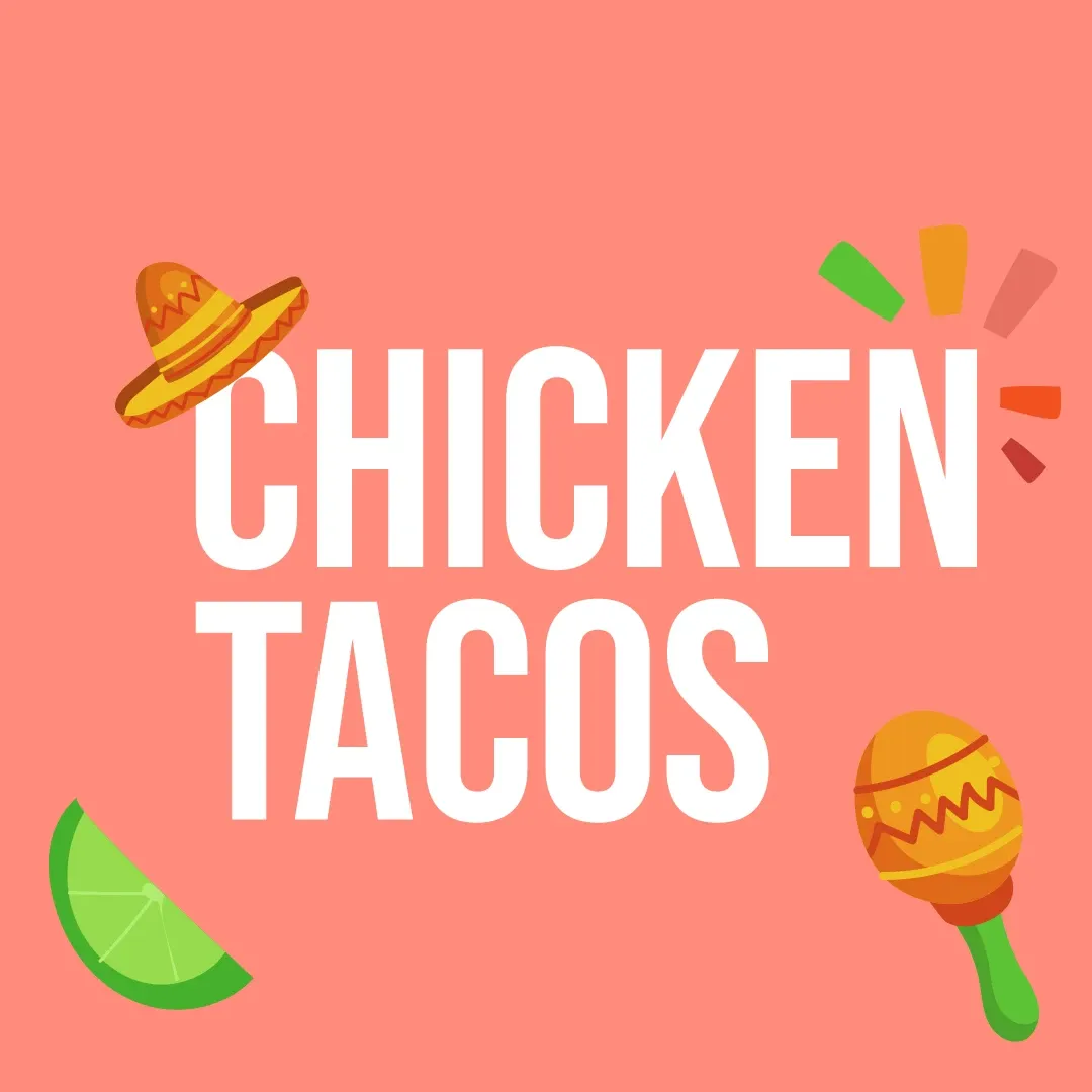
Chicken Tacos announcement post
The same template, doing its second job.

One team, from identity to intelligence.

Brand, software, AI, and growth from a single team, not separate vendors. That is why the positioning, the copy, the site and the data model on this project agree with each other.

Book a discovery call