
Case study
Eco Origin Bamboo Cotton Buds
Eco Origin sells bamboo cotton buds into one of the most crowded categories on Amazon. We built the whole launch: the box, the shoot, every listing image, the A+ content and the video, so a commodity product reads as the sustainable choice at thumbnail size.
- Client
- Eco Origin
- Channel
- Amazon
- Year
- 2024
- Deliverables
- Packaging, shoot, 9 listing images, A+ content, video
- Launch
- Sold out within its first week
- Packaging design
- Product photography
- Listing images
- A+ content
- Product video
- Listing copy
Eco Origin came to us with a product and a supplier, and nothing a shopper would ever see: no box, no photographs, no listing. Bamboo cotton buds are a crowded, price-led category on Amazon, so the brief was to make a commodity look like the considered choice and to do it inside Amazon's rules.
What an Amazon listing actually has to do
An Amazon product page is a fixed frame. The brand does not choose the layout; it chooses what goes into seven or eight image slots, one main image on pure white, the bullet points, the A+ content (Amazon's name for Enhanced Brand Content) that runs further down the page, and a short video. Every one of those slots has rules: the main image must be the product alone on white, text overlays are banned from it, images must be at least 1000px on the long side for zoom to work, and A+ modules come in fixed sizes.
Inside those rules the job is to answer, in the order a shopper scrolls, the four questions that decide a purchase: what is it, is it the right size, what is it made of, and what will I use it for. A listing that answers them with pictures converts; one that makes the shopper read the bullets to find out usually does not.
The box
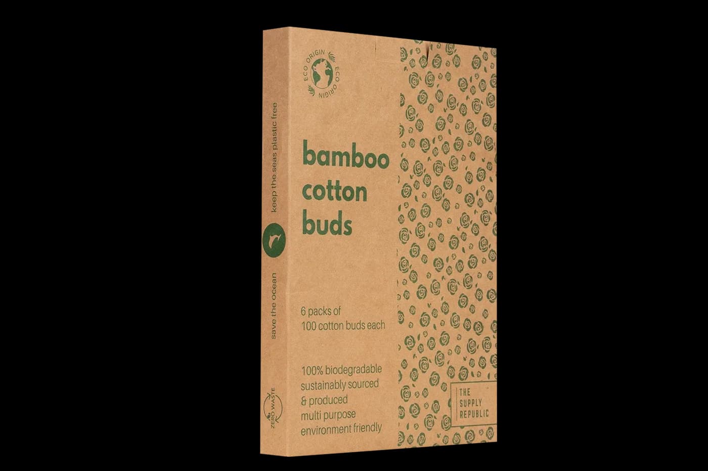
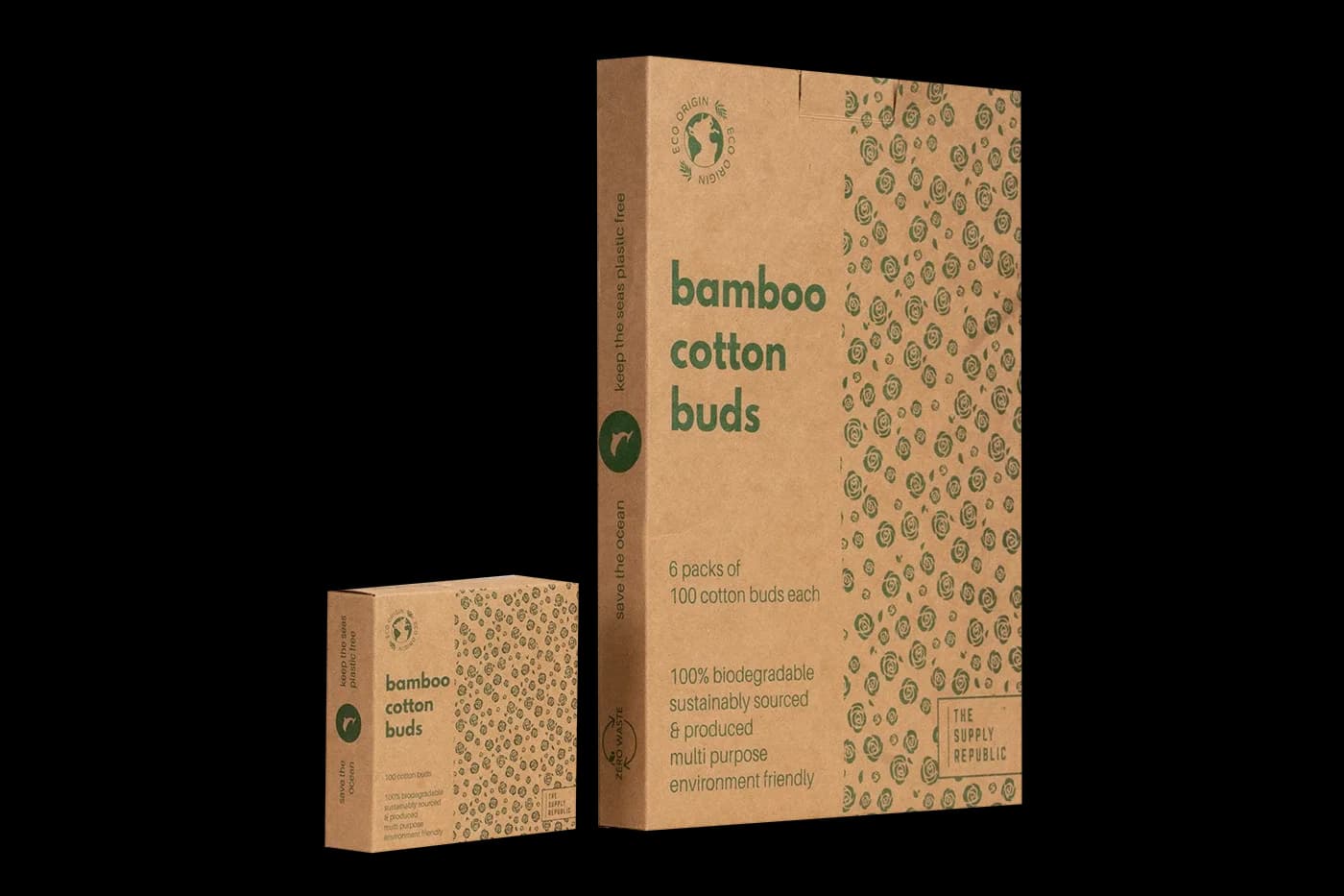
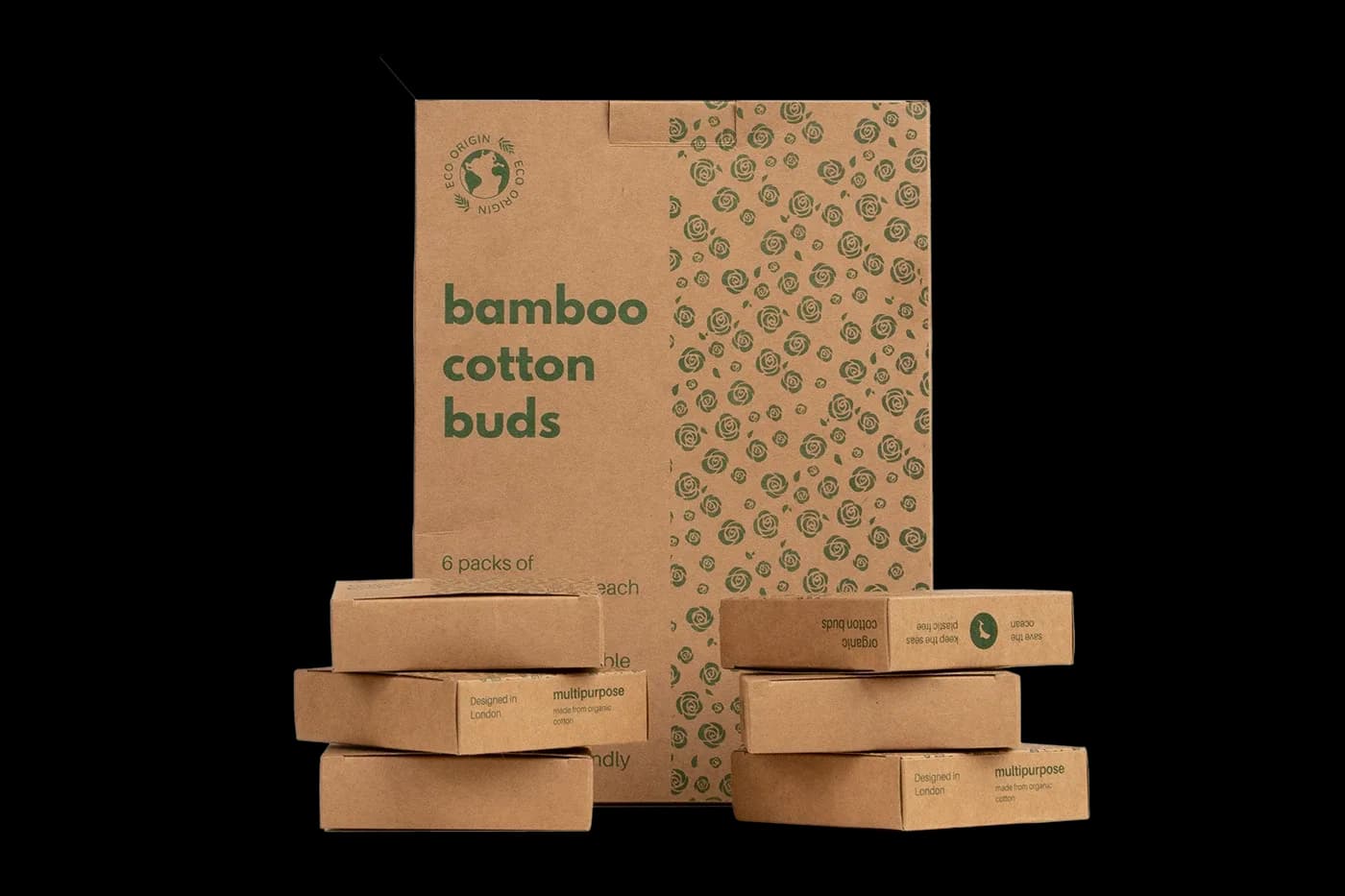
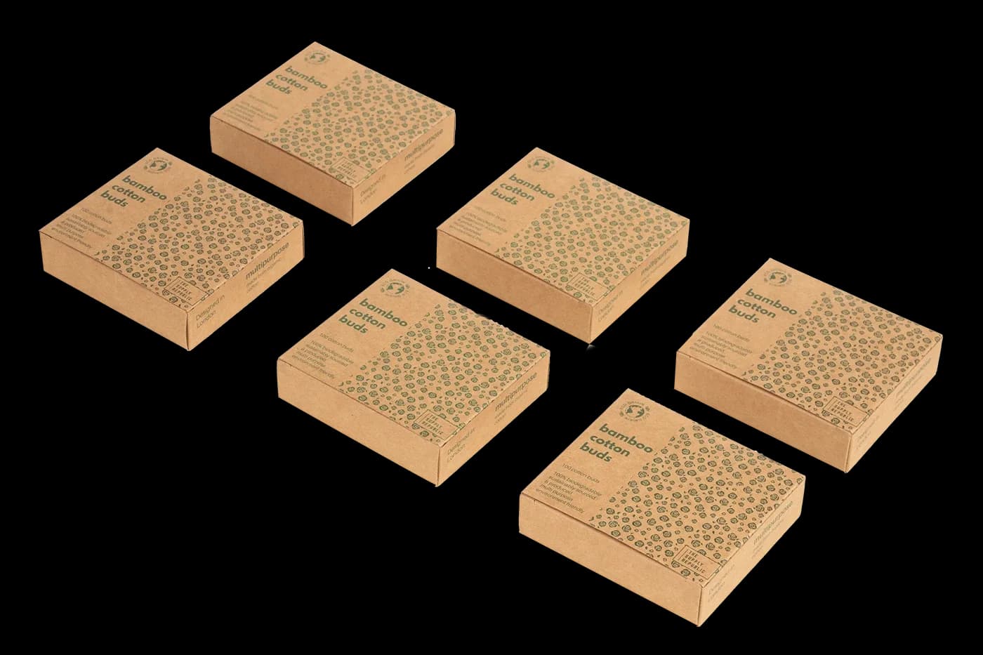
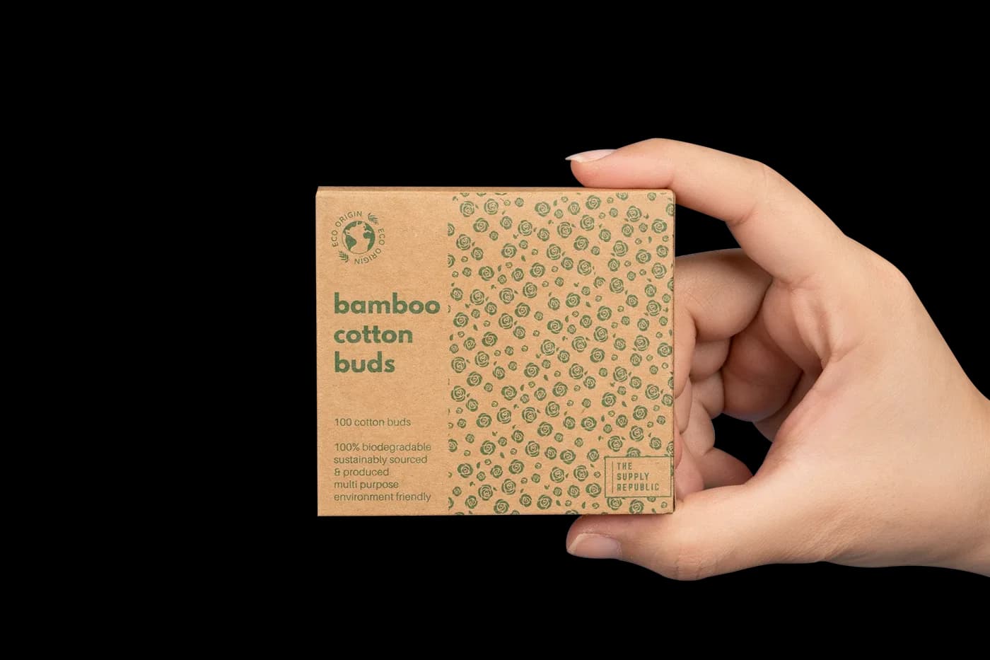
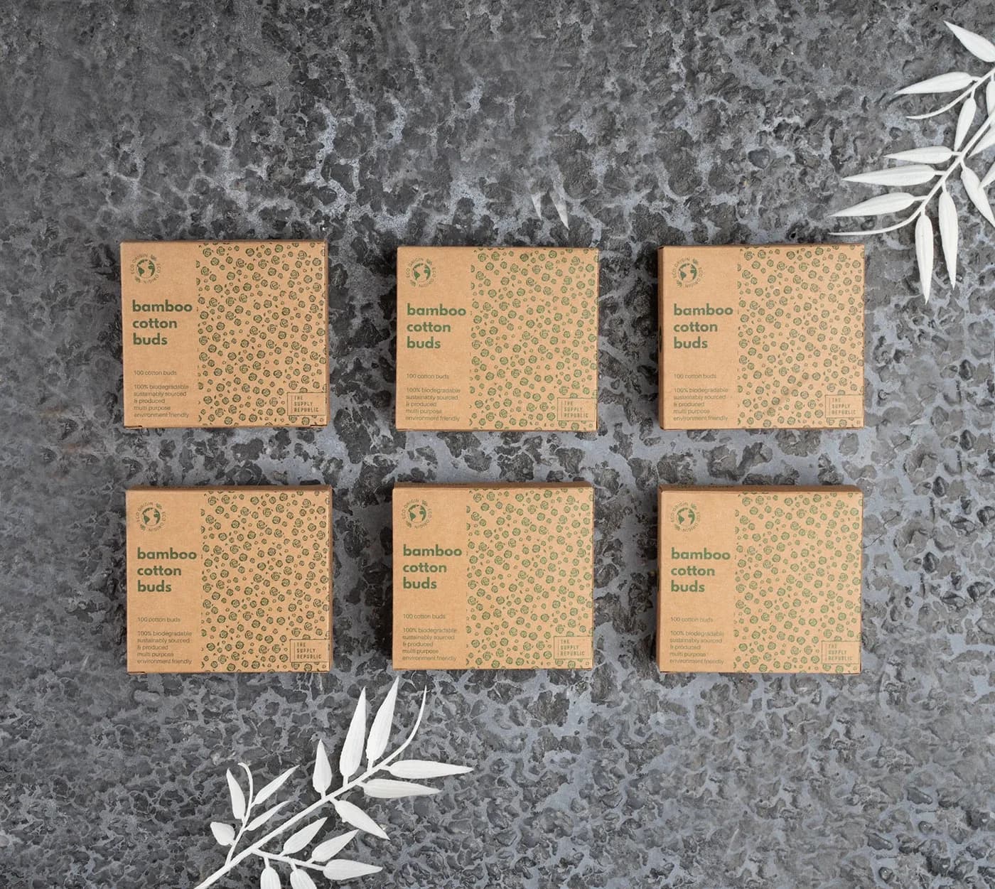
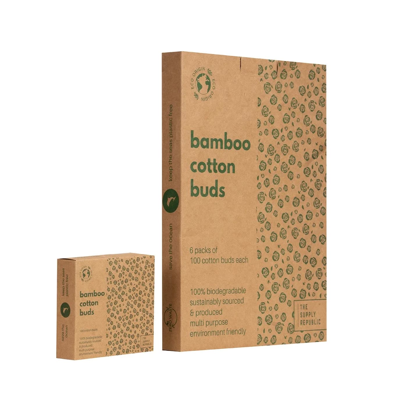
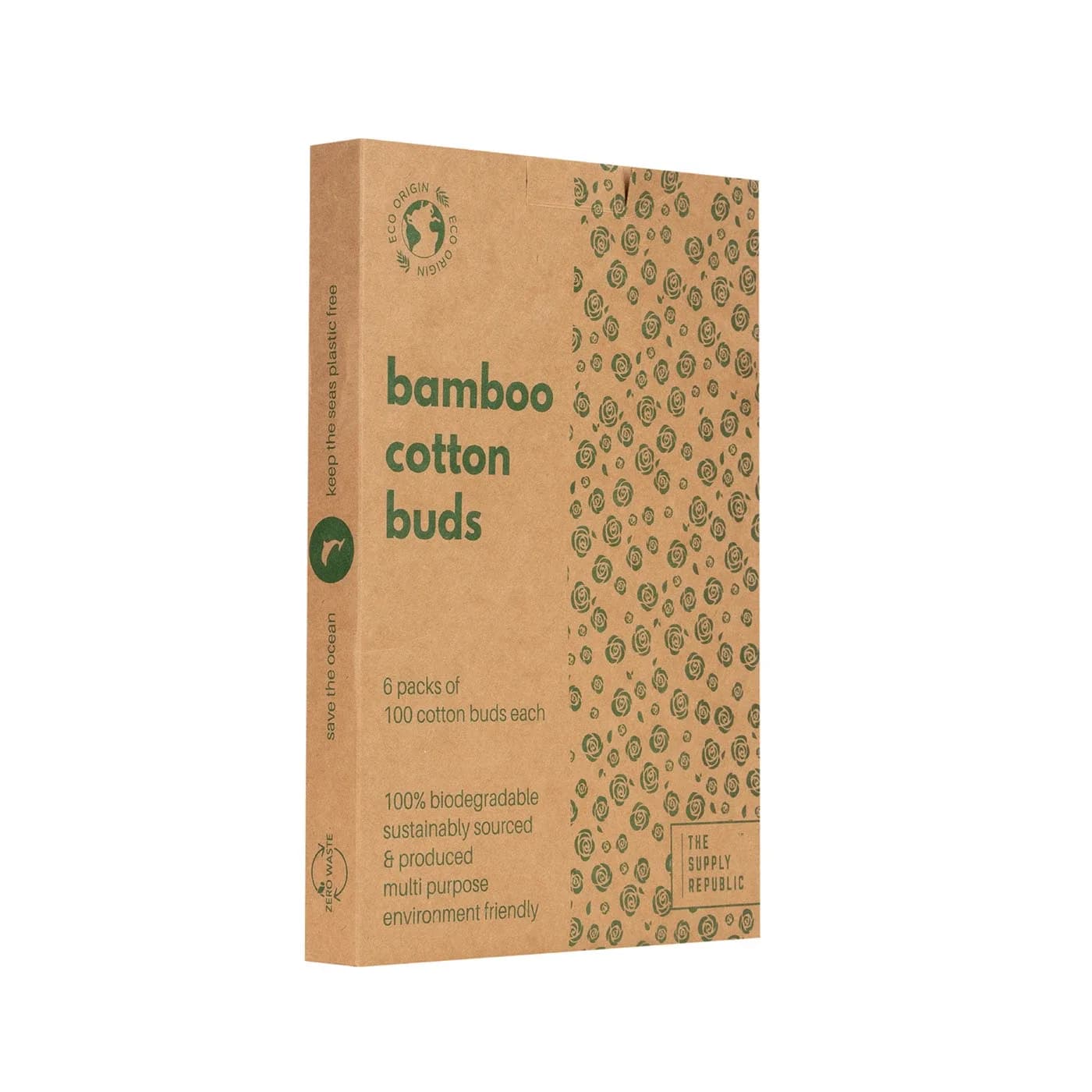
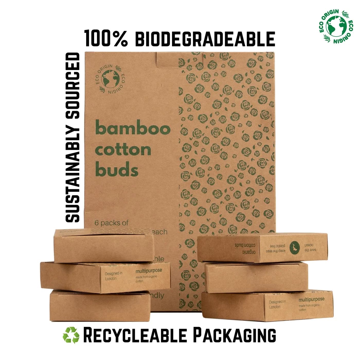
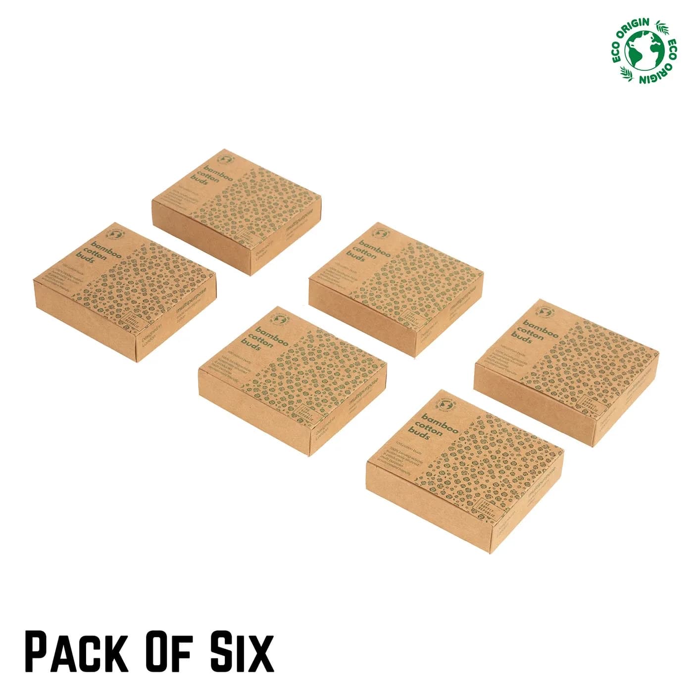
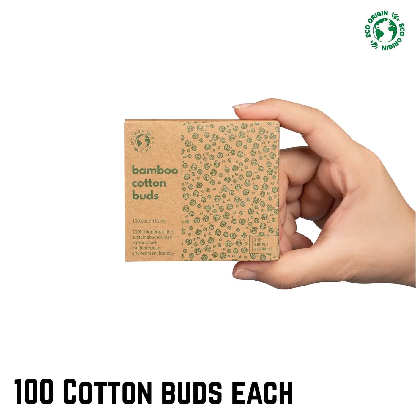
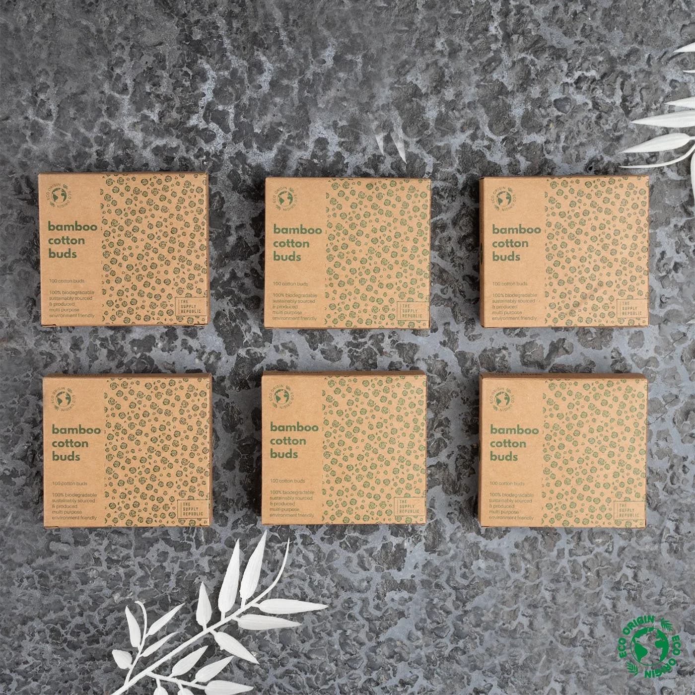
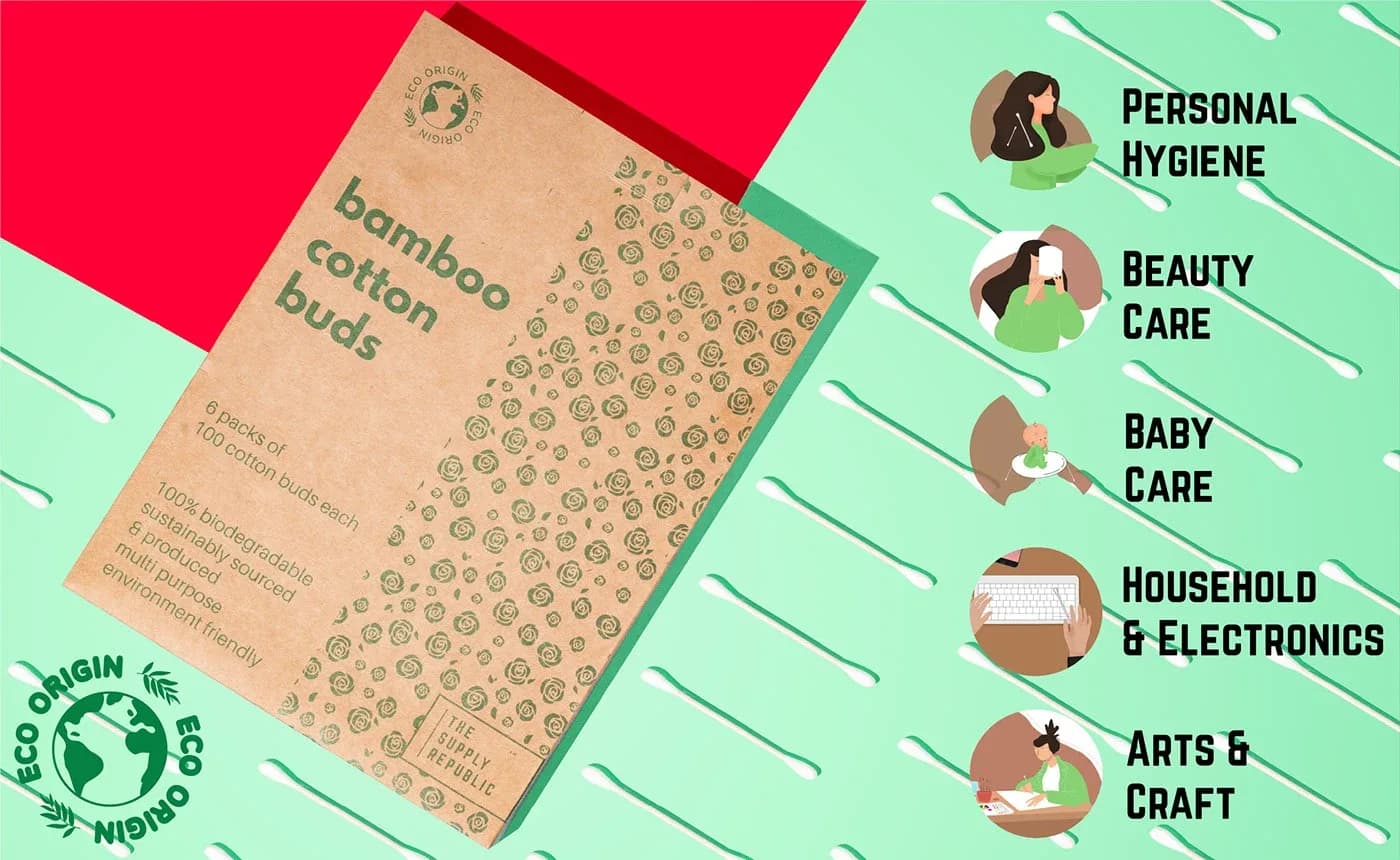
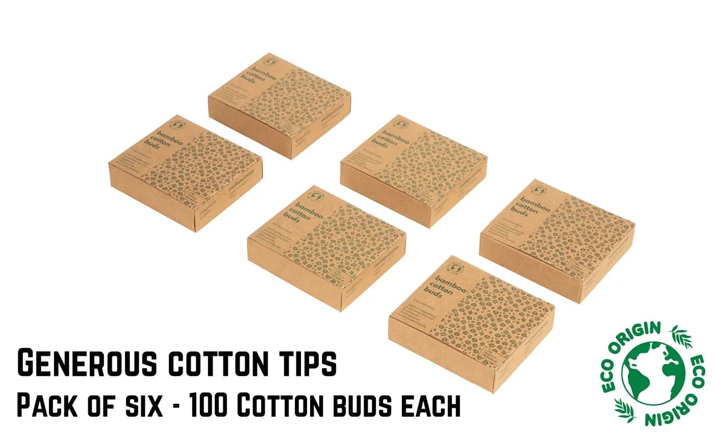
The packaging is kraft board printed in one green, with a rose pattern that reads as a texture at thumbnail size and as a print up close. Recyclable, cheap to run, and it photographs warm under studio light. The six-pack is the same design scaled, so the bulk buy and the single box sit together as one family on the shelf and in the image stack.
The shoot, the stack and the A+ content
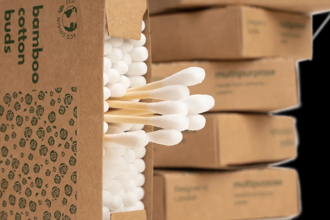
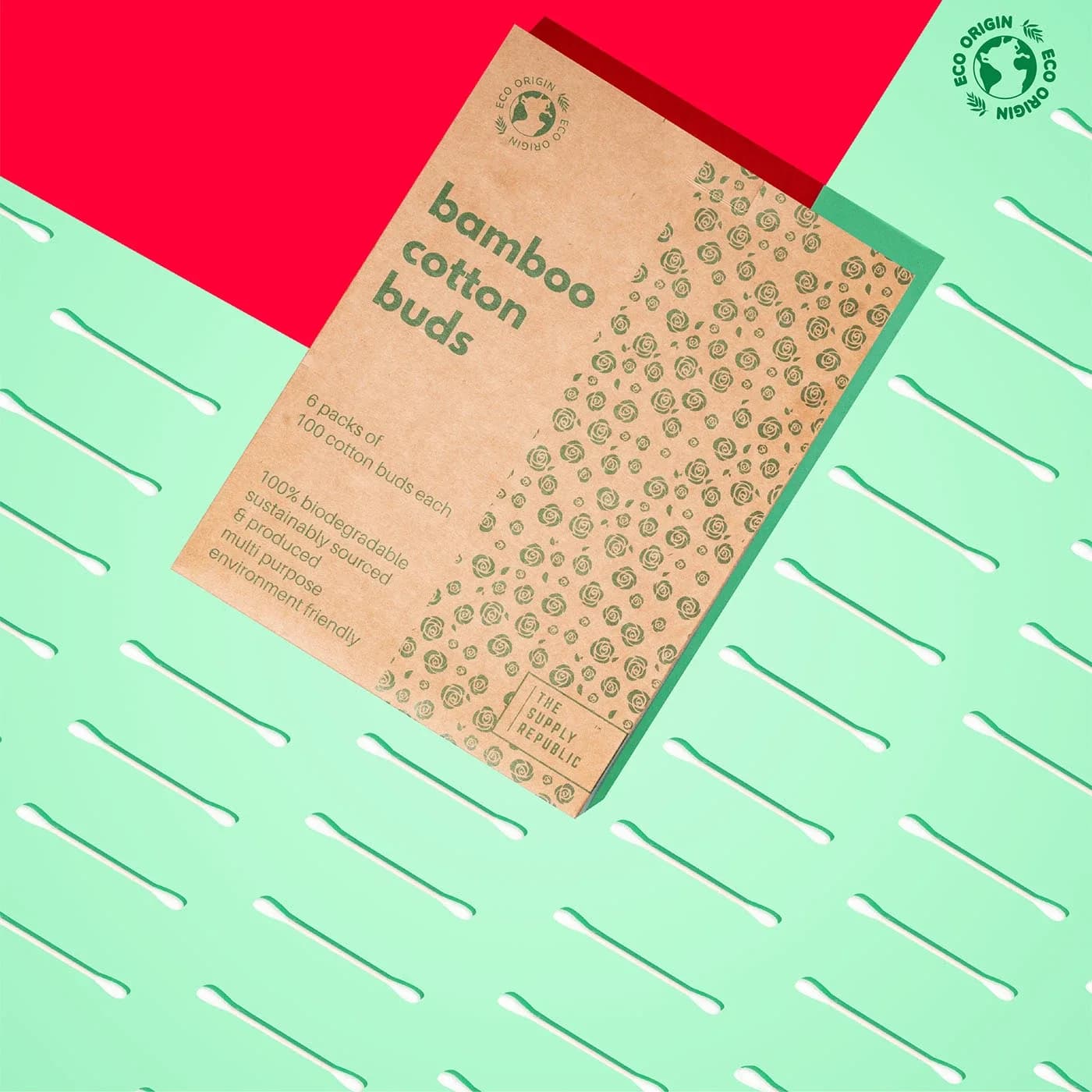
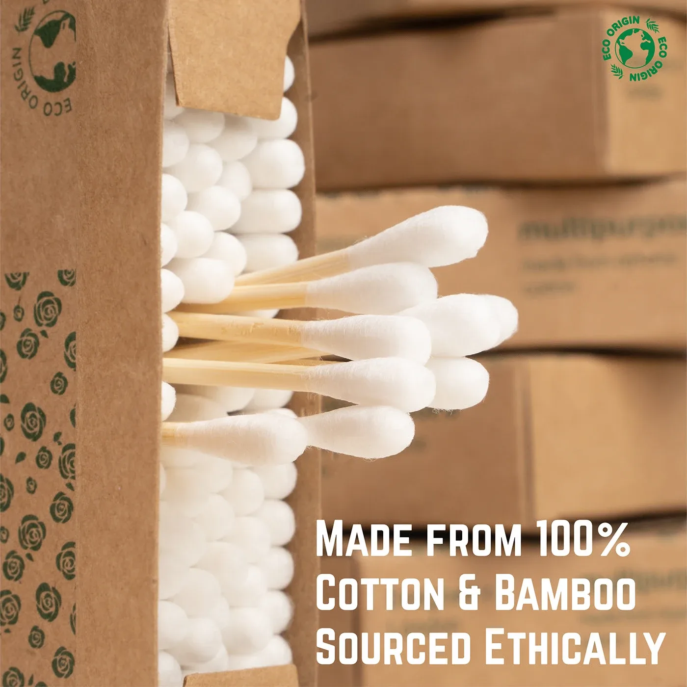
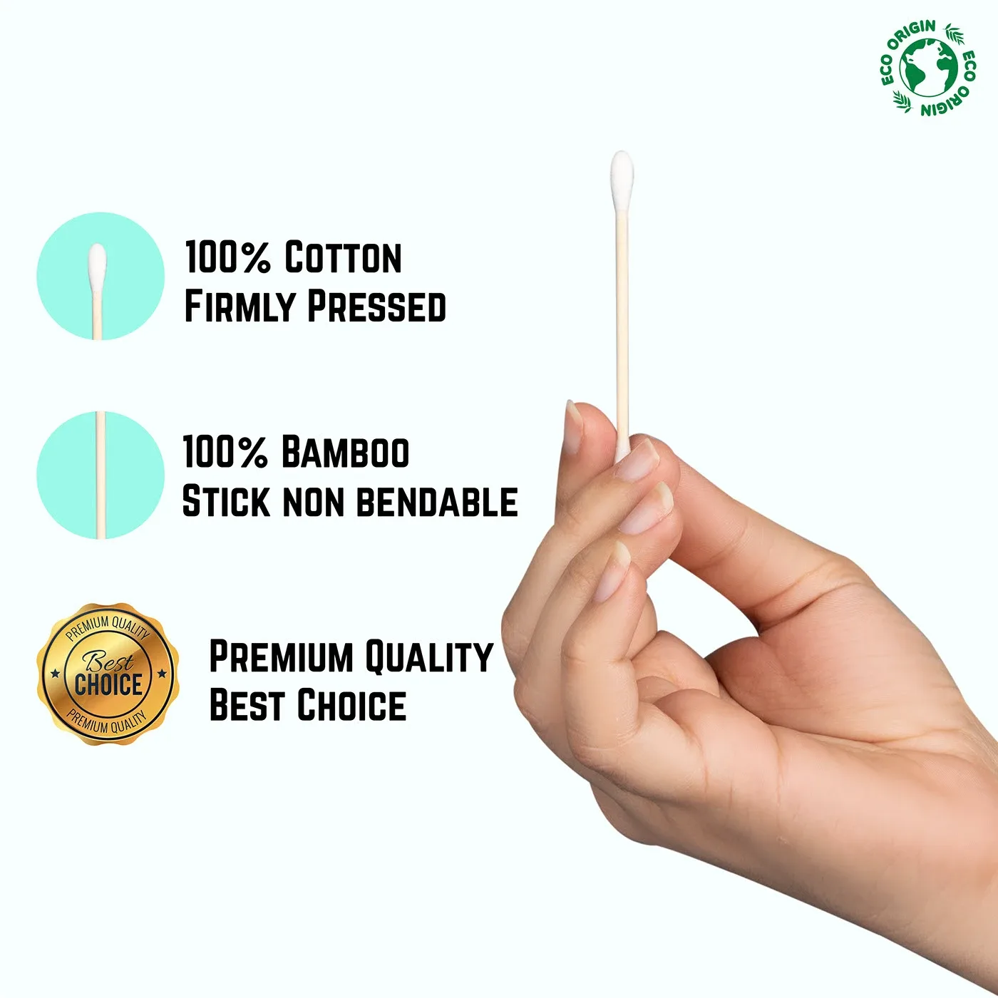
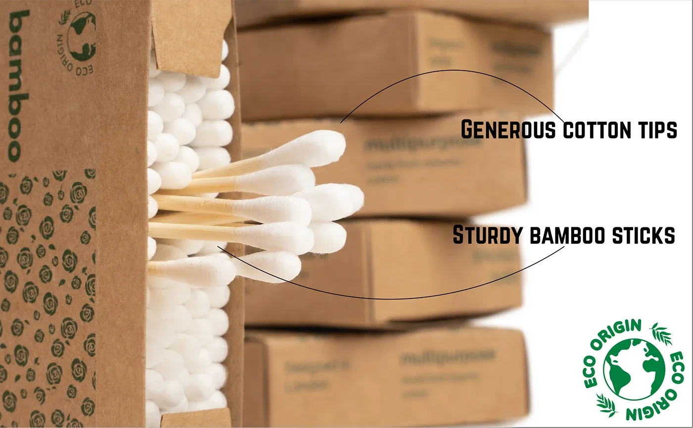
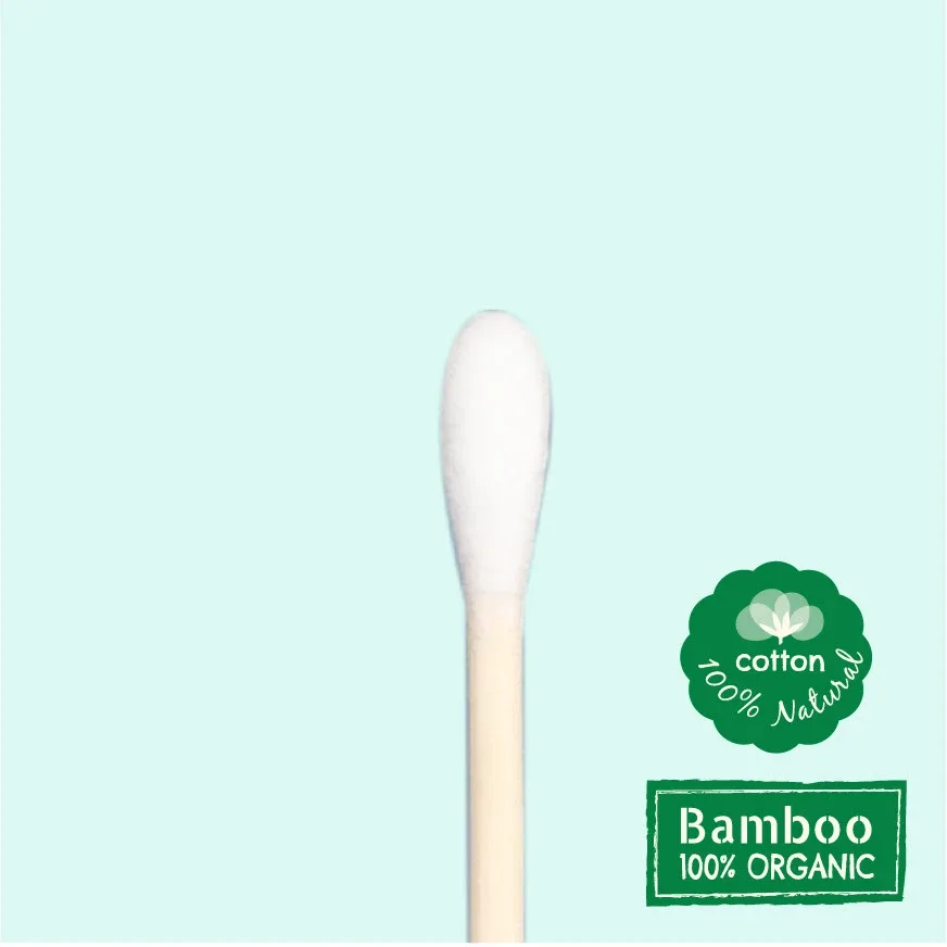
One shoot fed everything. The hero frames went into the listing, the lifestyle frames into the A+ content, and the macro and usage frames into the infographics. Every claim on the page (100% cotton, 100% bamboo, biodegradable, 6 x 100) appears once, in the slot where the question comes up, rather than everywhere at once.
Launch
The listing went live with a PPC campaign behind it. The product became a top-rated item and sold out within its first week. The work that made the advertising pay is the listing itself: ads buy the click, the page earns the sale.
Film & Photo
Eco Origin, product photography and video
A studio shoot built for two jobs: hero images for the listing and raw material for every A+ banner.
The kraft box is the product's argument, so the shoot keeps it the hero: dark ground to make the natural board and the green rose pattern glow, then scale shots against the single boxes so the six-pack reads as the value buy. The macro of a bud bending without snapping answers the one doubt people have about bamboo before they ask it.
The video is a short unboxing, shot for the listing's video slot where it plays silently on autoplay. It has to work without sound and make sense in the first three seconds.


Visual Communication
Eco Origin, listing images and A+ content
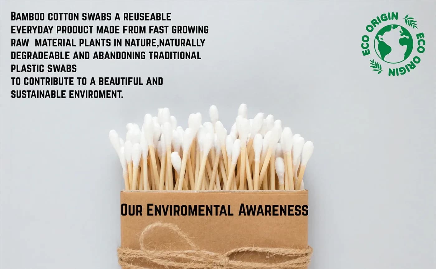
Nine listing images that answer what it is, how many, what it's made of and what it's for, then A+ banners that carry the sustainability story.
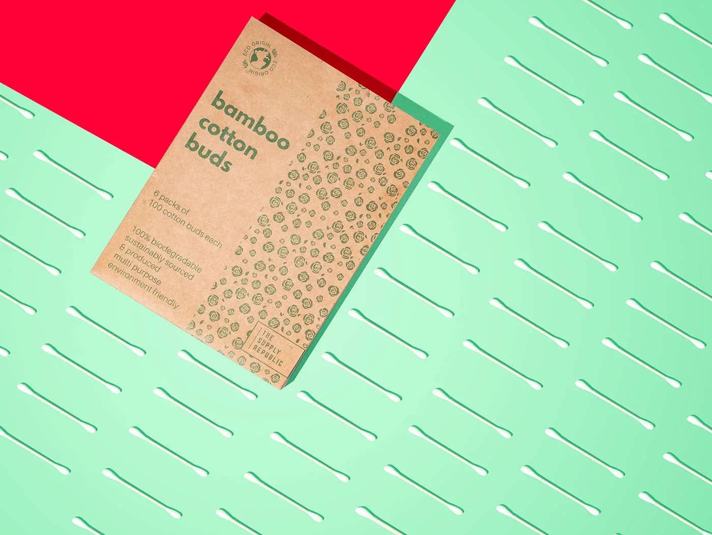
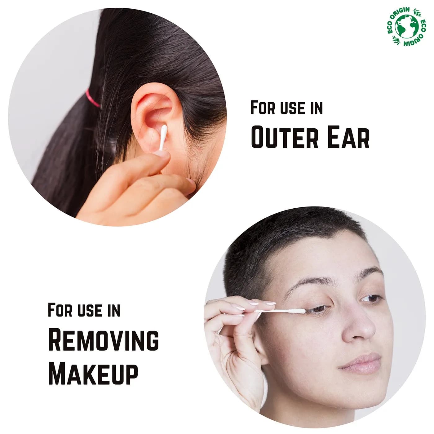
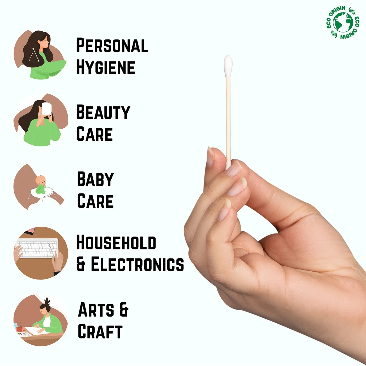
The image stack follows the order a shopper's questions arrive in. The main image is the product alone on white, as Amazon requires. Then quantity (six packs of 100), then material (100% cotton, 100% bamboo, biodegradable, recyclable packaging), then uses, ending on a range most competitors never show: makeup, medicine, pets, cleaning a keyboard or a ring.
The A+ content and footer reuse the shoot rather than stock, so the box in the banner is the box that arrives. The mint ground and green leaf motif run through every module so the page reads as one brand rather than a stack of uploads.








One team, from identity to intelligence.
Brand, software, AI, and growth from a single team, not separate vendors. That is why the positioning, the copy, the site and the data model on this project agree with each other.
Book a discovery call