
Case study
PrintVision
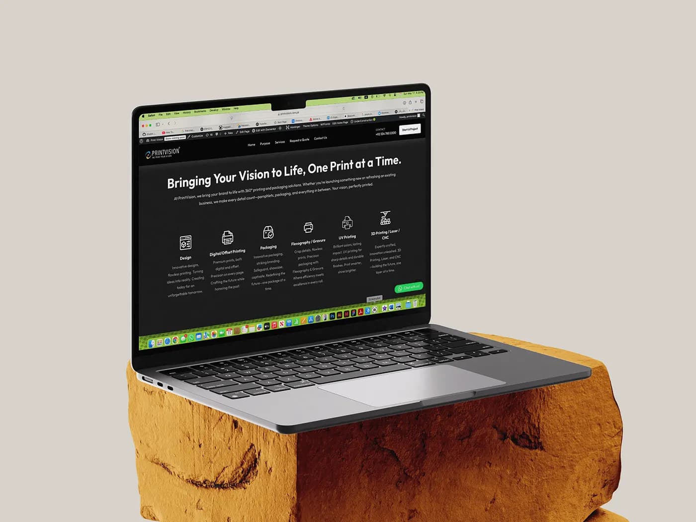
Thirty-seven years of offset printing, a client wall of pharmaceutical manufacturers, and a WordPress site whose shop page returned a 404 while forty-eight demo products sat in its sitemap. The job was to make the brand match the plant.
- Client
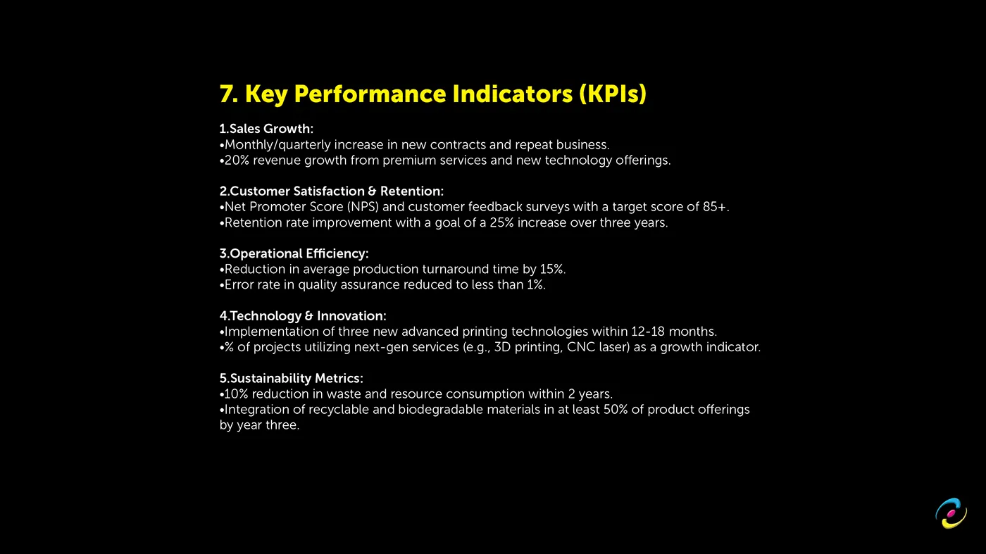
- PrintVision, Lahore
- Founded
- 1989
- Sector
- Printing and packaging
- Year
- 2026
- Scope
- Brand, collateral, website
- Brand strategy
- Visual identity
- Print collateral
- Web design
- Web engineering
- SEO
PrintVision runs six Solna 125 offset presses, a Heidelberg two colour, four die cutters, two precision leaflet folders, two guillotines and one automatic pasting machine out of a single building at 6/A Industrial Block, Allama Iqbal Town, Lahore. Forty-five specialists. Everything from design to dispatch under one roof.
None of that was visible from the outside. That was the whole problem.
What we inherited
The company started in 1989 as Farooq Trading Corporation, one printing machine and a founder, Ihsan Ullah Naik. A second machine two years later, then the first die. Plate making came in house through the 1990s. It became PrintVision in 2011 along with the line it still uses, we print your vision. A Heidelberg two colour arrived in 2022, flexo and gravure in 2023, an HP digital press in 2024, and in 2026 the company finished building its own ERP, every job tracked from quote to dispatch.
Thirty seven years of that, and the public face was a WordPress site running WooCommerce, Elementor and Slider Revolution, with a home page weighing roughly 200KB of HTML before a single asset loaded. We crawled it before writing anything. It had five defects worth naming, because each one became a decision:
- /shop/ returned a 404 while about forty eight demo WooCommerce products sat in the sitemap. Bird tank top. Cat bowl. Pet leash.
- The blog was live and empty.
- The stat counters rendered as broken text in the static HTML. "$1M". "0M+". "1 Person team".
- Content was duplicated twice on the purpose page, and the quote page shipped two copies of the same form markup.
- A plugin stack doing work that the page did not need.
A printer whose own website says "0M+" is not making a small presentation error. It is contradicting the one thing it sells.
The strategic call
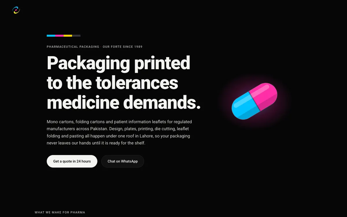
The client wall was the unplayed card. Searle, CCL, Remington, Schazoo, SIZA. Those are pharmaceutical manufacturers, and a pharmaceutical manufacturer does not choose a packaging supplier casually, because the packaging is part of a regulated product. The old site reduced that to a logo strip near the footer.
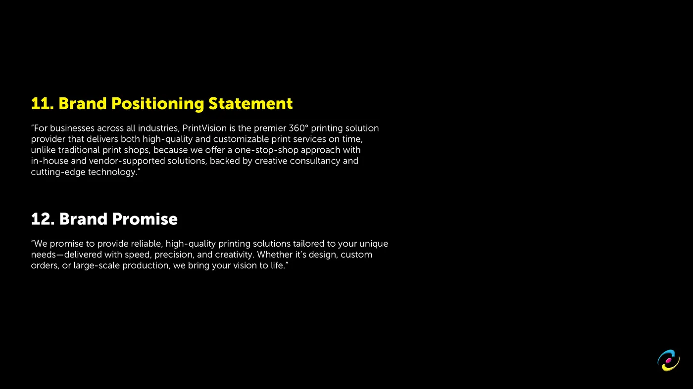
So the positioning became one line, and it is printed on the home page in exactly these words: pharma first, never pharma only. Pharmaceutical procurement leads, and the other seven industries follow it rather than compete with it. The pharmaceutical buyer gets a dedicated page, and that page is written the way a procurement audit reads: tolerances that hold, one roof and one chain of custody, regulated-industry experience.
The voice rule underneath everything was proof over adjectives. Minimum run 50,000 outranks "high volume capability". Equipment models outrank "state of the art". Published tolerances of plus or minus 5% on colour, 1mm on size and 10 gsm on stock outrank "precision engineering".
That rule cost the client something, and they took it anyway. An early draft proposed $10M+ invested and 100+ specialists, both marked to be confirmed. The verified numbers were $1M+ and 45. The site publishes the smaller true ones. No certifications appear anywhere either, for the same reason: none had been verified at the time of writing, and a pharma supplier claiming an unverified certification has a much larger problem than a thin page.
The brand foundation
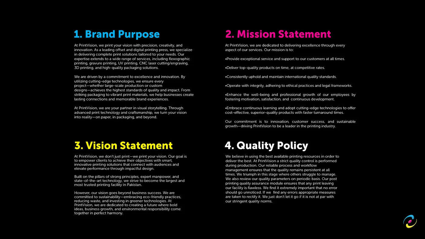
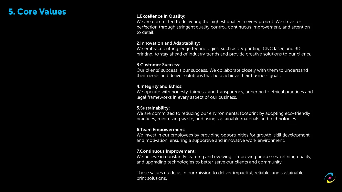
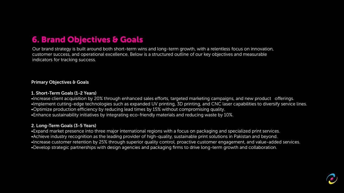
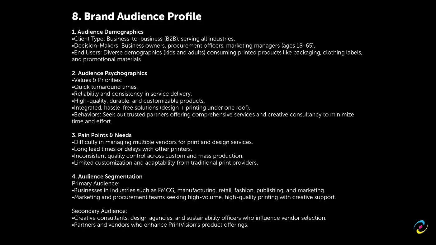
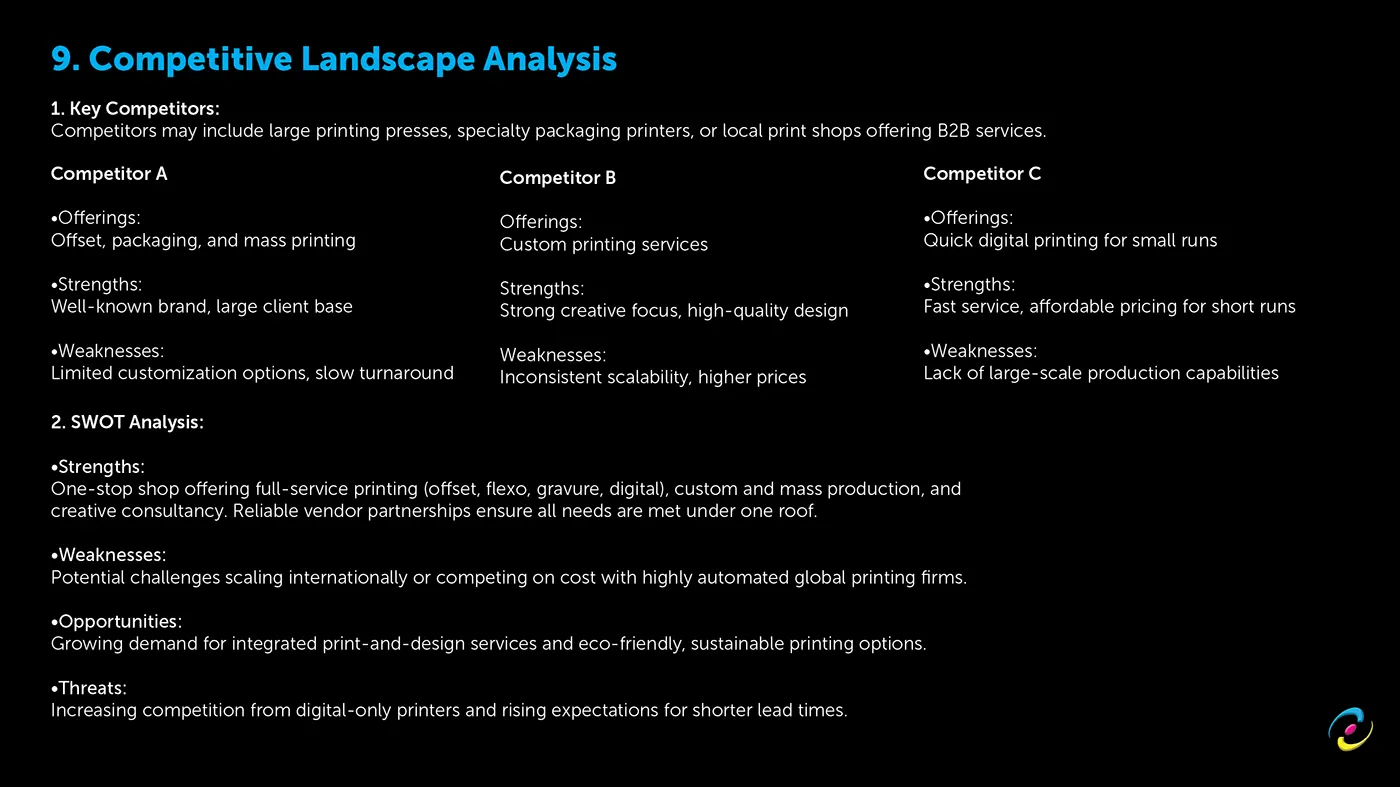
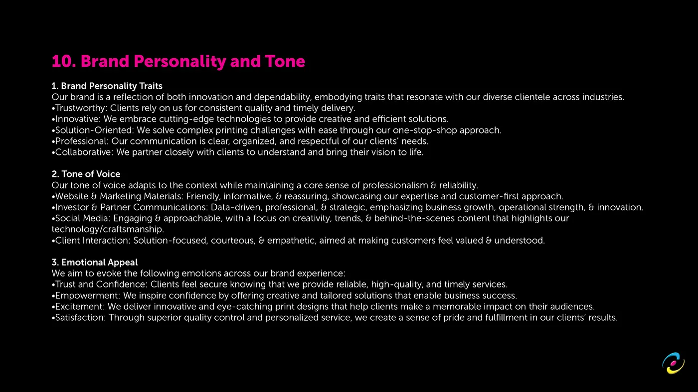
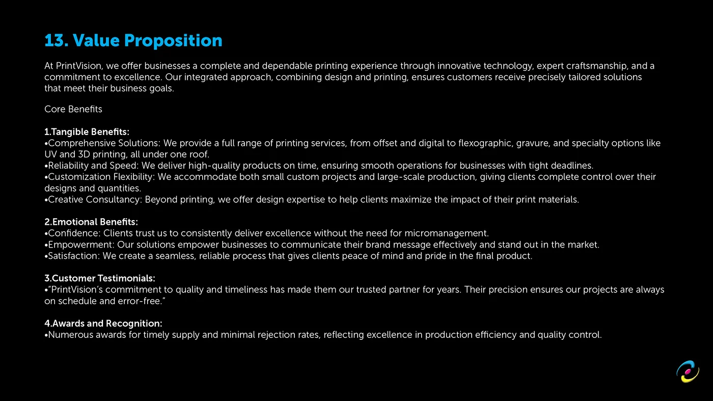
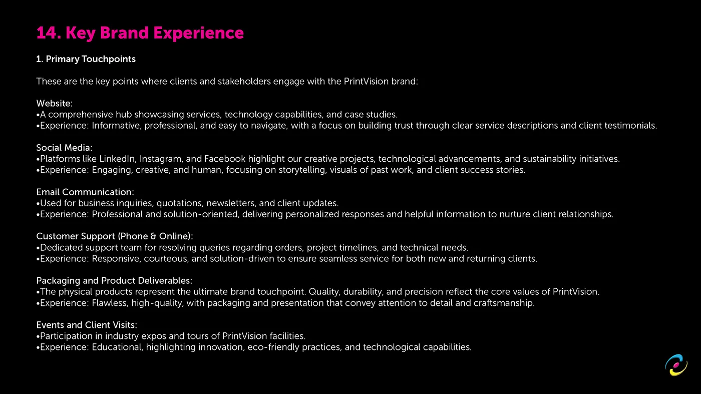
Written first, twenty five sections of it: purpose, mission, vision, quality policy, core values, objectives and KPIs, audience profile, competitive analysis, SWOT, personality and tone, positioning statement, brand promise, value proposition, key brand experience, communication strategy, legal and compliance, then the visual system.
The mark, and where it came from
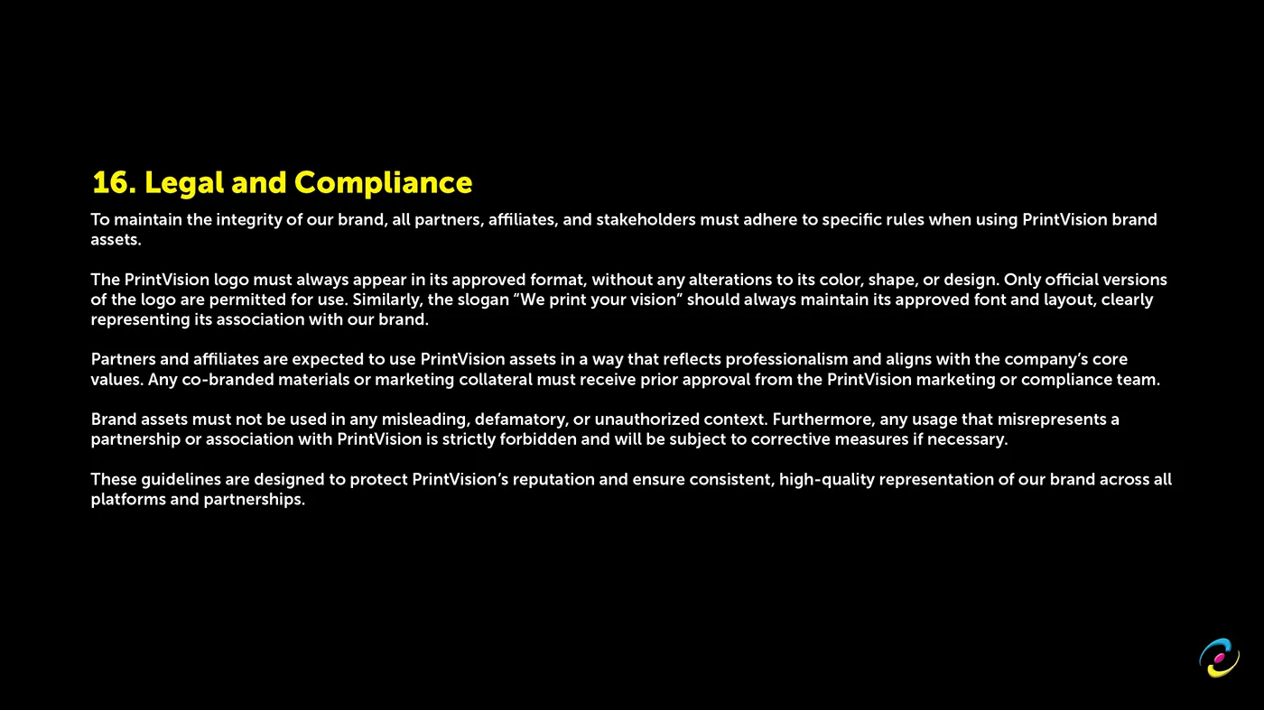
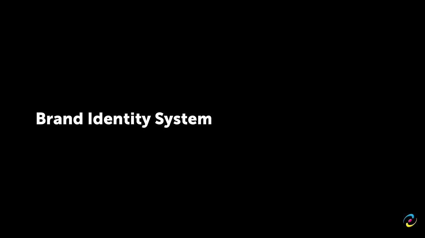
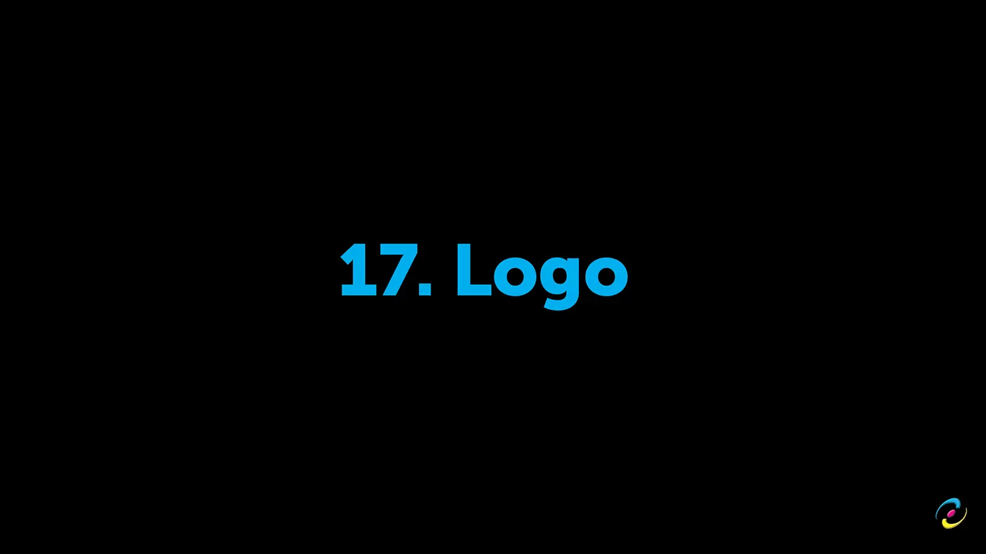
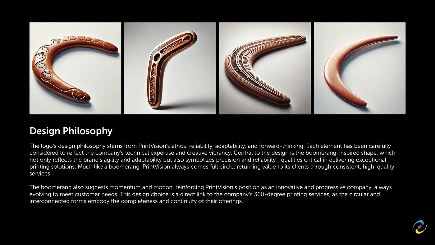
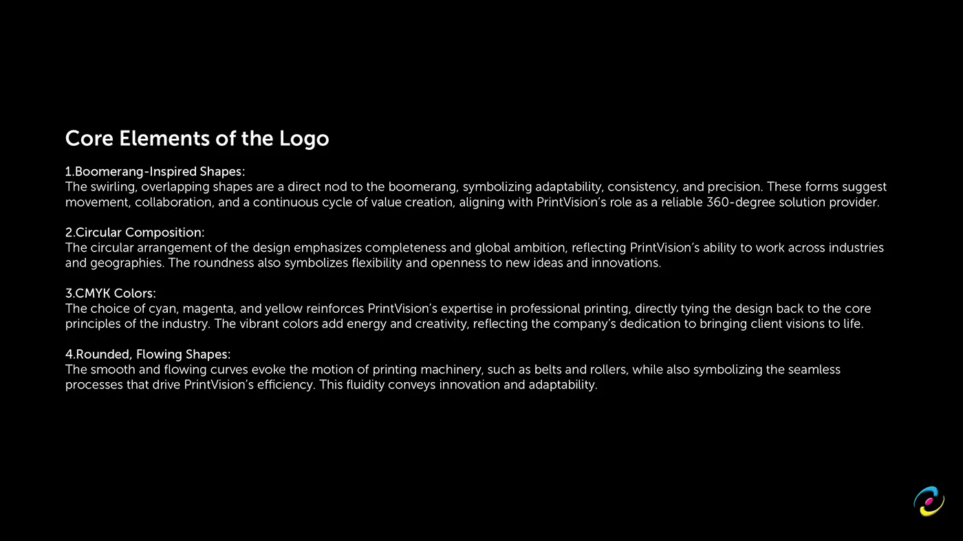
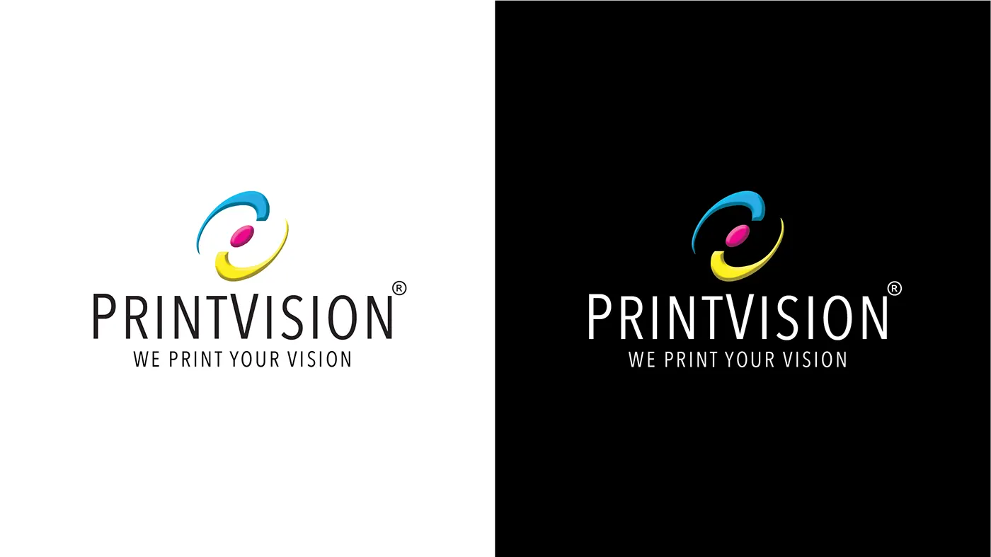
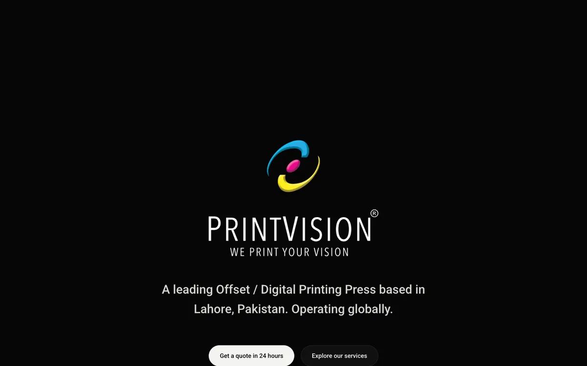
The mark starts somewhere most printing logos do not. It starts with a boomerang.
The reasoning survives being said out loud, which is the test. A boomerang returns. It is the shape of value coming back to the person who sent it out, and that is precisely the argument a printer with decades of repeat clients is trying to make. It carries momentum without carrying aggression. And two of them overlapped close into a circle, which is how the 360 in "360 degree printing solutions under one roof" gets stated as a shape instead of typed as a number.
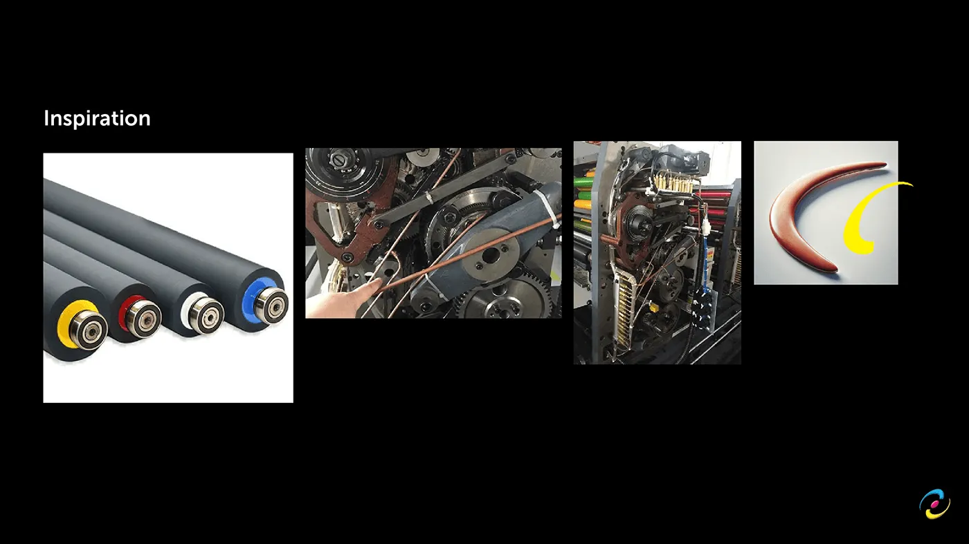
The second influence came off the plant floor rather than out of a moodboard. The inspiration board is colour-coded ink rollers, and the belts and gears of a running press, photographed in the building. That is where the finished curve comes from: the mark reads as a boomerang if you know the philosophy, and as a roller in motion if you have ever stood next to one of the Solnas.
Four elements were fixed in writing before anything was drawn:
- Boomerang-inspired shapes, for adaptability, consistency and precision, and for a continuous cycle of value rather than a one-off transaction.
- Circular composition, for completeness and reach across industries and geographies.
- CMYK colour, tying the mark directly to the process the company sells.
- Rounded, flowing forms, for the motion of printing machinery, belts and rollers, and the seamlessness of a plant that does not outsource a stage.
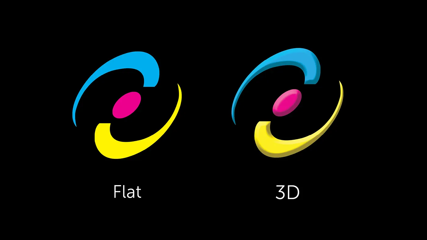
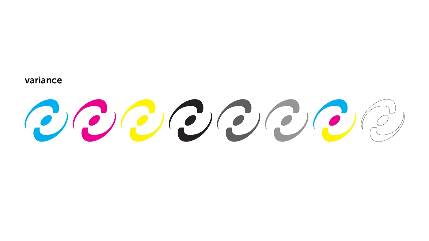
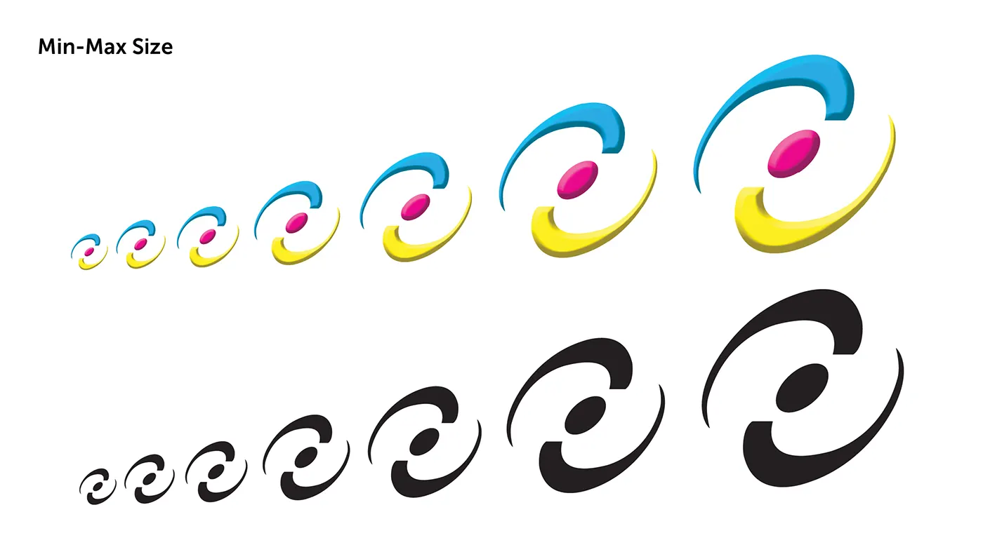
It is drawn flat for print and dimensional for screen, with single-plate colourways so it survives one colour jobs, foil, emboss and deboss without being redrawn, and with minimum and maximum sizes specified so it holds from a favicon to a press sheet.
Colour and type
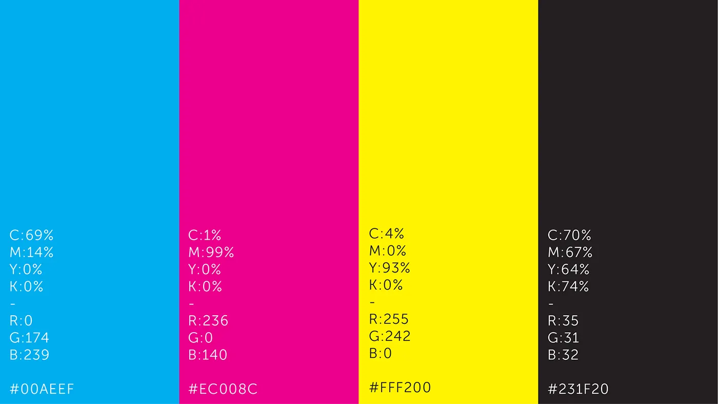
The palette is the process, and each plate was given a job:
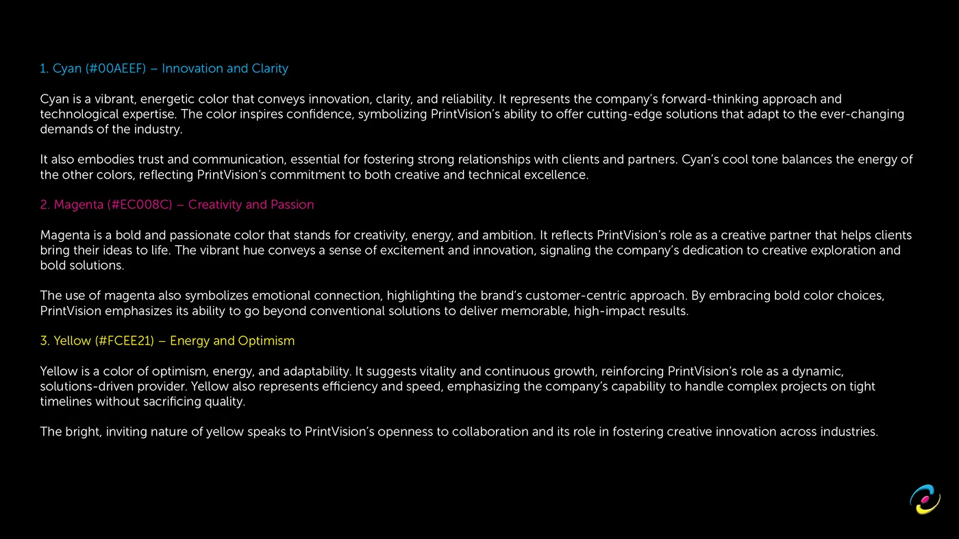
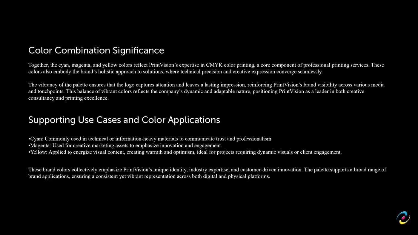
- Cyan #00AEEF, innovation and clarity, and the cool tone that steadies the other two
- Magenta #EC008C, creativity and the emotional half of the relationship
- Yellow #FFF200, energy, optimism, and the speed a print buyer is actually asking about
- Key #231F20, a charcoal rather than a true black, so it stays a colour and not an absence
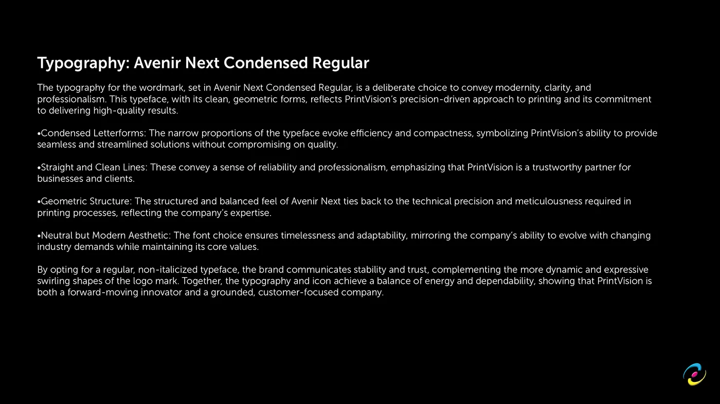
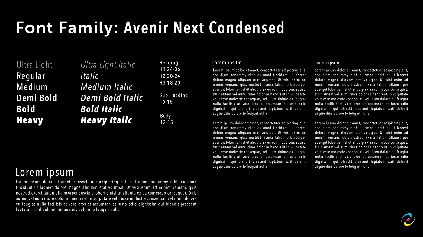
Typography is Avenir Next Condensed. Condensed letterforms, because a printer's copy is mostly specifications and specifications are dense. Straight, clean lines and a geometric structure, because the thing being sold is technical precision and the type should not contradict it.
The wordmark is set in the Regular, upright, deliberately. The mark is the element allowed to move; the name it sits above is the element that has to look like it will still be there in ten years. Energy from one, dependability from the other.
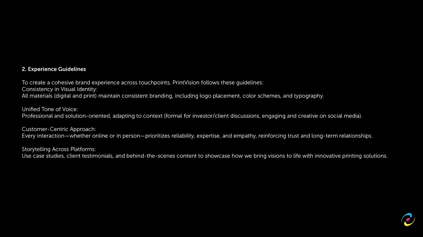
Then the applications: stationery, ID badges, the company profile, an information-rich brochure, social templates keyed one plate colour per service line, brand artwork, an icon set, apparel, and the corporate video.
The website
The new site is twelve routes, ten indexed, statically generated with the Next.js App Router. No CMS. Copy lives in typed TypeScript modules, which means every word change arrives as a reviewable diff next to the code that renders it, and derived values compute themselves rather than going stale.
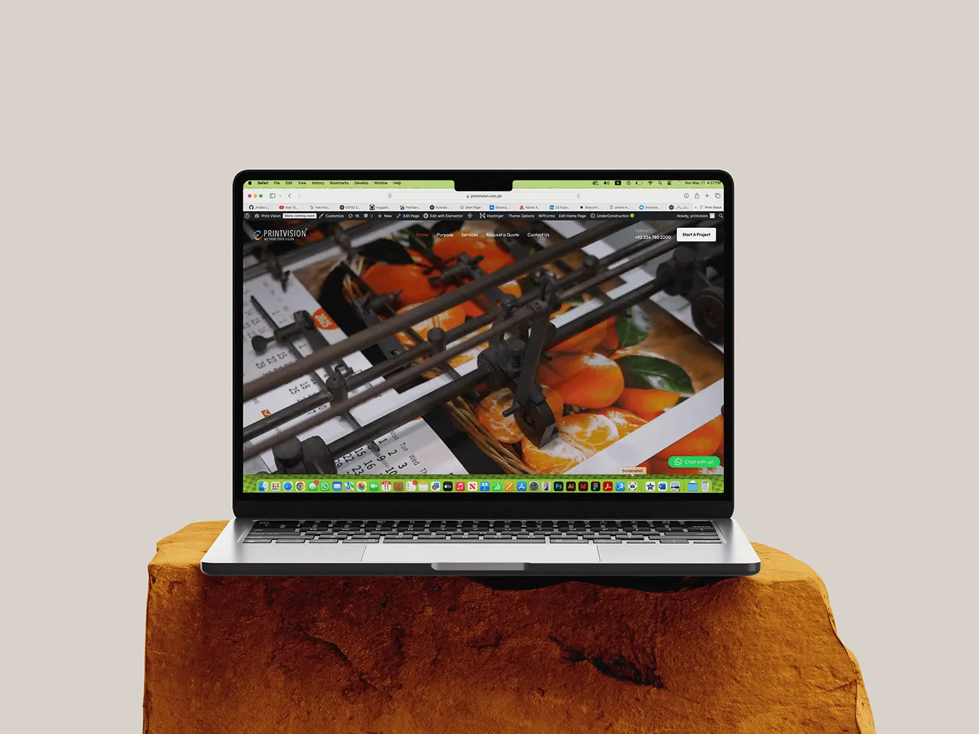
The design is the identity inverted. The approved direction was a light paper system, paper #F7F5F0 on ink #161511. What shipped is the same semantic vocabulary flipped to black, #060607 paper and near-white ink, with CMYK surviving only as a hairline colour bar and plate-coloured accents, under 2% of any viewport. Full-saturation CMYK as interface colour was one of the things that made the first attempt read as generic. The cursor is a registration mark, and it turns magenta over anything interactive, except text inputs, where it hands back the native I-beam because a registration mark over an editable field breaks the affordance.
Secondary text is pinned at a contrast level that clears AAA on every surface. It is not dimmed for style.
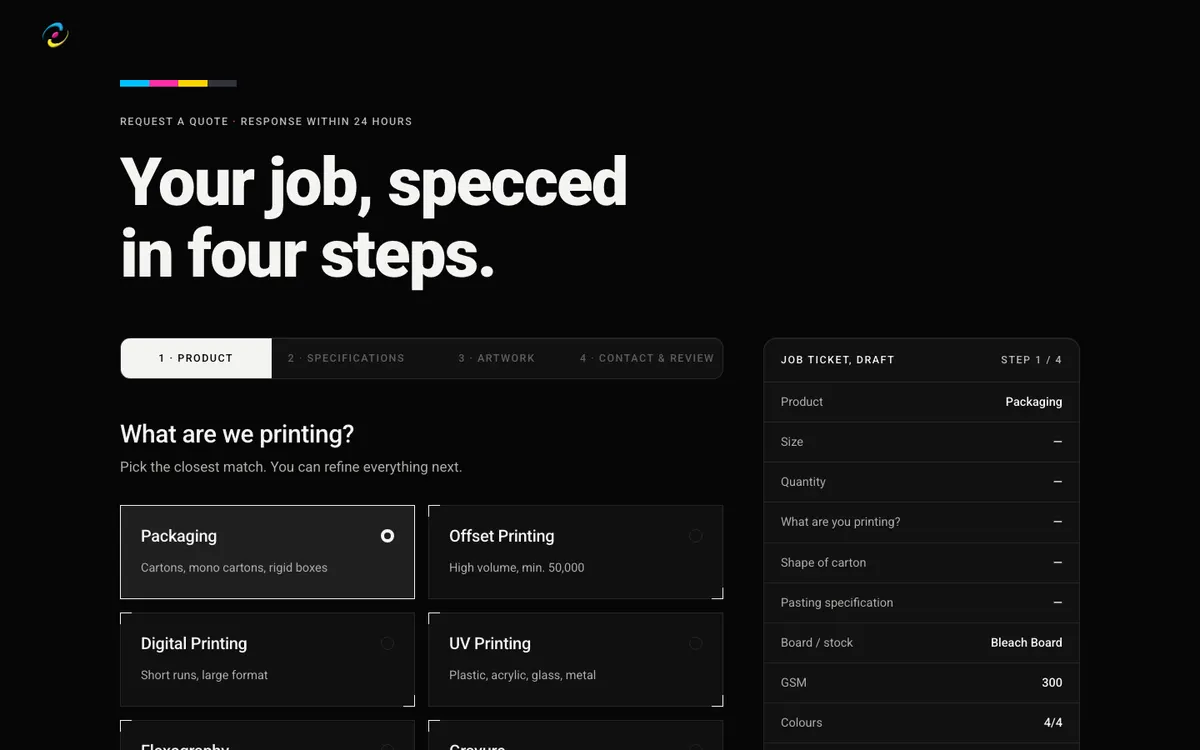
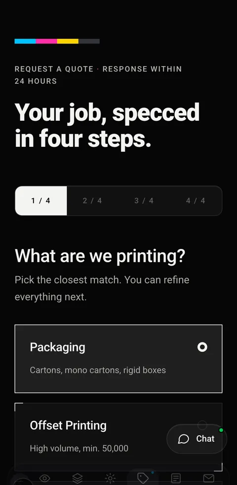
Underneath, the site is a front door to the ERP the company already built. Both public forms POST to a single server route that calls a Supabase procedure, and the shape of that payload is a written contract between the web side and the ERP side. The four-step quote wizard is therefore not a contact form with extra fields, it is a specification intake: product, specifications, artwork, contact and review, and what comes out the other end is machine readable. The live chat answers from the ERP's own knowledge base, and talking to a person is an explicit escalation rather than the default.
Both public endpoints sit behind bot detection and per-IP rate limiting, and the privileged database call was moved server side so the ERP team can revoke the public grant without breaking the website.
Performance was treated as a content problem rather than a build flag. The plant reel was compressed from 26MB to 7.4MB, every video is poster first, and playback is deferred until scroll. Visitors who prefer reduced motion never download the video at all, they keep the poster.
Search
Fifteen articles were written and published before launch, in four categories, all shaped like queries a buyer types before they know which supplier to call. Choosing GSM for pharma cartons. Offset versus digital by run size. Pantone versus CMYK for brand colour consistency. What buyers inspect in export-quality packaging from Pakistan. How to audit a pharmaceutical packaging supplier.
The rule was written down and followed: do not launch an empty blog.
We also ran an SEO audit against our own work and published the result rather than filing it. It found H1 quality to be the systemic weakness, and three of its top five fixes shipped the same week. Two were declined on purpose, because brand voice was judged to be worth more than a keyword on those particular pages. A recommendation you decline for a stated reason is a decision. One you never write down is an accident.
What shipped
- A written brand foundation, twenty five sections
- A complete visual identity: mark, colourways, type system, icon set, brand artwork
- Stationery, company profile, brochure, social templates, apparel
- A corporate video
- A twelve-route website, statically generated, wired into the client's ERP
- A four-step specification intake replacing an email-and-hope quote form
- Fifteen search-shaped articles, live at launch
- A client portal, provisioned from the ERP and kept out of the index
Design, technology and growth were not three vendors passing files between them here. The brand foundation set the positioning, the positioning wrote the copy, the copy shaped the routes, and the routes fed a production system the client already owned. That is the argument for doing it in one team, and PrintVision is the clearest proof of it we have.
Brand
PrintVision, brand foundation & identity
The Ultimate Brief in full, all sixty pages: purpose, positioning and audience through to the mark, the palette, the type system and every application.
The brief came before the pencil
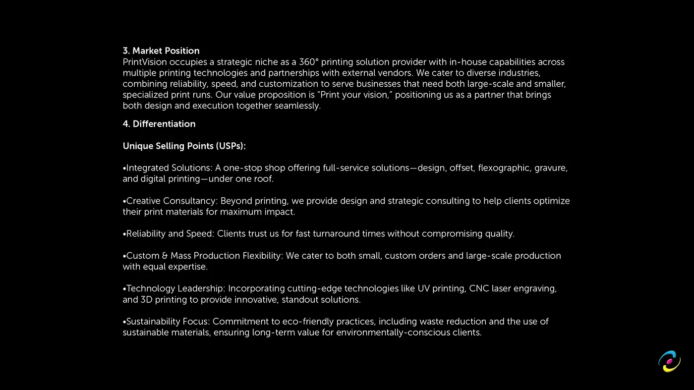
Sixty pages were written before a single mark was drawn. Not a moodboard, a document: purpose, mission, vision and quality policy; core values; objectives and KPIs; audience profile; competitive landscape and SWOT; personality and tone; positioning statement; brand promise; value proposition; key brand experience; communication and channel strategy; legal and compliance. Then, and only then, the identity system.
The order matters. A mark drawn before the positioning is decoration, and decoration is the thing a company quietly stops using two years later. Every visual decision in the back half of this document can be traced to a sentence in the front half.
The mark
It starts with a boomerang, which sounds arbitrary until you say the reason out loud: a boomerang returns. It is the shape of value coming back to the person who sent it out, and that is exactly the argument a printer with decades of repeat clients is making. Two of them overlapped close into a circle, which is how the 360 in "360 degree printing solutions under one roof" becomes a shape instead of a number.
The second influence came off the plant floor rather than a moodboard. The inspiration board is colour-coded ink rollers and the belts and gears of a running press, photographed in the building. The finished curve reads as a boomerang if you know the philosophy, and as a roller in motion if you have stood next to one of the Solnas.
Four elements were fixed in writing first: boomerang-derived shapes for adaptability and precision, a circular composition for completeness and reach, CMYK to tie the mark to the process being sold, and rounded flowing forms for the motion of the machinery.
Colour
The palette is the process, and each plate was given a job rather than picked for looks. Cyan #00AEEF for clarity, and the cool tone that steadies the other two. Magenta #EC008C for the creative and emotional half of the relationship. Yellow #FFF200 for energy and for the speed a print buyer is actually asking about. Key #231F20 as a charcoal rather than a true black, so it stays a colour and not an absence.
Every colourway is specified down to a single plate, so the mark survives one-colour jobs, foil, emboss and deboss without being redrawn, and the minimum and maximum sizes are stated so it holds from a favicon to a press sheet.
Type
Avenir Next Condensed. Condensed because a printer's copy is mostly specifications and specifications are dense. Geometric and clean-lined because the thing being sold is technical precision, and the type should not contradict the claim.
The wordmark sits in the Regular, upright. The mark is the element allowed to move; the name above it has to look like it will still be there in ten years.





Visual Communication
PrintVision, stationery & applied identity
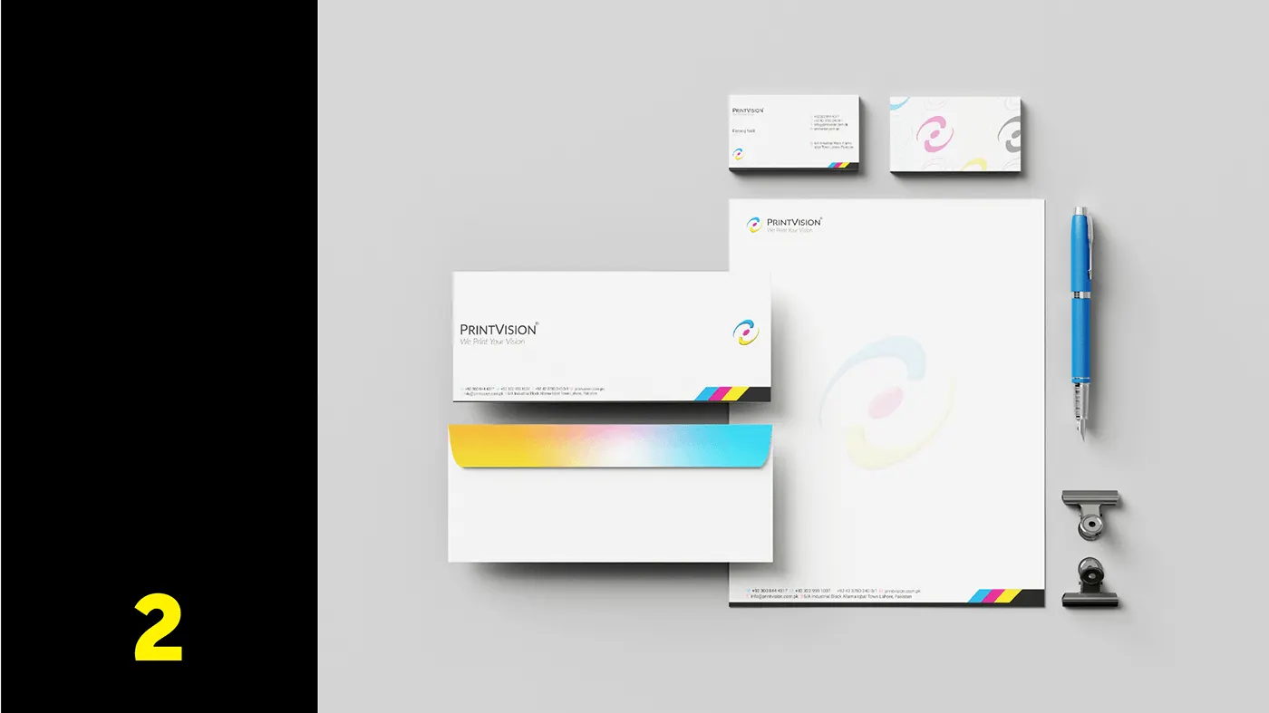
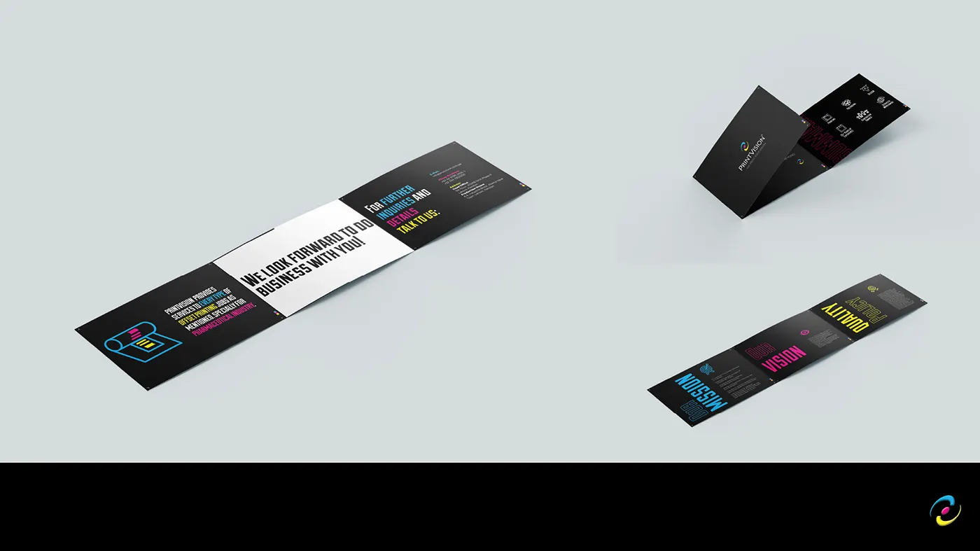
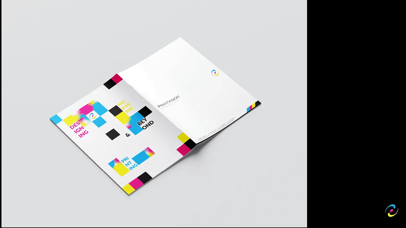
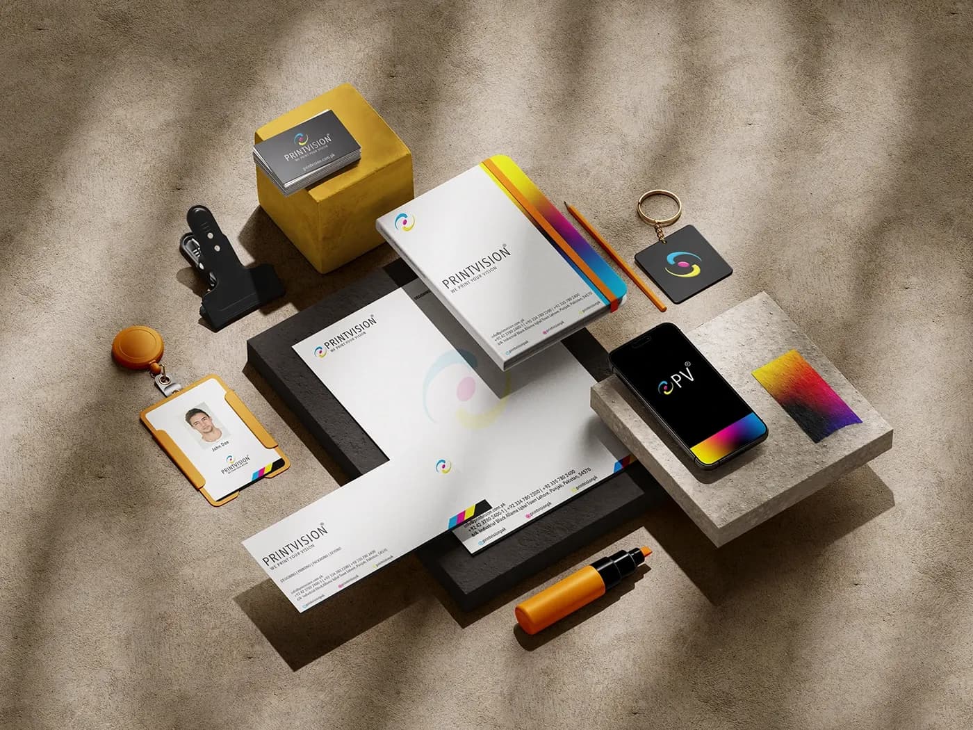
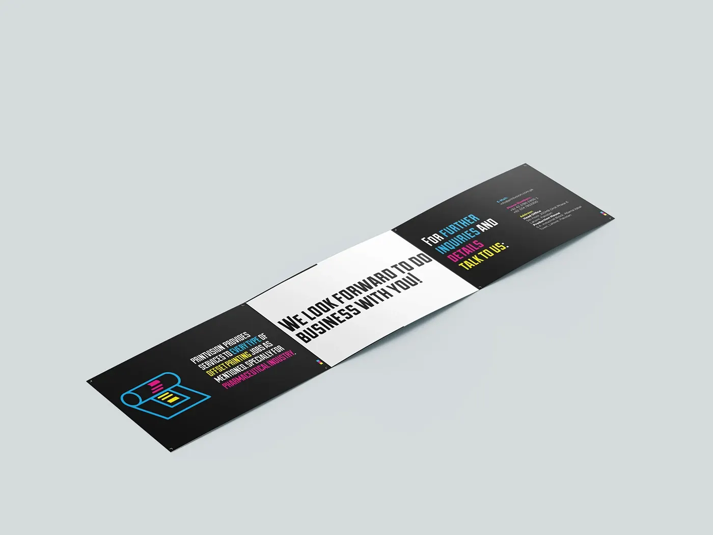
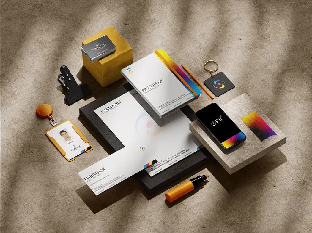
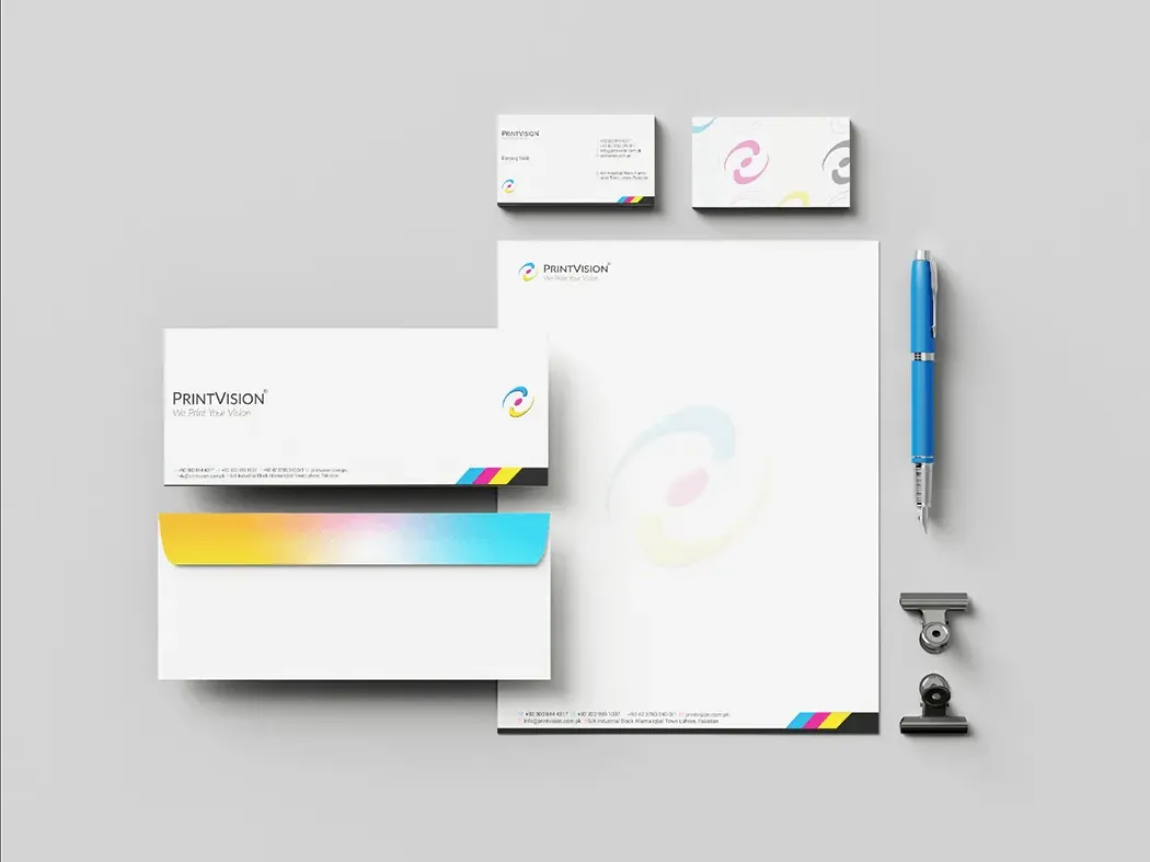
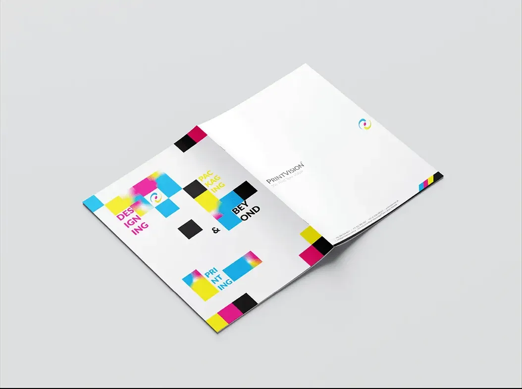
The applied identity: stationery, company profile, brochures, mockups, the icon set, brand artwork and the services lockups.
A printer's collateral is its own proof
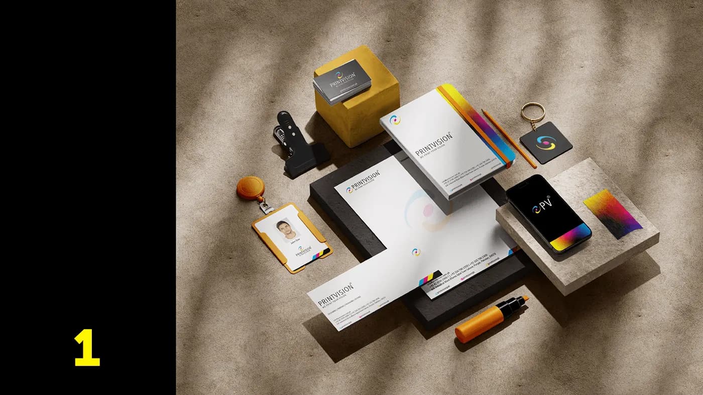
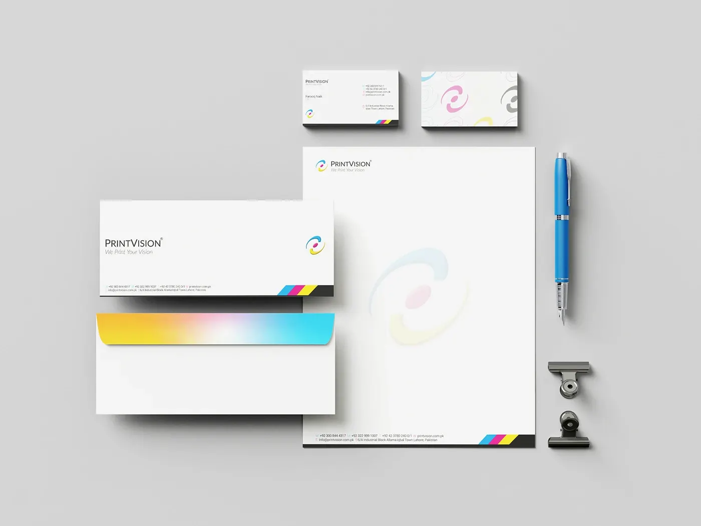
Most companies can pick a nice stock for their business cards. A printing house is different: its own collateral is a work sample, and a buyer will read the finish before they read the copy. So the applied identity is built to be handled, not just viewed.
One mark, four plates
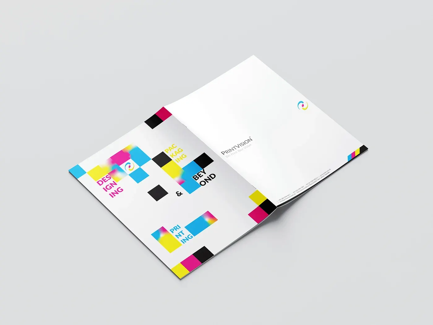
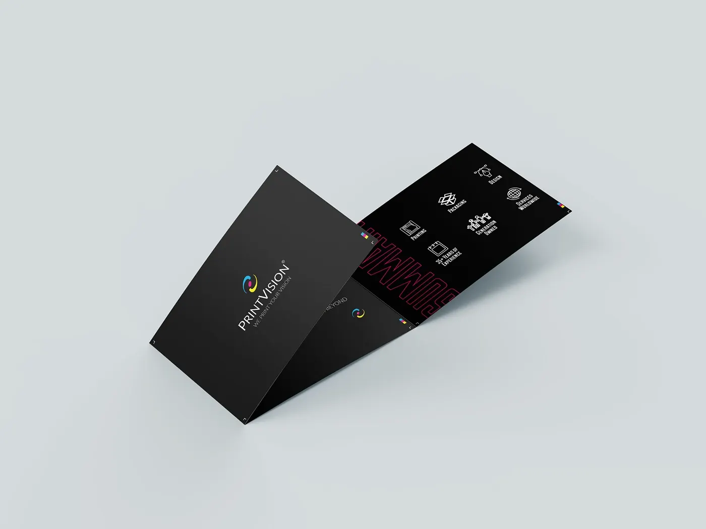
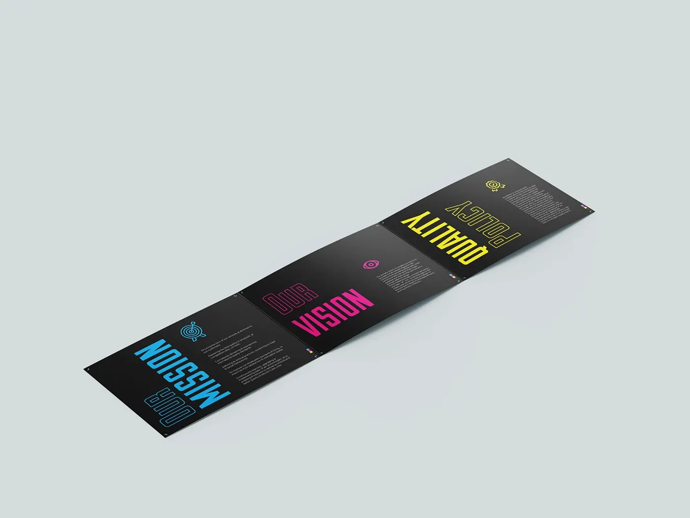
Letterhead, business cards, envelopes, ID badges, the company profile and an information-rich brochure. The CMYK bar and plate-coloured edges recur across all of it, which means the system is recognisable from a fragment: the corner of an envelope in a stack does the same job as the full lockup.
Off the page
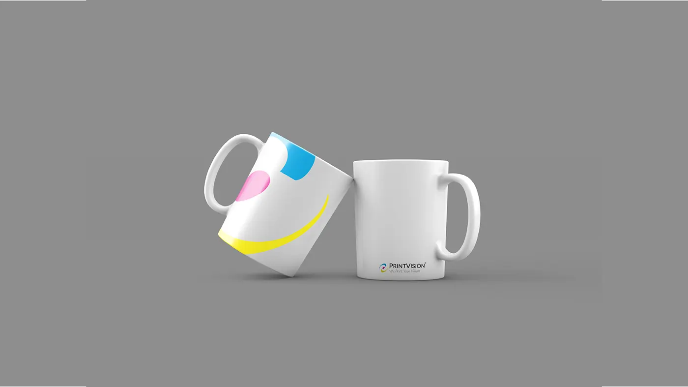
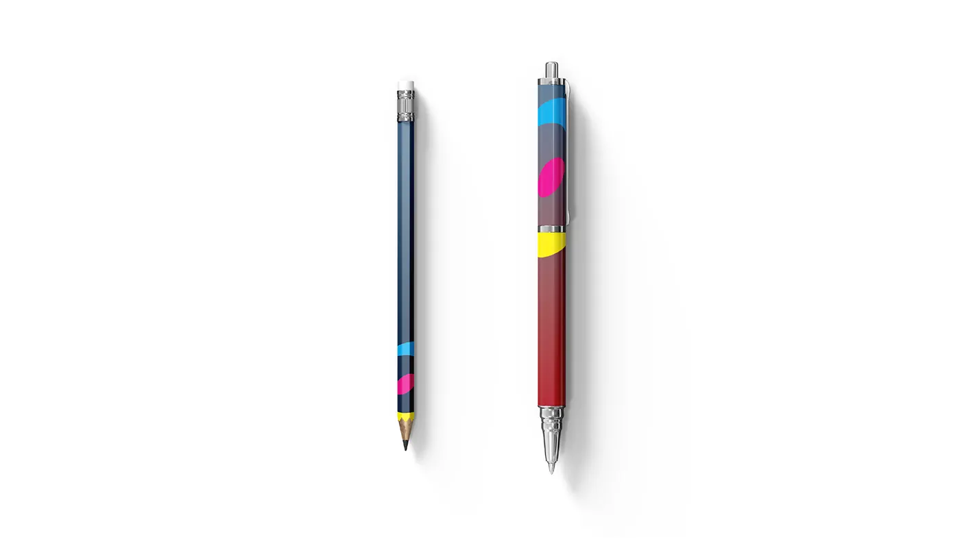
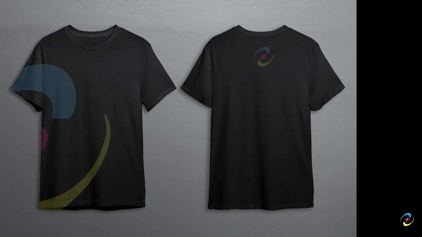
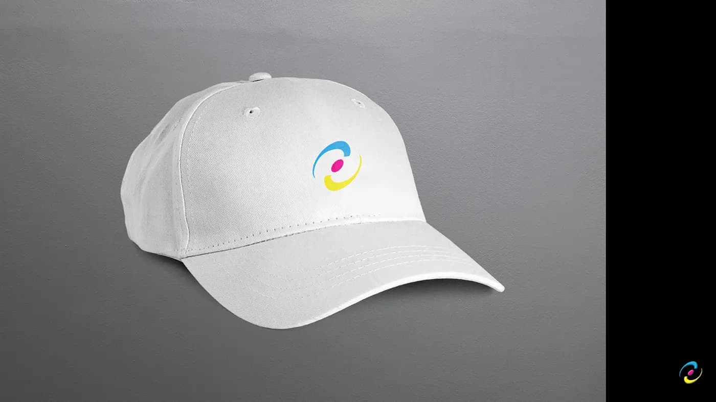
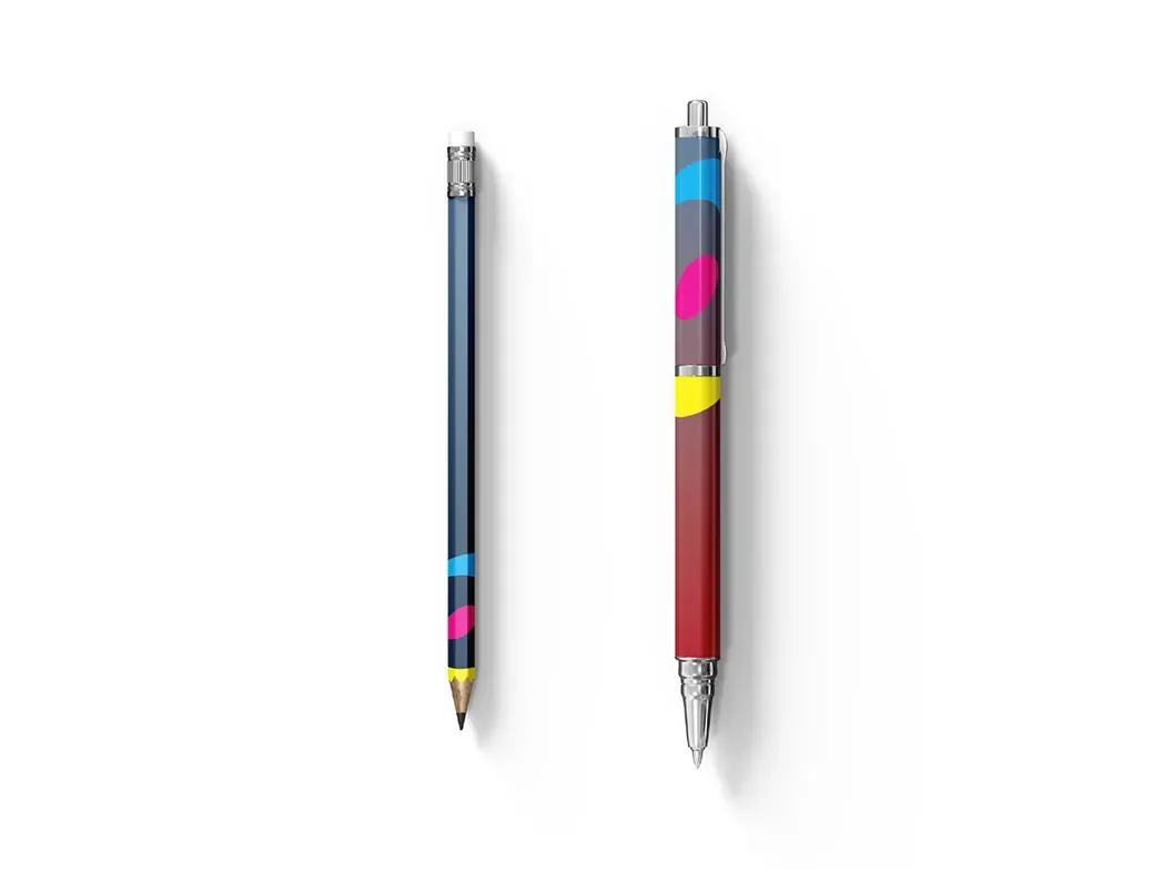
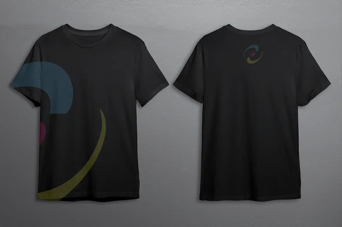
The mark then goes onto the things the plant actually uses. A wall clock, mugs, a notebook, pens, apparel and caps. This is not merchandise for its own sake. A brand that only exists on the sales deck and never on the floor is a brand the staff do not believe in, and buyers who tour the plant can tell the difference in about ten seconds.
Artwork
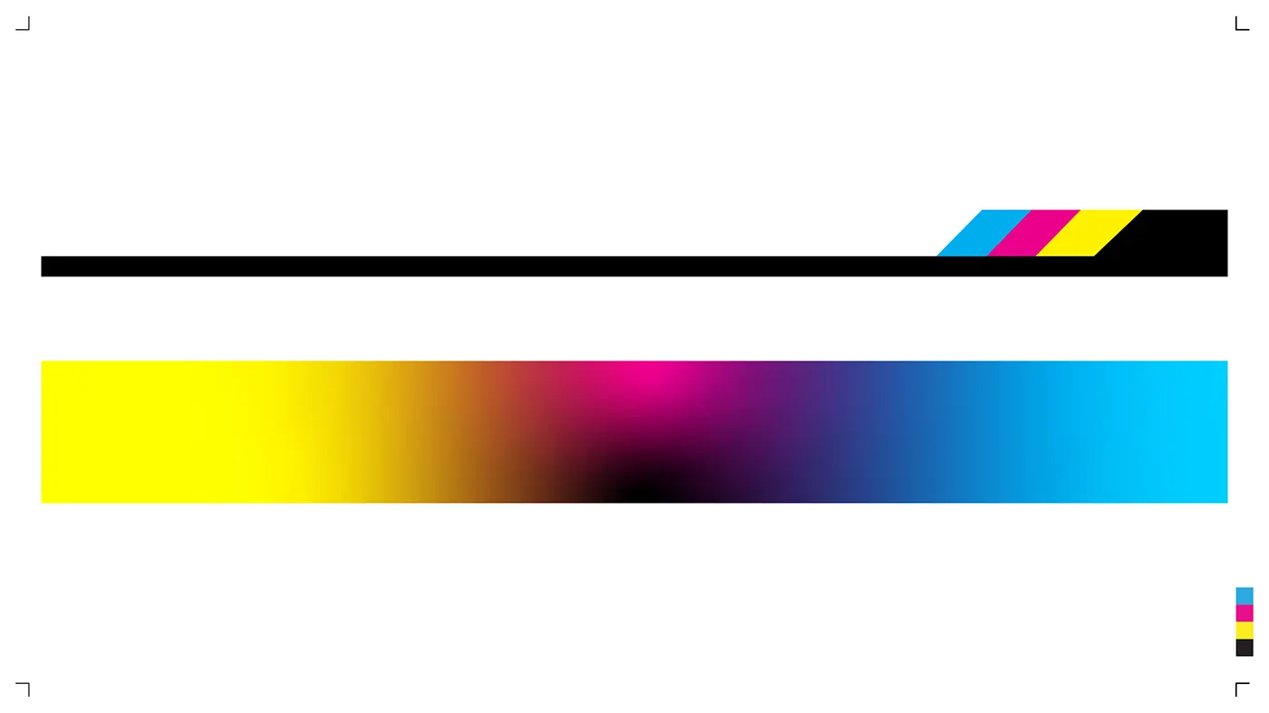
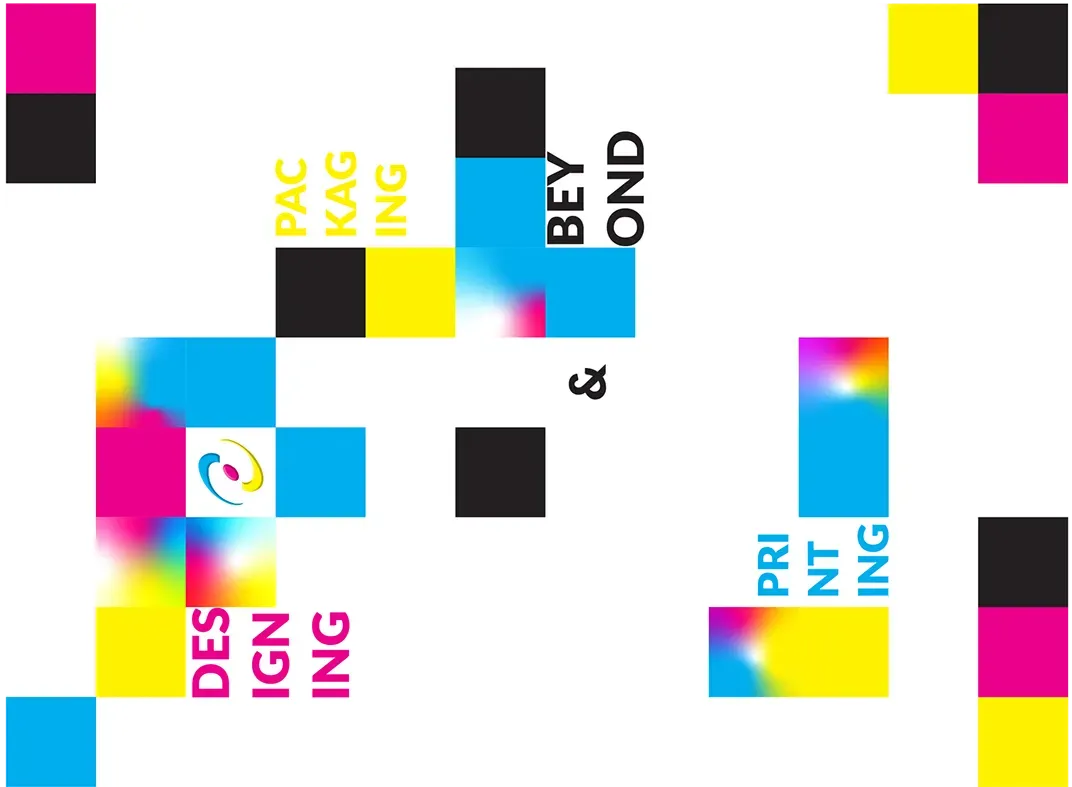
A set of brand artwork built from the process itself: the colour bar, brush marks in the three plates, and registration blocks. It gives the identity something to say on a surface that has no logo on it, which is most surfaces.
Services, stated plainly
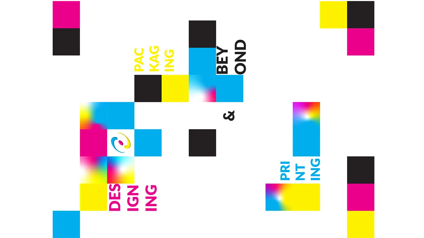
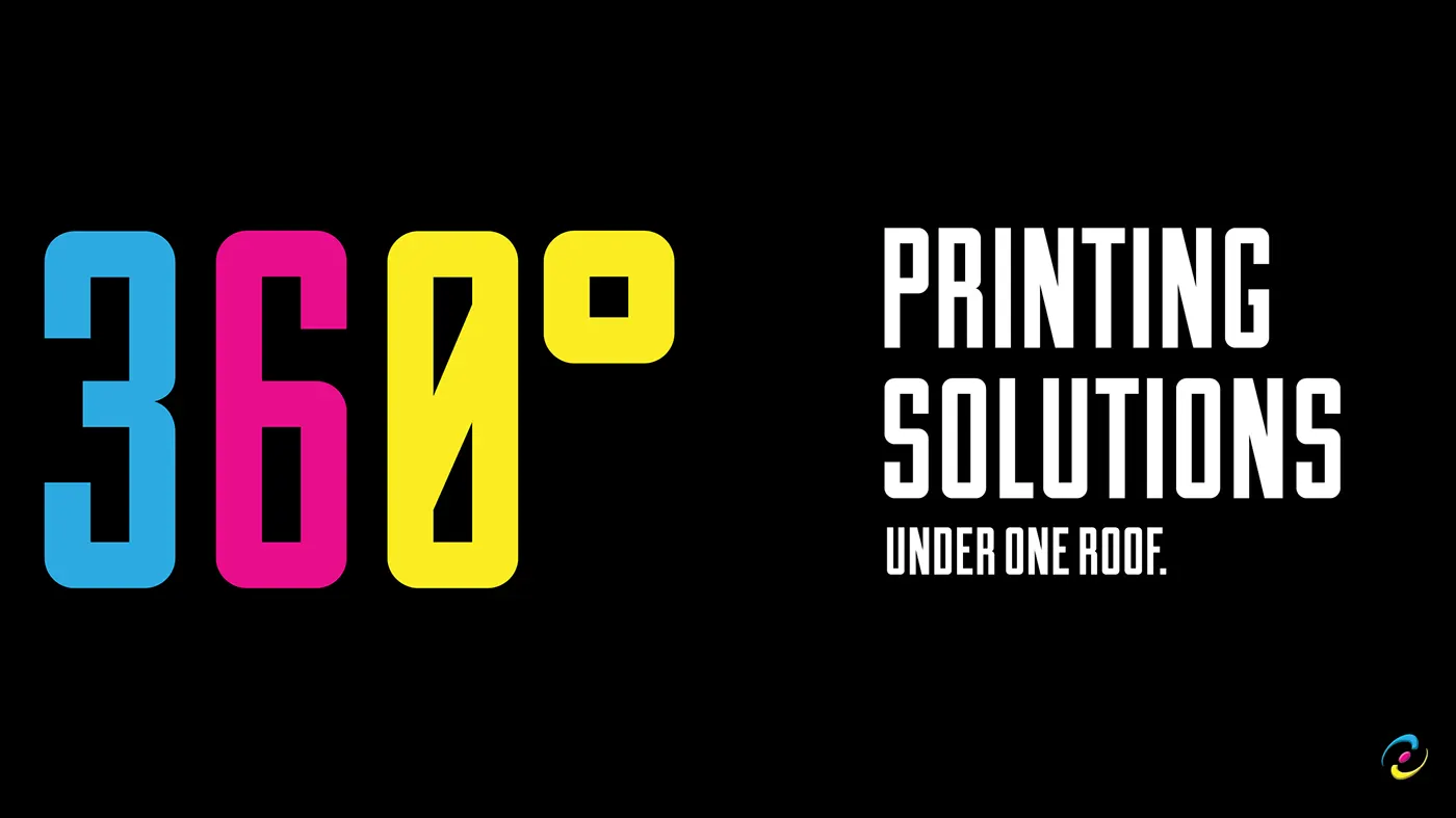
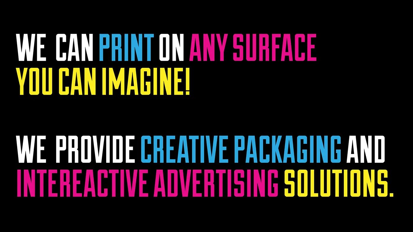
The services lockups do the positioning work in display type. "360 degree printing solutions under one roof." "We can print on any surface you can imagine." Both are large claims, and both are cashed out by the service list beside them: offset, digital, screen, DTF, 3D, UV, gravure, flexographic, die cutting, lamination, emboss and deboss, foiling, automatic pasting. Sixteen processes, all in house. That list is the reason the claim is not an exaggeration.


Film & Photo
PrintVision, corporate film
Shot on the floor in Lahore, on the presses the case study keeps citing.
Shot on the floor
Plates being set. Sheets running. Cartons checked by hand under the light. The leadership at their desks, and the people who actually run the machines.
Why a film at all
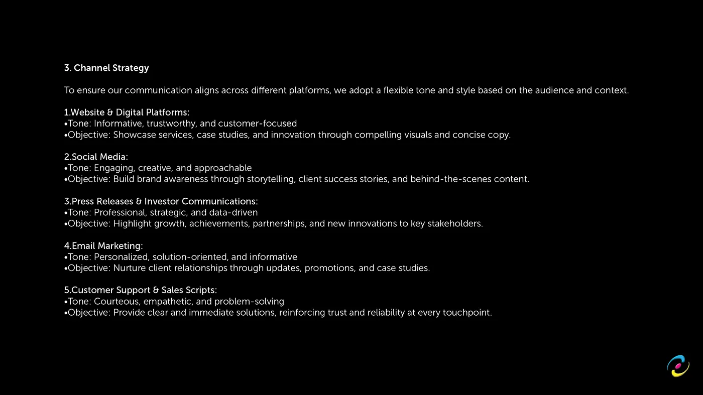
The whole brand rests on one claim: everything happens under one roof, design to dispatch, nothing outsourced. That claim is unusually hard to make in words without sounding like every other supplier, because every other supplier says it too.
Film is the only format that can decline to argue and just show you. Sixty-five seconds of the actual plant does more for a procurement manager's confidence than a page of adjectives, and it is the asset that gets reused everywhere afterwards: the website hero, the social channels, and the room when someone is pitching in person.
Growth
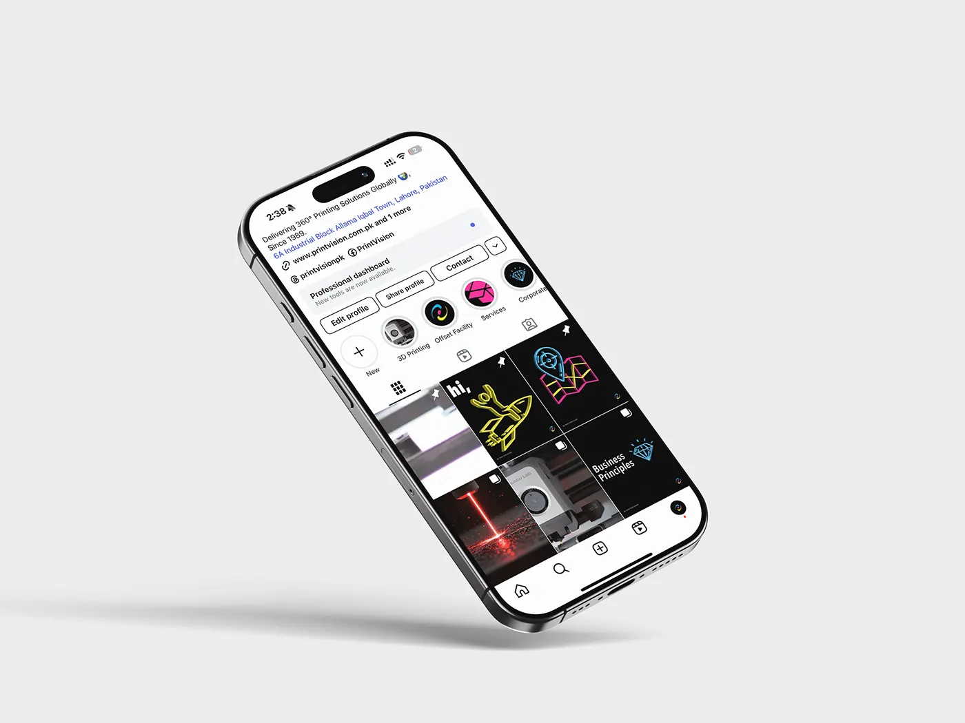
PrintVision, social templates
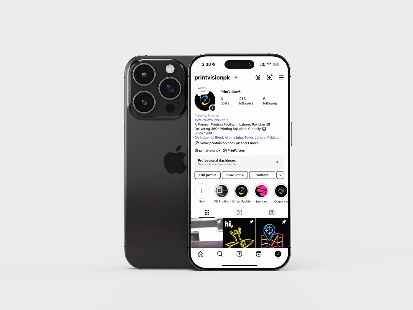
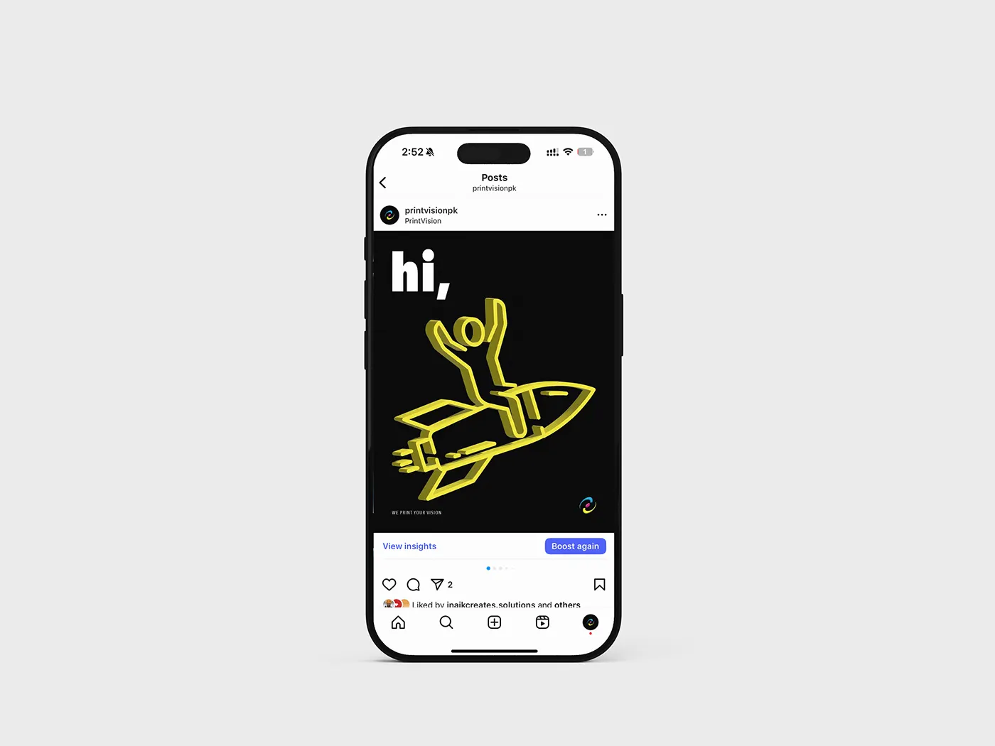
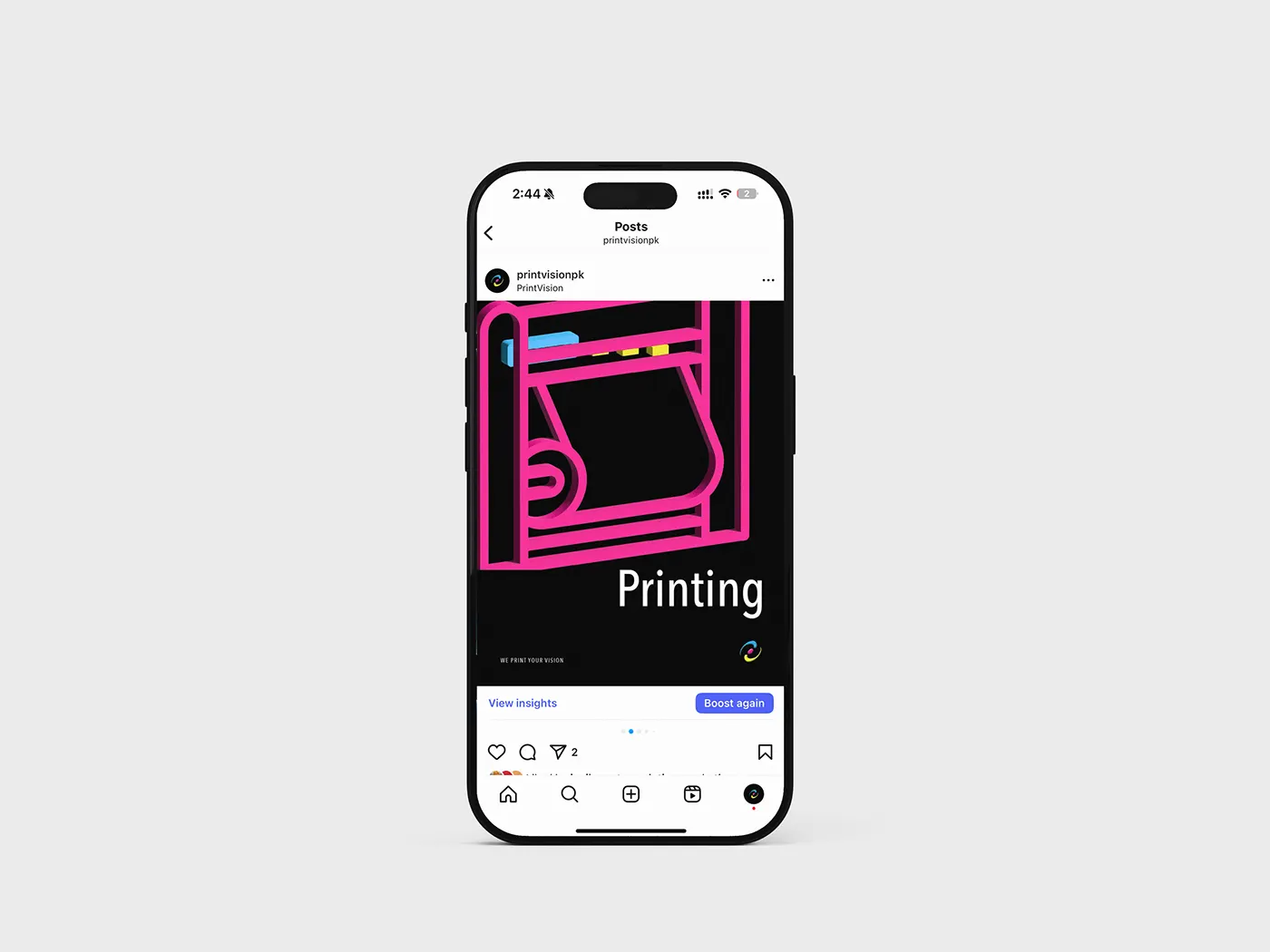
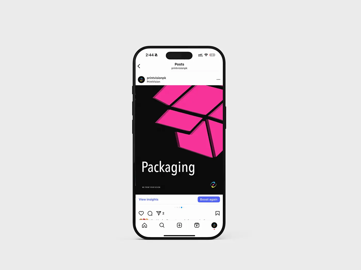
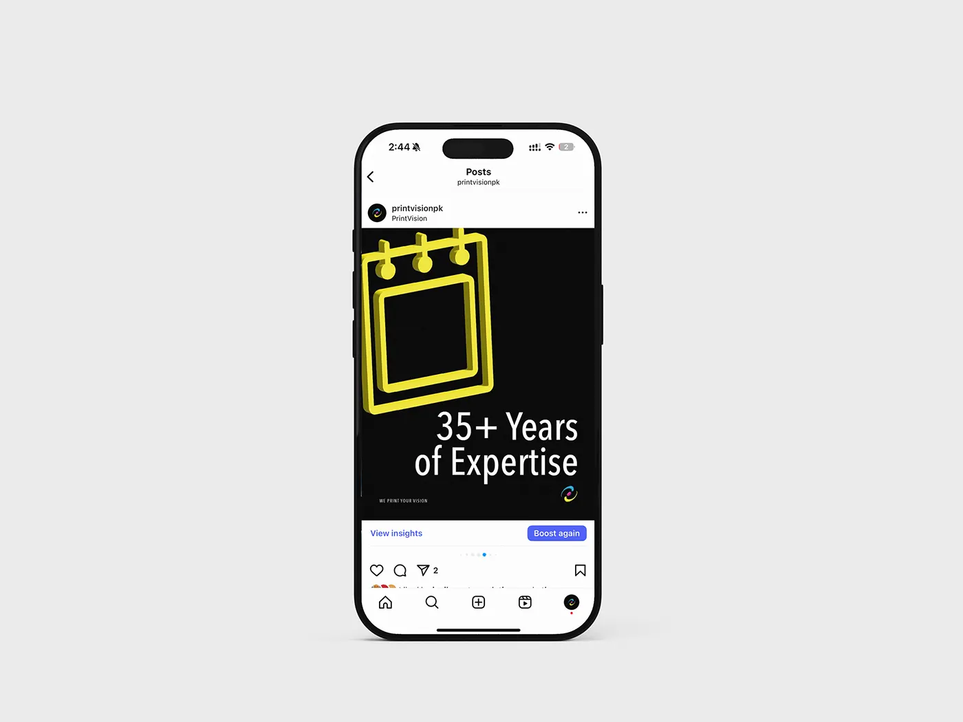
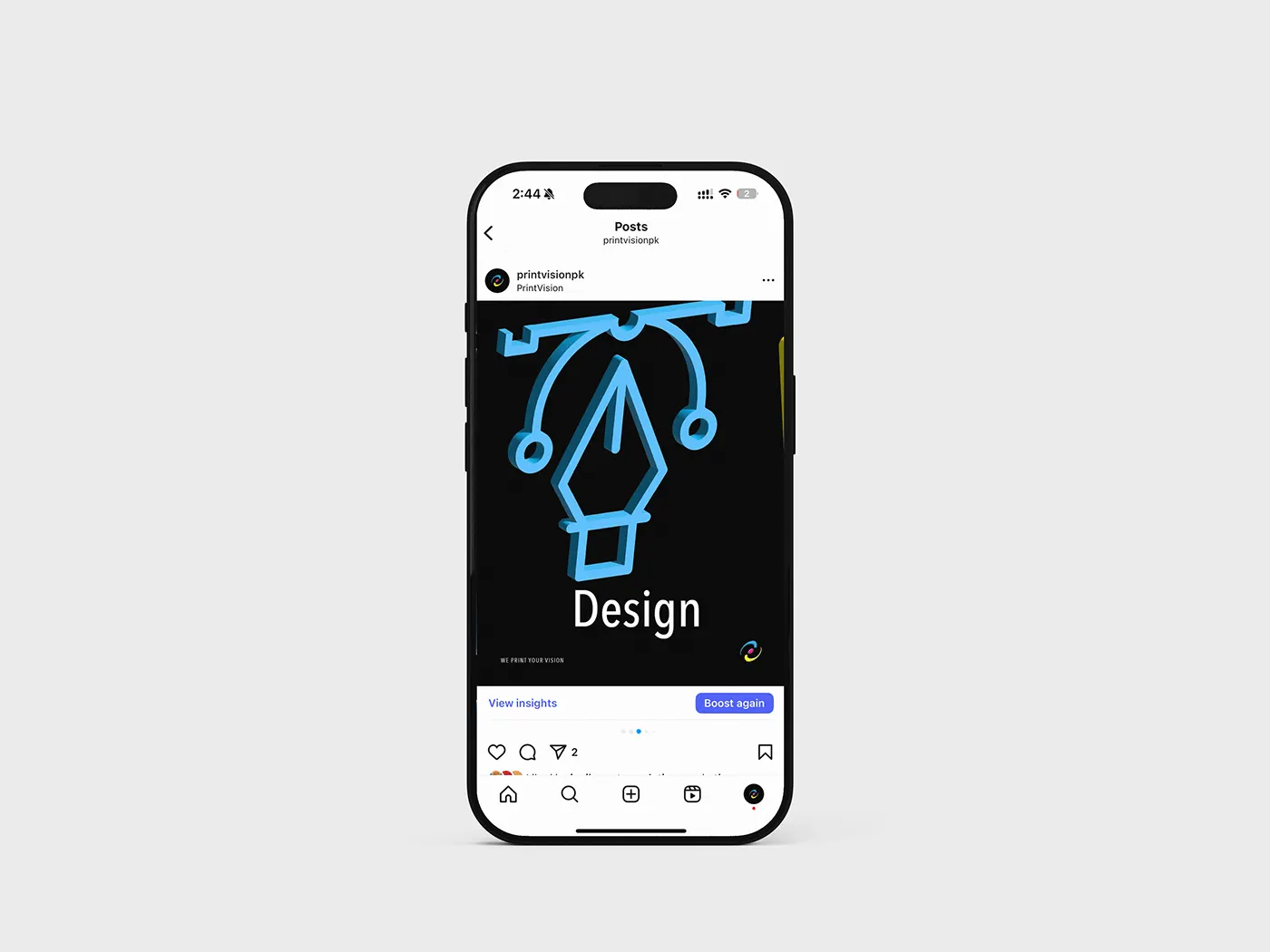
The profile, the grid, and a post template per service line, one plate colour each.
One plate colour per service line
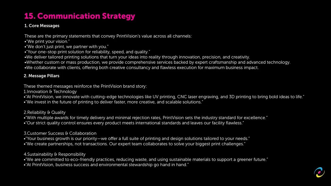
The social system is built on a single rule that makes it survivable: each service gets one plate colour and keeps it. Printing is magenta. Packaging is magenta's counterweight. Design is cyan. Experience and milestones are yellow.
That rule is what lets somebody who is not a designer keep posting on brand. There is no judgement call to get wrong, and the grid stays coherent even when the posts are made in a hurry.
The grid as a second home page
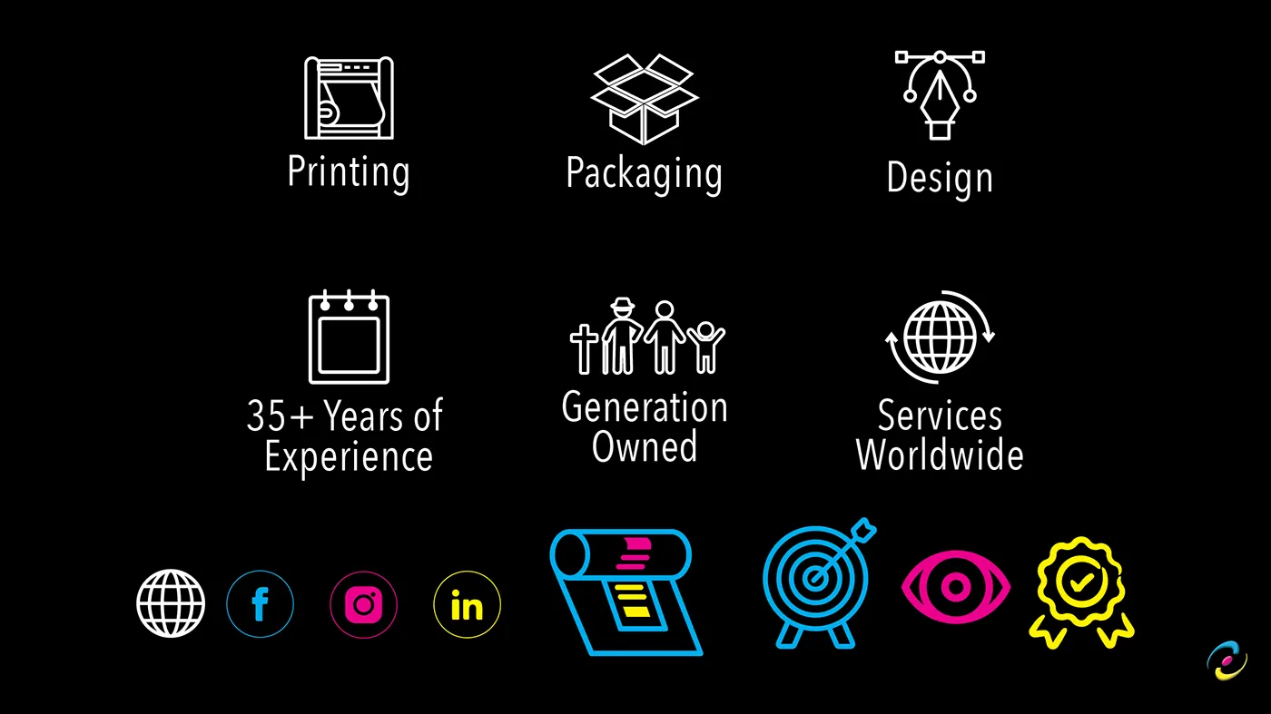
For a lot of buyers the Instagram profile is the first thing they see, not the website. So the profile and the grid were treated as a landing page in their own right: the identity is legible at thumbnail size, the mark holds at profile-picture scale, and the templates carry the same trust claims the site leads with, thirty five years of experience, generation owned, services worldwide.
What it is doing
This is top of the funnel, and it is honest about that. It is not trying to close a fifty thousand unit carton order in a caption. It is there so that when a procurement team finally does search, the name is not the first time they have seen the brand.
Web
PrintVision, the website
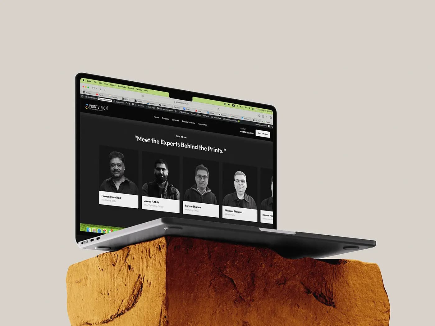
printvision.com.pk, statically generated on the Next.js App Router and wired into the client's own ERP.
Twelve routes, statically generated
Next.js App Router, twelve routes, ten of them indexed, prerendered at build time. The two that are not indexed are the client login and portal.
There is no CMS. Copy lives in typed TypeScript modules, which means every word change arrives as a reviewable diff next to the code that renders it, and derived values compute themselves instead of going stale: the years-in-business figure is the current year minus 1989, so nobody has to remember to update it.
That trade is real in both directions. A typo fix is a deploy, and there is no non-technical editing, drafts or preview. For a site whose copy changes a few times a year and whose operational system of record is the ERP, it was the right side of the trade.
A front door to an ERP, not a brochure
The company had already built its own ERP that tracks every job from quote to dispatch. The website is the public front door to it.
Both public forms POST to a single server route that calls one database procedure, and the shape of that payload is a written contract between the web side and the ERP side, checked into the repo rather than agreed in a thread. The live chat answers from the ERP's own knowledge base, stateless and rate-limited server-side, and talking to a person is an explicit escalation rather than the default.
Hardened where the public can write
Every public write path is treated as hostile. Both endpoints sit behind bot detection and per-IP rate limiting, and the privileged database call was moved server-side so the ERP team can revoke the public grant without taking the website down with it.
The service-key client is instantiated per invocation and never persists an auth session, which matters in a serverless function where instances are reused.
Performance as a content problem
The heaviest asset on the site is the plant reel, and the fix was not a build flag. It was compressed from 26MB to 7.4MB at 720p, every video is poster-first behind a single shared poster, and playback is deferred until scroll.
Search plumbing
Structured data in three tiers: the business itself sitewide, an FAQ block generated from the visible text so the markup cannot drift from what users read, and an article record per post. Fifteen posts were written and published before launch, because a live empty blog is worse than no blog.
We also ran an SEO audit against our own work and shipped three of its top five fixes the same week. Two were declined on purpose, with the reason written down. A recommendation you decline for a stated reason is a decision; one you never record is an accident.
One team, from identity to intelligence.
Brand, software, AI, and growth from a single team, not separate vendors. That is why the positioning, the copy, the site and the data model on this project agree with each other.
Book a discovery call