
Case study
MultiVerse '21
An event brand has about three weeks to exist. It is seen on a phone before it is ever seen on a wall, and it ends its life on a wristband at a door. So the identity had to work at story size, at poster size, and at twenty millimetres, without being redrawn for any of them.
- Client
- The Decibel Collective
- Sector
- Music festival
- Promoter and label
- The Decibel Collective
- City
- Lahore, Pakistan
- Year
- 2021
- Date on the bill
- 3 December
- Lineup
- 11 artists
- Scope
- Posters, social, merchandise, on-site
- Visual identity
- Poster design
- Social campaign
- Merchandise
- Event collateral
MultiVerse '21 was a one-night music festival in Lahore, put on by The Decibel Collective, a Pakistani label and event promoter. Eleven artists on the bill, set for 3 December, with a guestlist that closed on 21 November and a room that could only hold so many people.
That last detail shaped the work more than the name did. This was not a brand that needed to last a decade. It needed to be recognised twice in three weeks, on a phone, by people who were deciding whether to keep a Friday free.
A label throwing its own night
When the promoter is also the label, the event is not a neutral venue booking. The bill is close to a roster, and the night is the label saying this is what we sound like now.
That set the one rule the identity is built on: MultiVerse had to look like an event, not like a record sleeve. The Decibel Collective's name belongs on the night, but the artwork could not become a label logo with a date attached, or the poster would read as an ad for the company rather than an invitation to a room. So the collective signs the work and the event owns the image.
Lahore, and why the guestlist is on the poster
A city decides how an event is sold. Lahore's electronic scene in 2021 ran on private rooms and word of mouth rather than on ticket links, which is why `[ guestlist. NOW OPEN. ]` and `( until 21.11. )` are set on the artwork instead of a "buy tickets" button.
That is also why capacity is stated on the announce rather than buried. In a guestlist city, a limited room is not a disclaimer, it is the offer, and putting it on the poster in the accent colour turns a constraint into the reason to reply today.
What the work had to do
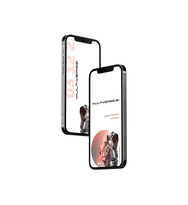
- Be recognised at story size. Most of the audience would only ever see it at 1080 by 1920, held at arm's length, for under two seconds.
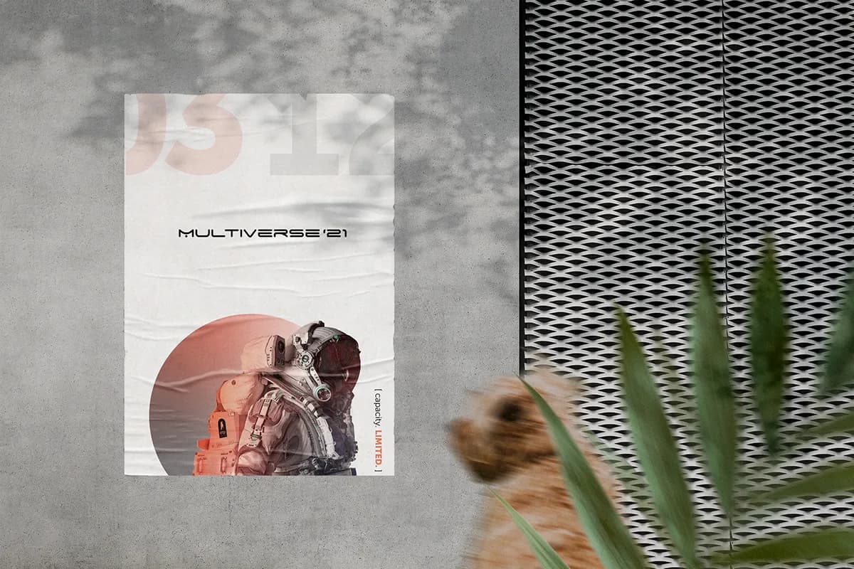
- Survive paste-up. The same artwork had to read on a creased sheet on a concrete wall, seen at an angle, in passing.
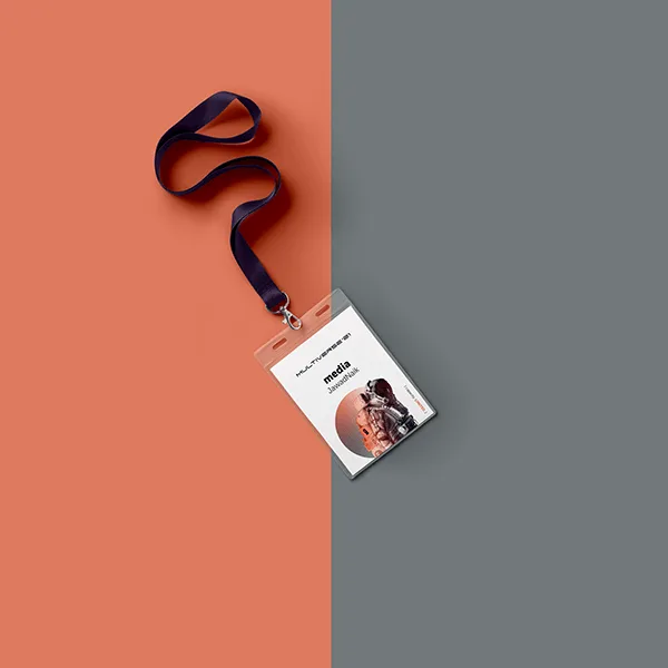
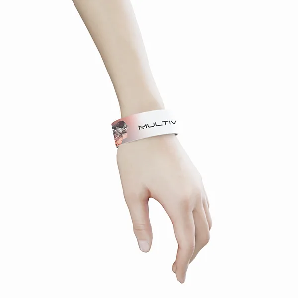
- Reach the door. Accreditation, wristbands and merchandise are part of the identity, not an afterthought once the posters are approved.
- Change its message without changing its face. Announce, then lineup, then guestlist open, then guestlist closing, all from one artwork.
The decisions
One held image instead of a universe of them, because the name was already doing the "infinite" work and a second voice saying it would have been noise.
The date set larger than the name, because a first-year event sells a night, not a brand.
A single bracketed line as the only moving part, with exactly one word in accent orange, always the word that asks for an action.
The year dropped from the wordmark on anything anyone keeps.
What it comes down to
An event identity is judged on a wall at ten metres and on a wrist at ten centimetres, by the same person, on the same night. Most of the work here was making sure those two are recognisably the same thing.
Visual Communication
MultiVerse '21, festival identity and campaign
One held image, one wordmark, and a bracket that takes whatever is true this week: posters, stories, merchandise and accreditation for a one-night festival.
One image, held
The name invites a galaxy. Multiverse, infinite worlds, every effect in the filter menu. That is exactly why the identity does the opposite: one photograph, one circle, one figure, and nothing else moving.
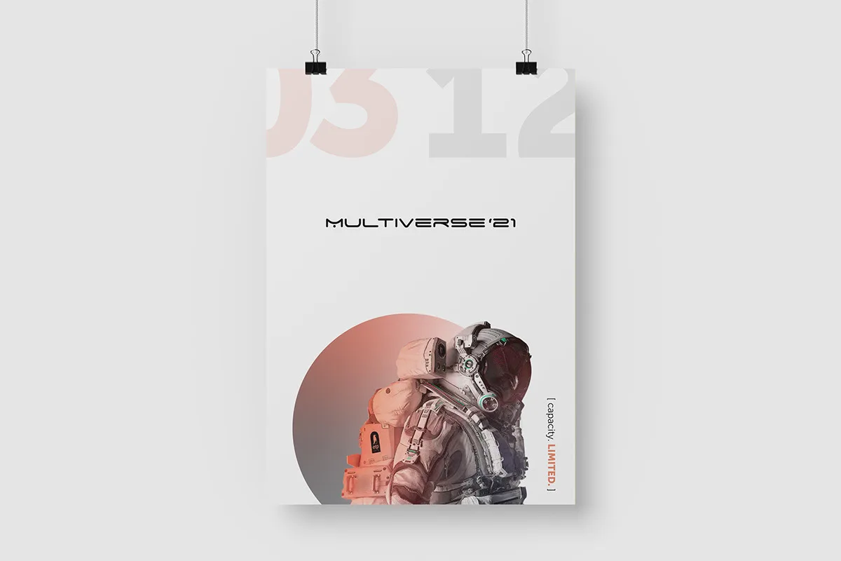
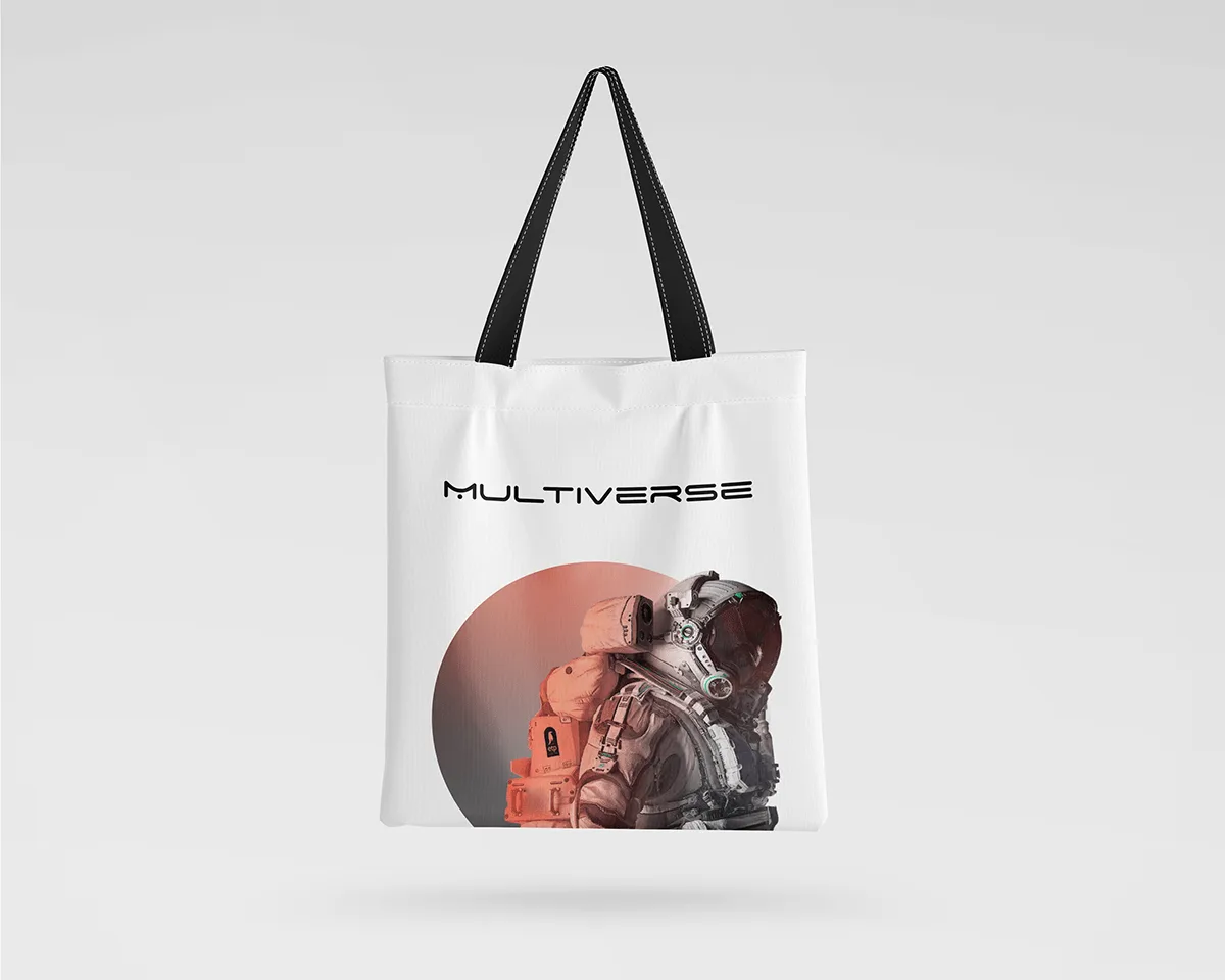
An astronaut sits inside a terracotta disc on an off-white field. It is a single held image, reused at every size, never recomposed. That restraint is what makes the campaign recognisable after two exposures rather than five, which is all the runway a three-week event gets.
The date shouts, the name whispers
On the announce poster the numerals 03 12 are ghosted across the top edge at full width, bleeding off both sides. The wordmark sits in the middle of the sheet at a fraction of that size.
That inversion is deliberate. Nobody has heard of a first-year festival, so the name cannot do the selling. A date can. Someone glancing at a pasted poster from across a street takes away one thing, and it should be the night they need to keep free.
A bracket for whatever is true this week
The identity has one live slot: a bracketed line set small and vertical against the right edge.
- `[ capacity. LIMITED. ]` on the announce
- `[ guestlist. NOW OPEN. ]` with `( until 21.11. )` on the stories
One word inside each bracket is set in the accent orange, and it is always the word that asks for an action. The rest of the artwork never changes. That is what let the campaign stay current for a month without a single redesign, and it is why the orange is rationed: spend it everywhere and it stops meaning "do this now".
Eleven names, turned sideways
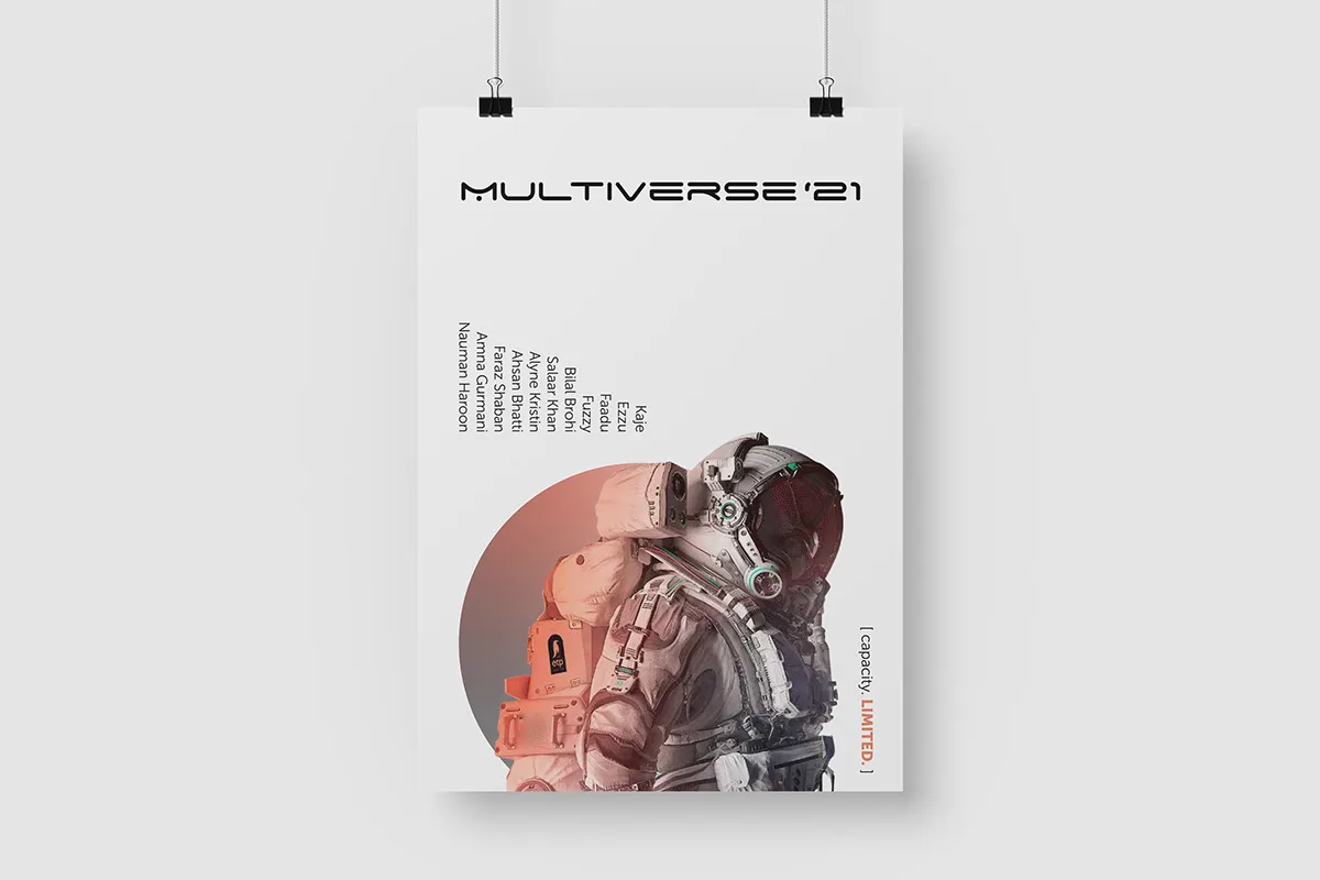
The lineup poster reuses the announce artwork exactly, and sets the bill vertically down the left of the figure: Kaje, Ezzu, Faadu, Fuzzy, Bilal Brohi, Salaar Khan, Alyne Kristin, Ahsan Bhatti, Faraz Shaban, Amna Gurmani and Nauman Haroon.
Rotating the type solves two problems at once. Eleven names stacked horizontally would either shrink below reading size or crop into the astronaut. Turned, they fit at full size, they leave the image whole, and the column of names becomes a texture of its own.
Down to twenty millimetres
The system had to survive the end of the night as well as the announcement. On merchandise the wordmark loses its year, so a tote is not obsolete in January. On media accreditation and on the wristband, everything is stripped back to the circle and the mark, because at that scale a hierarchy of four elements is just a smudge.
If an identity only works at A1, it is a poster, not an identity. This one was checked at the door before it was signed off.
One team, from identity to intelligence.
Brand, software, AI, and growth from a single team, not separate vendors. That is why the positioning, the copy, the site and the data model on this project agree with each other.
Book a discovery call